STA 113 2.0 Descriptive Statistics
Misuse of Statistics
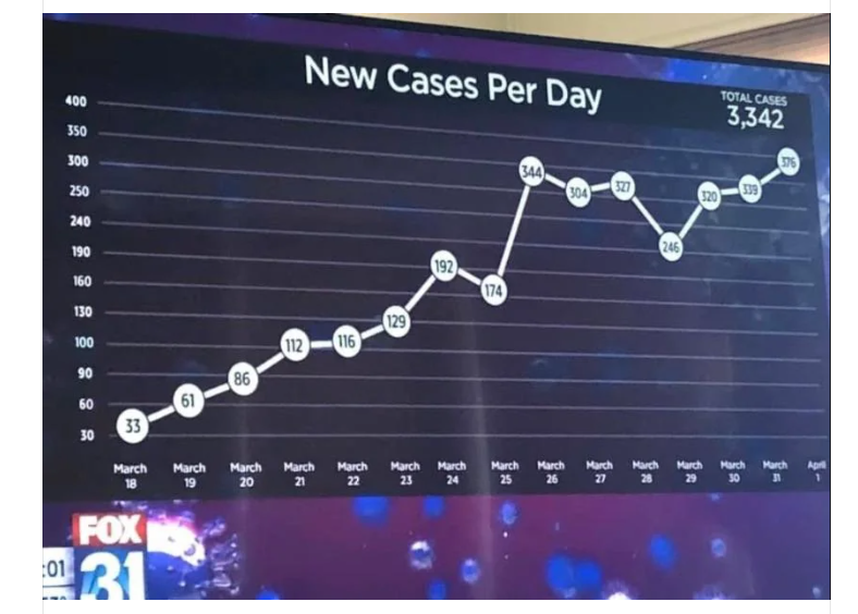
Non-zero baseline barchart
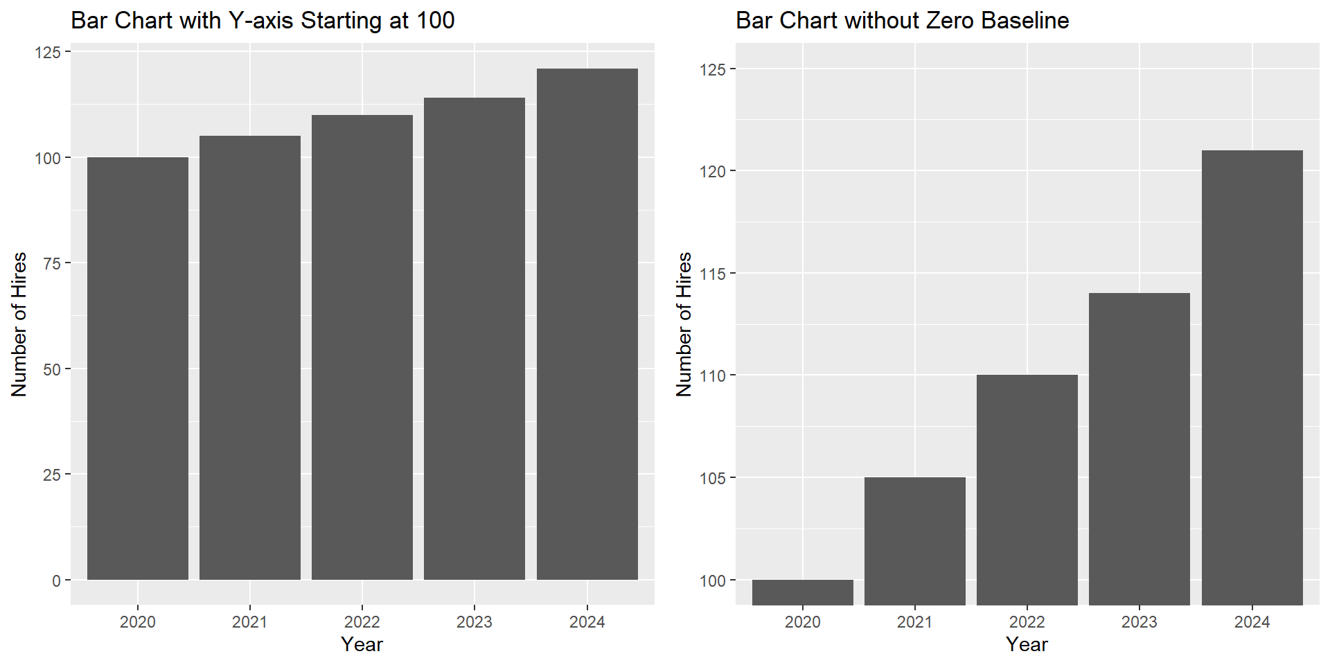
Why is this chart misleading?
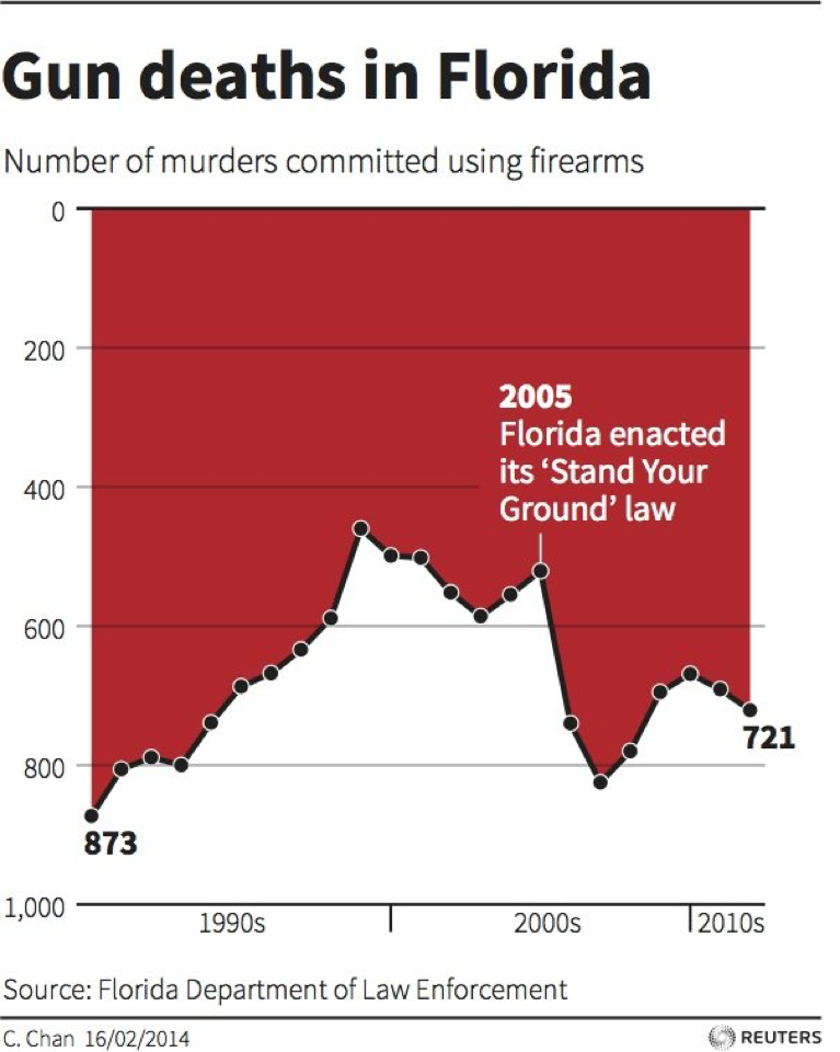
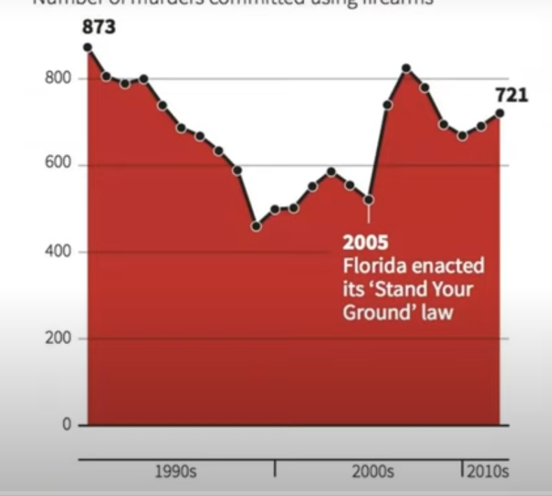
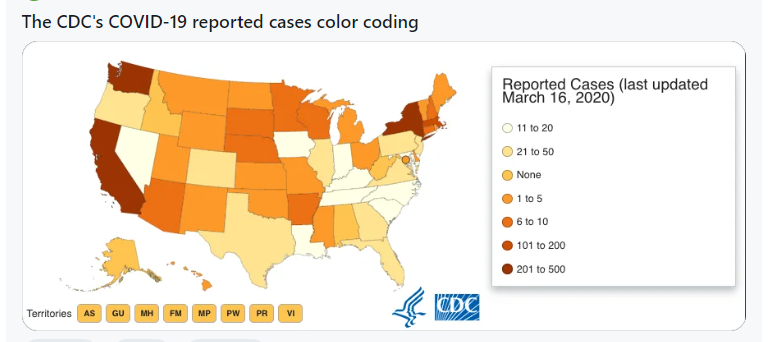
Why is this chart misleading?
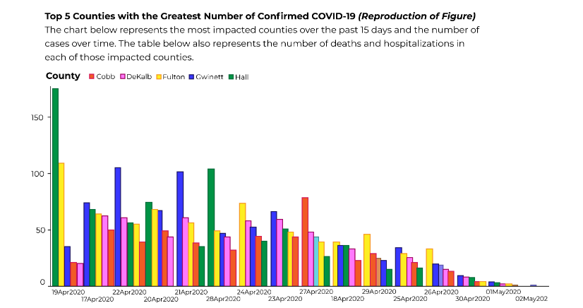
Why is this chart misleading?
Why is this chart misleading?
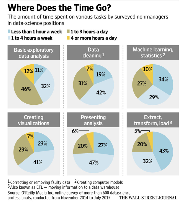
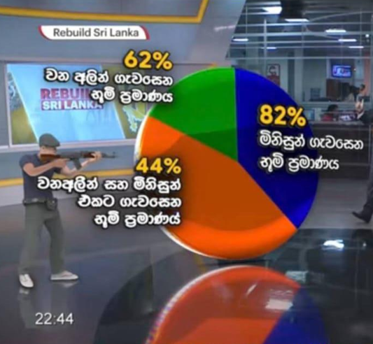
What went wrong with the pie chart? Redraw it correcting the issues.
Improve the visualization