Beyond Basics: Elevate Your Plots

Dr. Thiyanga S. Talagala
Department of Statistics, Faculty of Applied Sciences
University of Sri Jayewardenepura, Sri Lanka

Packages

library(ggplot2)
library(tibble)
# install.packages("devtools")
#devtools::install_github("thiyangt/elephants")
library(elephants)
#devtools::install_github("thiyangt/drone")
library(drone)

Data

elephants
# A tibble: 1,700 × 9
   Category Age_Category Gender Flank_Girth Heart_Girth Neck_Girth Weight Height
   <chr>    <chr>        <chr>        <dbl>       <dbl>      <dbl>  <dbl>  <dbl>
 1 African  less than 1… male          291.        239.       211.  1775.   2.46
 2 African  less than 1… male          270.        331.       119.  1564.   2.28
 3 African  less than 1… male          291.        275.       200.  2070.   2.56
 4 African  less than 1… male          285.        253.       111.  1716.   2.33
 5 African  less than 1… male          184.        389.       180.  2736.   2.38
 6 African  less than 1… male          235.        284.       158.  1773.   2.2 
 7 African  less than 1… male          265.        262.       161.  1651.   2.68
 8 African  less than 1… male          226.        226.       123.  2053.   2.67
 9 African  less than 1… male          266.        290.       191.  2159.   2.63
10 African  less than 1… male          163.        332.       172.  2075.   2.12
# ℹ 1,690 more rows
# ℹ 1 more variable: Fore_Feet_Circumference <dbl>
data("worldbankdata")
worldbankdata
# A tibble: 7,937 × 7
   Country Code  Region                     Year Cooking Electricity Income
   <fct>   <fct> <fct>                     <dbl>   <dbl>       <dbl> <fct> 
 1 Aruba   ABW   Latin America & Caribbean  1990      NA       100   H     
 2 Aruba   ABW   Latin America & Caribbean  2000      NA        91.7 H     
 3 Aruba   ABW   Latin America & Caribbean  2013      NA       100   H     
 4 Aruba   ABW   Latin America & Caribbean  2014      NA       100   H     
 5 Aruba   ABW   Latin America & Caribbean  2015      NA       100   H     
 6 Aruba   ABW   Latin America & Caribbean  2016      NA       100   H     
 7 Aruba   ABW   Latin America & Caribbean  2017      NA       100   H     
 8 Aruba   ABW   Latin America & Caribbean  2018      NA       100   H     
 9 Aruba   ABW   Latin America & Caribbean  2019      NA       100   H     
10 Aruba   ABW   Latin America & Caribbean  2020      NA       100   H     
# ℹ 7,927 more rows

Pairwise plot matrix, scatterplot plot matrix, parallel coordinates plot, survival plot

#install.packages("GGally")
library(GGally)
ggpairs(elephants)

ggpairs(elephants, columns = c(2, 3, 4))

ggpairs(elephants, columns = c(2, 8, 9))

ggpairs(elephants, columns = c(2, 8, 9), mapping=aes(color=Gender))

ggpairs(elephants, columns = c(2, 8, 9), mapping=aes(color=Gender)) + scale_color_brewer(palette = "Dark2") 

ggpairs(elephants, columns = c(2, 8, 9), mapping=aes(color=Gender)) + scale_color_brewer(palette = "Dark2") + scale_fill_brewer(palette = "Dark2")

ggpairs(elephants, columns = c(2, 8, 9), mapping=aes(color=Gender)) + scale_color_brewer(palette = "Dark2") + scale_fill_brewer(palette = "Dark2") + theme_bw()

ggpairs(elephants, columns = c(2, 8, 9), mapping=aes(color=Gender, alpha=0.5)) + scale_color_brewer(palette = "Dark2") + scale_fill_brewer(palette = "Dark2") + theme_bw()

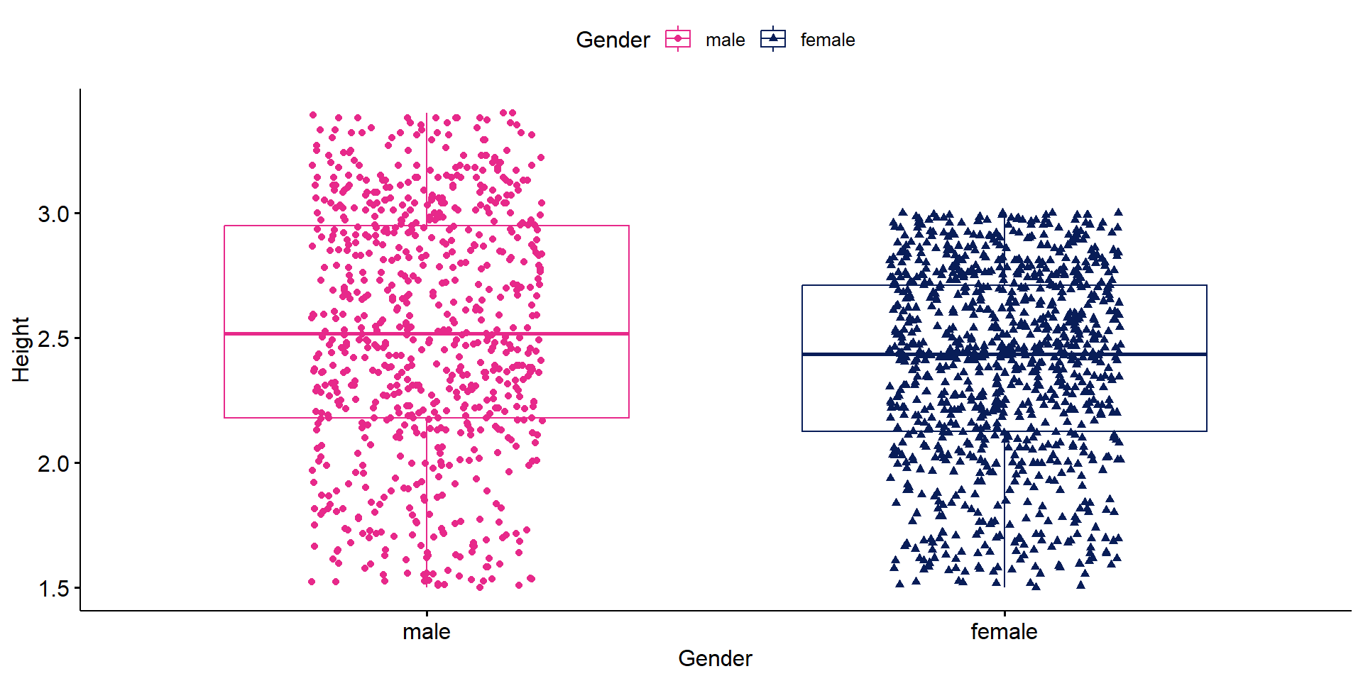
Your turn: Fix aspect ratio of the plots.

Aspect Ratio

df <- data.frame(
    x = runif(100, 0, 5),
    y = runif(100, 0, 5))

ggplot(df, aes(x=x, y=y)) + geom_point() 

ggplot(df, aes(x=x, y=y)) + geom_point() + coord_fixed()

ggplot(data=elephants,
aes(x=Fore_Feet_Circumference,
y=Height)) + geom_point()

ggplot(data=elephants,
aes(x=Fore_Feet_Circumference,
y=Height)) + geom_point() + coord_fixed()

ggplot(data=elephants,
aes(x=Fore_Feet_Circumference,
y=Height)) + geom_point() + coord_equal()

x <- elephants$Fore_Feet_Circumference
y <- elephants$Height
ar <- (max(x)-min(x))/(max(y)-min(y))
ggplot(data=elephants,
aes(x=Fore_Feet_Circumference,
y=Height)) + geom_point() + coord_fixed(ratio=ar)

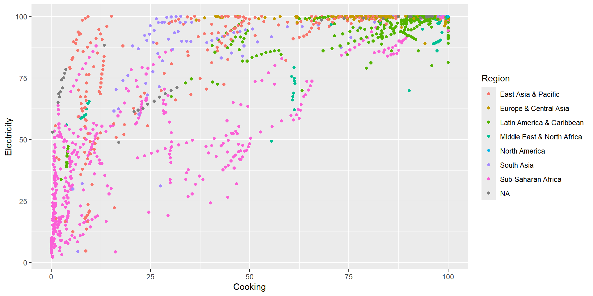
ratio aspect ratio, expressed as \(\frac{y}{x}\)

Beware!

ggpairs(elephants, columns = c(2, 8, 9), mapping=aes(color=Gender, alpha=0.5)) + scale_color_brewer(palette = "Dark2") + scale_fill_brewer(palette = "Dark2") + coord_fixed(ratio=ar)

Beware!

ggpairs(elephants, columns = c(2, 8, 9), mapping=aes(color=Gender, alpha=0.5)) + scale_color_brewer(palette = "Dark2") + scale_fill_brewer(palette = "Dark2") + theme(aspect.ratio = ar)

Combine separate ggplots into the same graphic

p1 <- ggplot(elephants, aes(x=Gender, fill=Gender)) + geom_bar()
p1

p2 <- ggplot(data=elephants,
aes(x=Fore_Feet_Circumference,
y=Height)) + geom_point() + coord_fixed(ratio=ar)
p2

library(patchwork)
p1+p2

Arranging plots into a grid

p1 <- ggplot(elephants, aes(x=Gender, fill=Gender)) + geom_bar()
p1

p2 <- ggplot(data=elephants,
aes(x=Fore_Feet_Circumference,
y=Height)) + geom_point() + coord_fixed(ratio=ar)
p2

library(cowplot)
plot_grid(p1, p2, labels = c('A', 'B'), label_size = 12)

Creating graphics with details from statistical tests

Defaults return

✅ raw data + distributions ✅ descriptive statistics ✅ inferential statistics ✅ effect size + CIs ✅ pairwise comparisons ✅ Bayesian hypothesis-testing ✅ Bayesian estimation

library(ggstatsplot)
ggbetweenstats(
  data  = elephants,
  x     = Gender,
  y     = Height,
  title = "Distribution of height by gender"
)

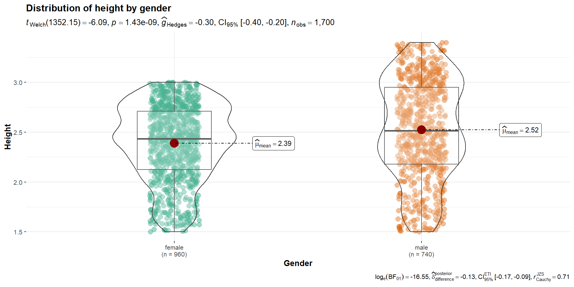
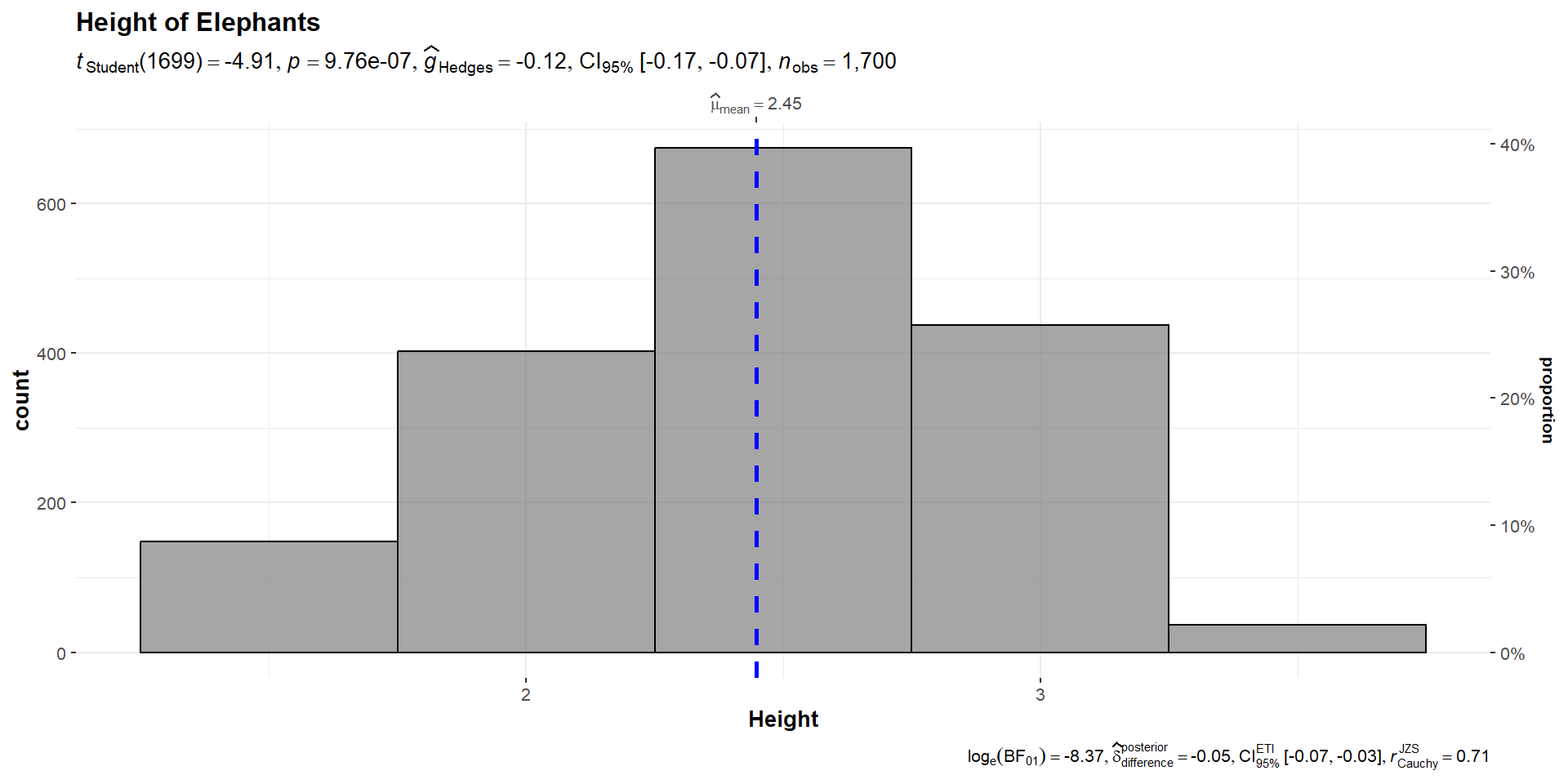
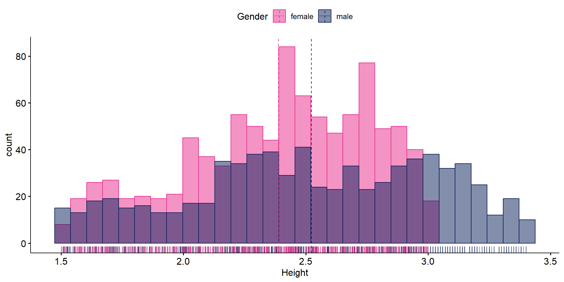
To visualize the distribution of a single variable and check if its mean is significantly different from a specified value with a one-sample test
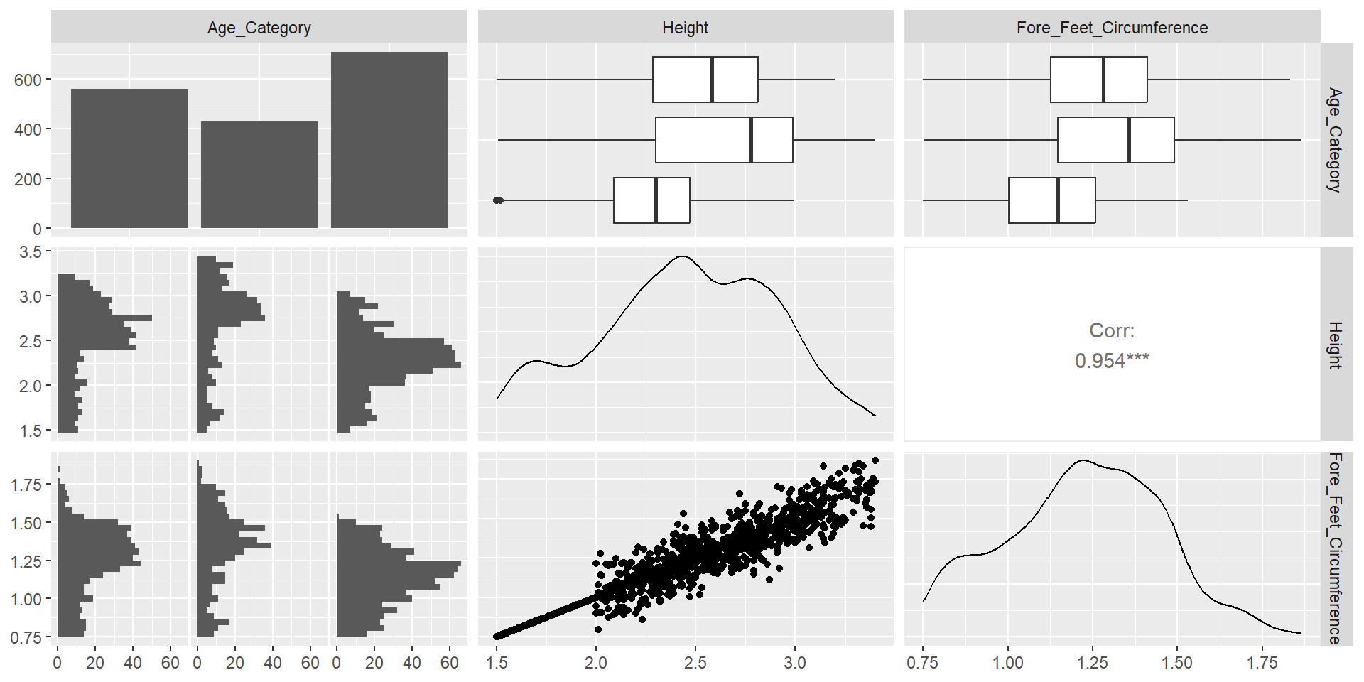
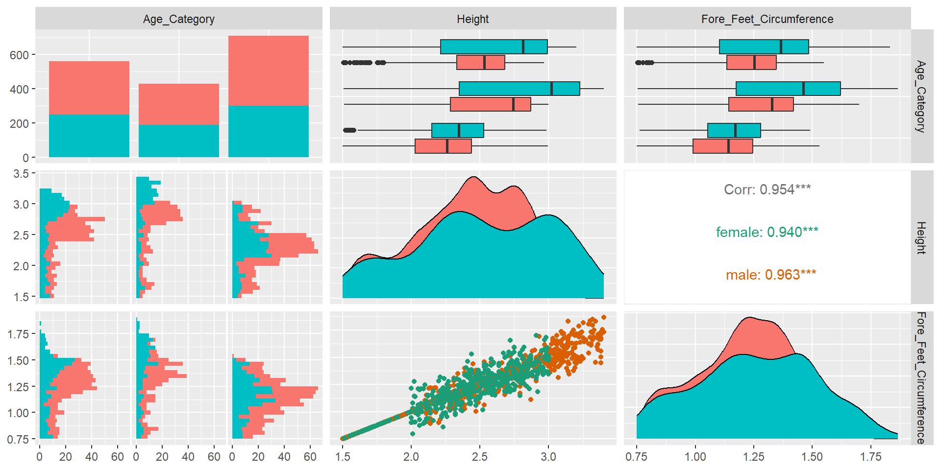
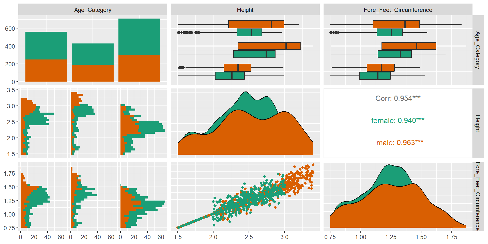
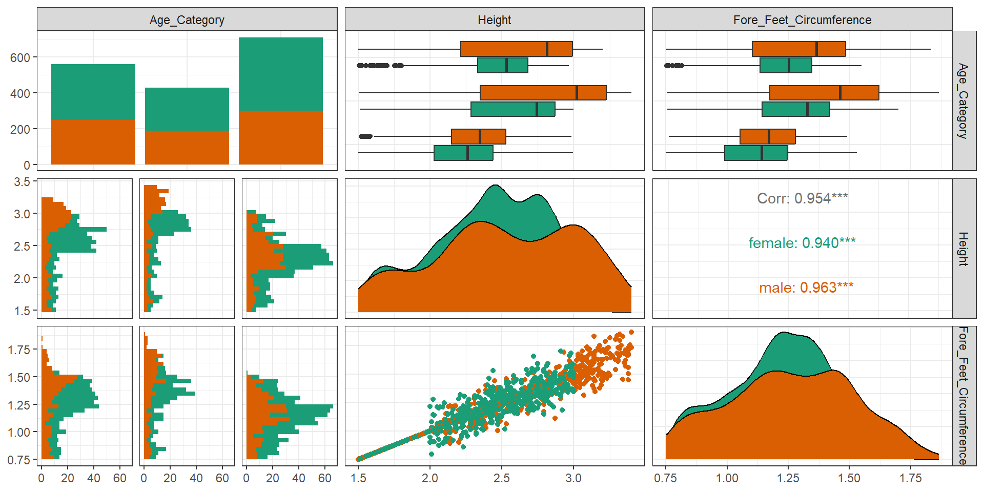
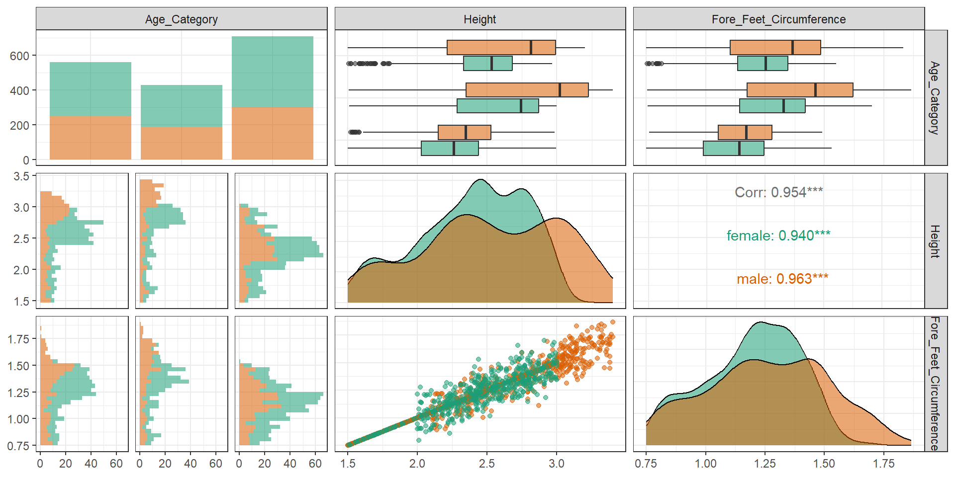
gghistostats(
  data       = elephants,
  x          = Height,
  title      = "Height of Elephants",
  test.value = 2.5,
  binwidth   = 0.5
)

Publication Ready Plots

library("ggpubr")
gghistogram(elephants, x = "Height",
   add = "mean", rug = TRUE,
   color = "Gender", fill = "Gender",
   palette = c( "#e7298a","#081d58"))

ggboxplot(elephants, y = "Height", x="Gender",
   color = "Gender",
   palette = c( "#e7298a","#081d58"),
   add = "jitter", shape = "Gender")

Interactively explore your data by visualizing it with the ggplot2 package

In-class demo

library("esquisse")
esquisse::esquisser(elephants::elephants)

Add graphical information about one of the main panel’s axis.

library(ggside)
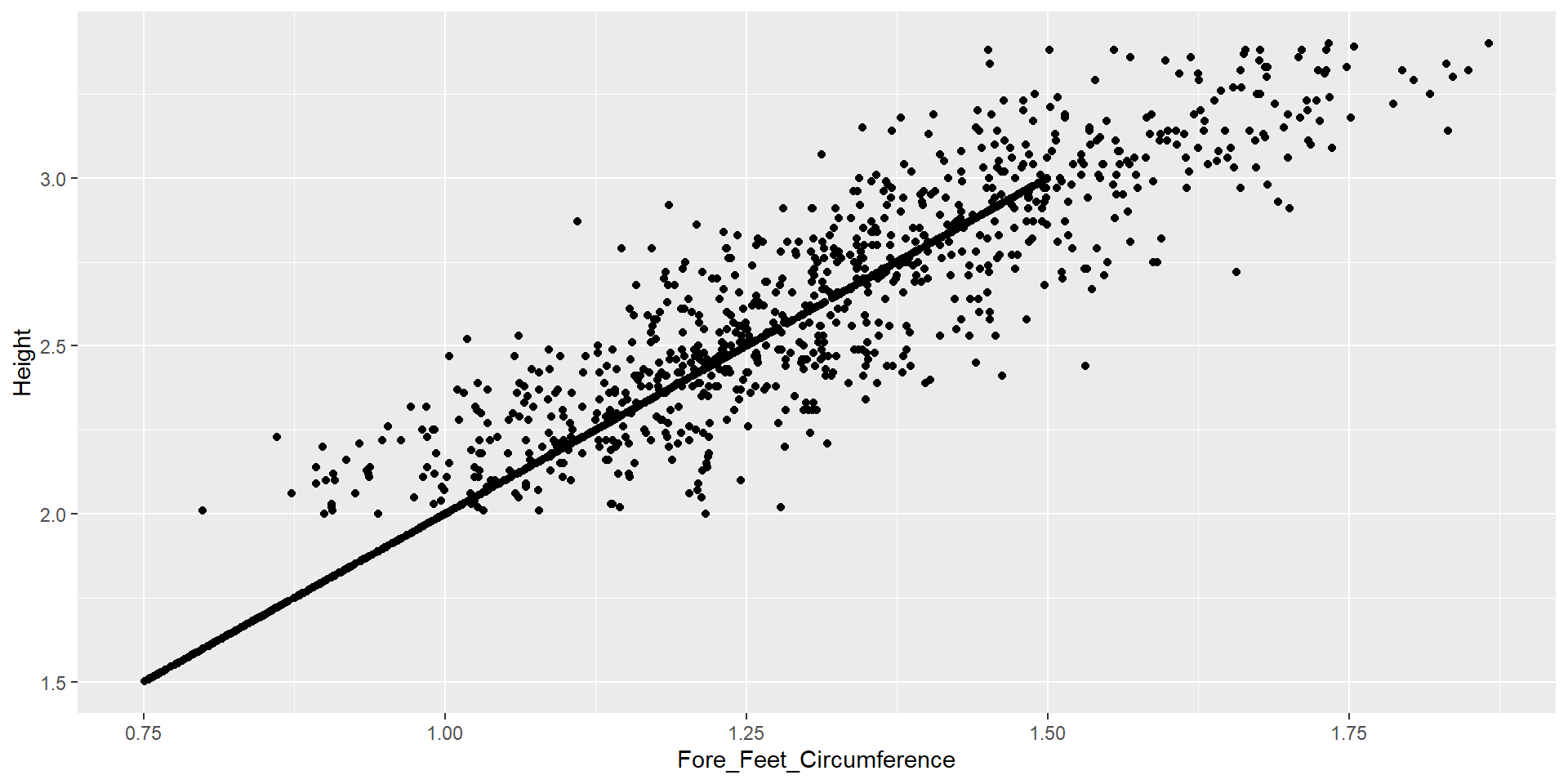
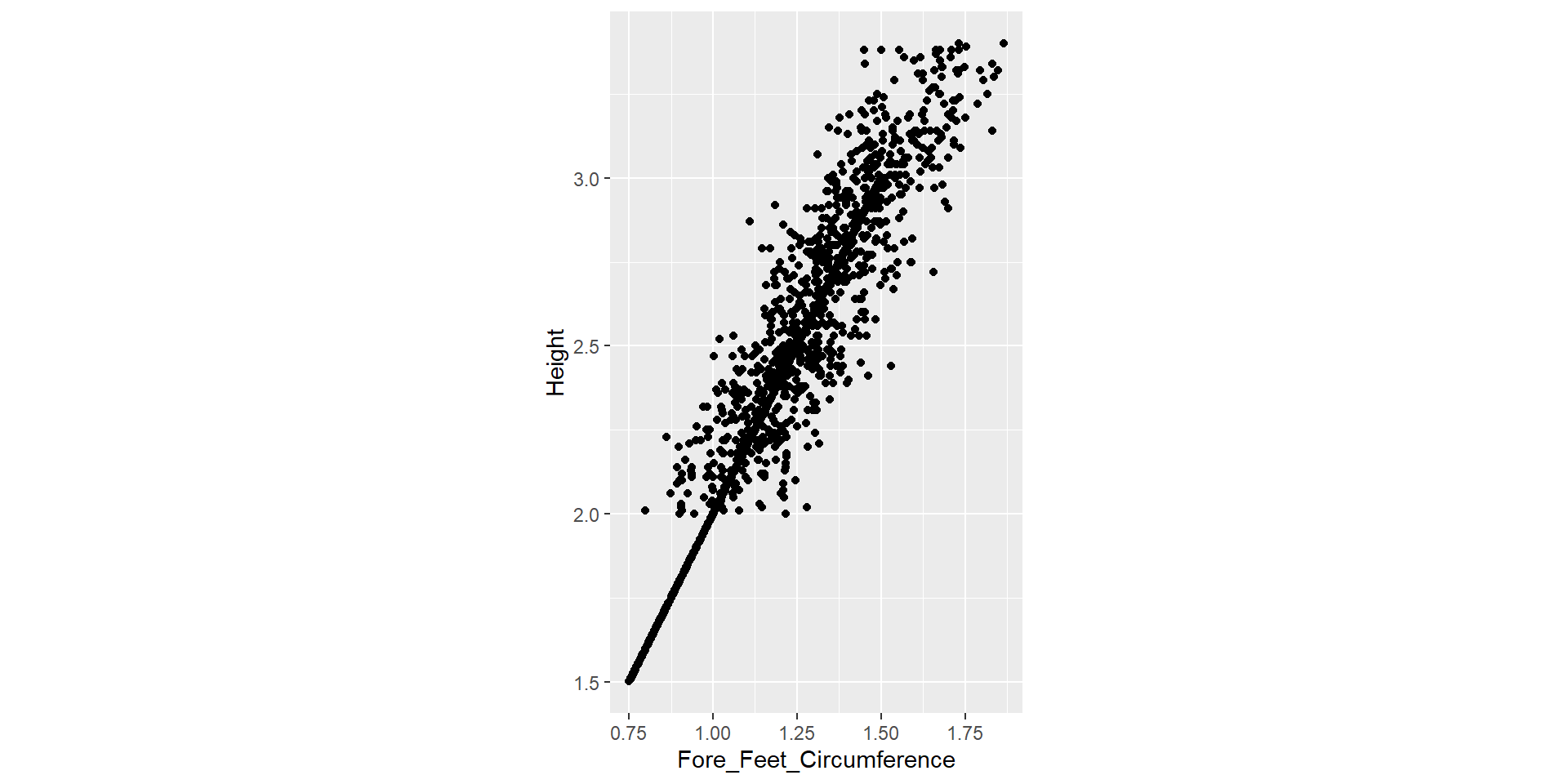
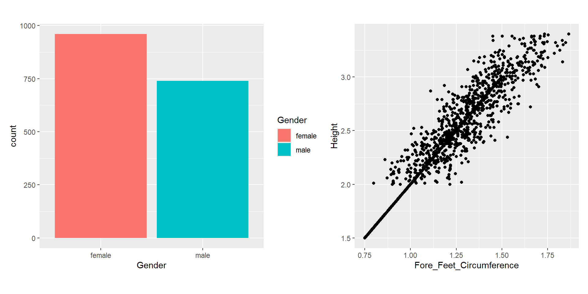
ggplot(elephants, aes(x=Height, y=Fore_Feet_Circumference, colour = Gender)) + 
  geom_point(size = 2) +
  geom_xsideboxplot(aes(y =Gender), orientation = "y") +
  geom_ysidedensity(aes(x = after_stat(density)), position = "stack") +
  scale_ysidex_continuous(guide = guide_axis(angle = 90), minor_breaks = NULL) +
  theme(ggside.panel.scale = .3, aspect.ratio = ar)
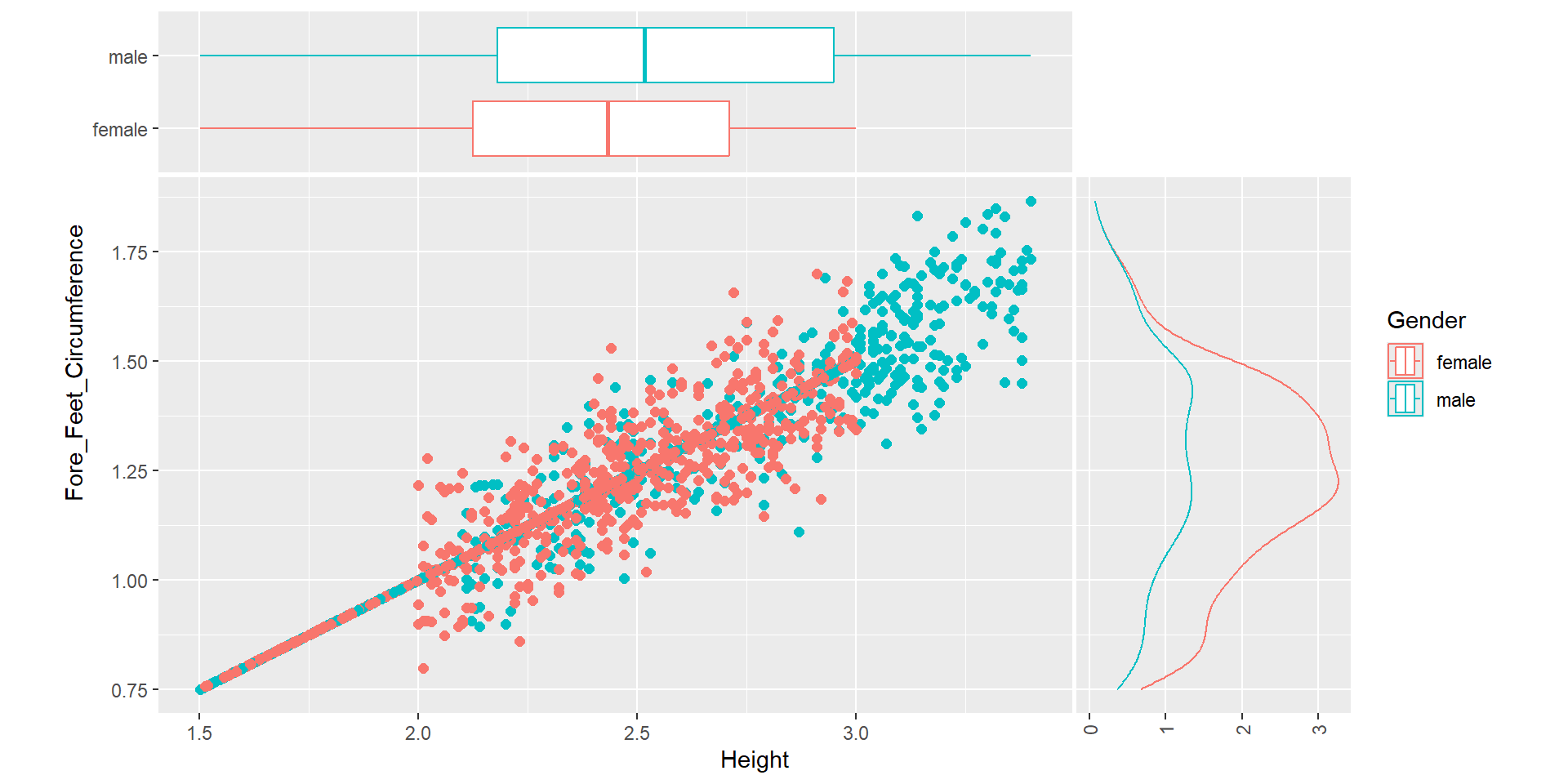
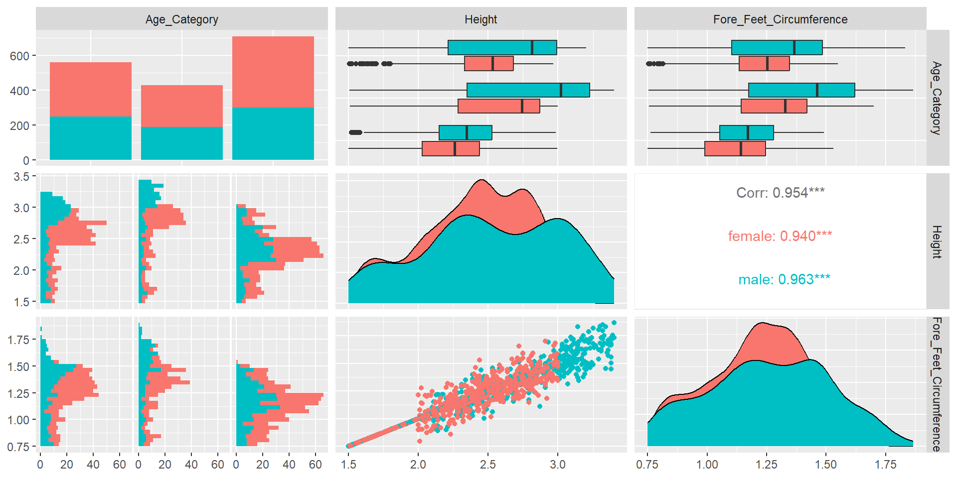
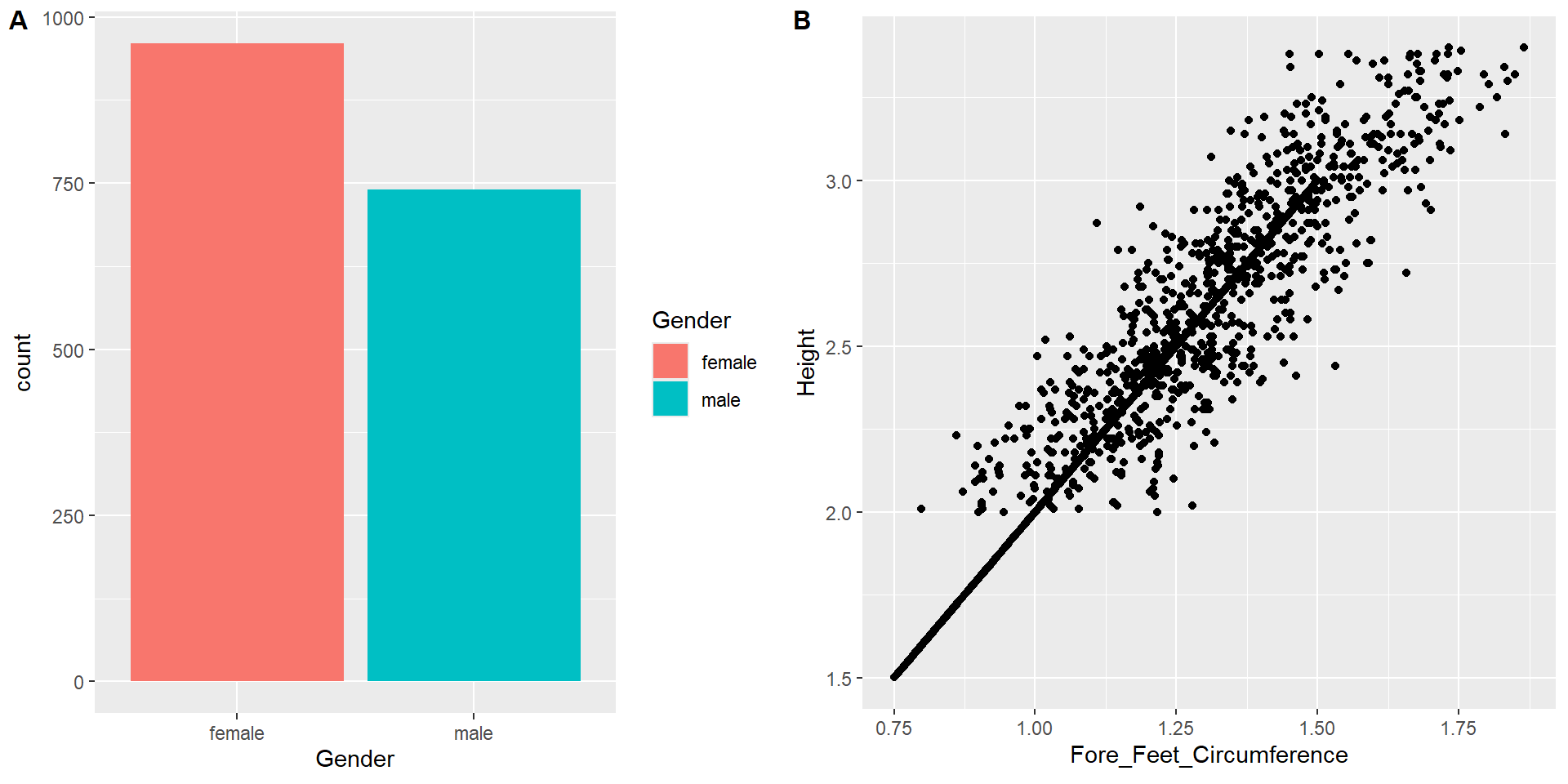
library(ggside)
ggplot(elephants, aes(x=Height, y=Weight, colour = Gender)) + 
  geom_point(size = 2) +
  geom_xsideboxplot(aes(y =Gender), orientation = "y") +
  geom_ysidedensity(aes(x = after_stat(density)), position = "stack") +
  scale_ysidex_continuous(guide = guide_axis(angle = 90), minor_breaks = NULL) +
  theme(ggside.panel.scale = .3)
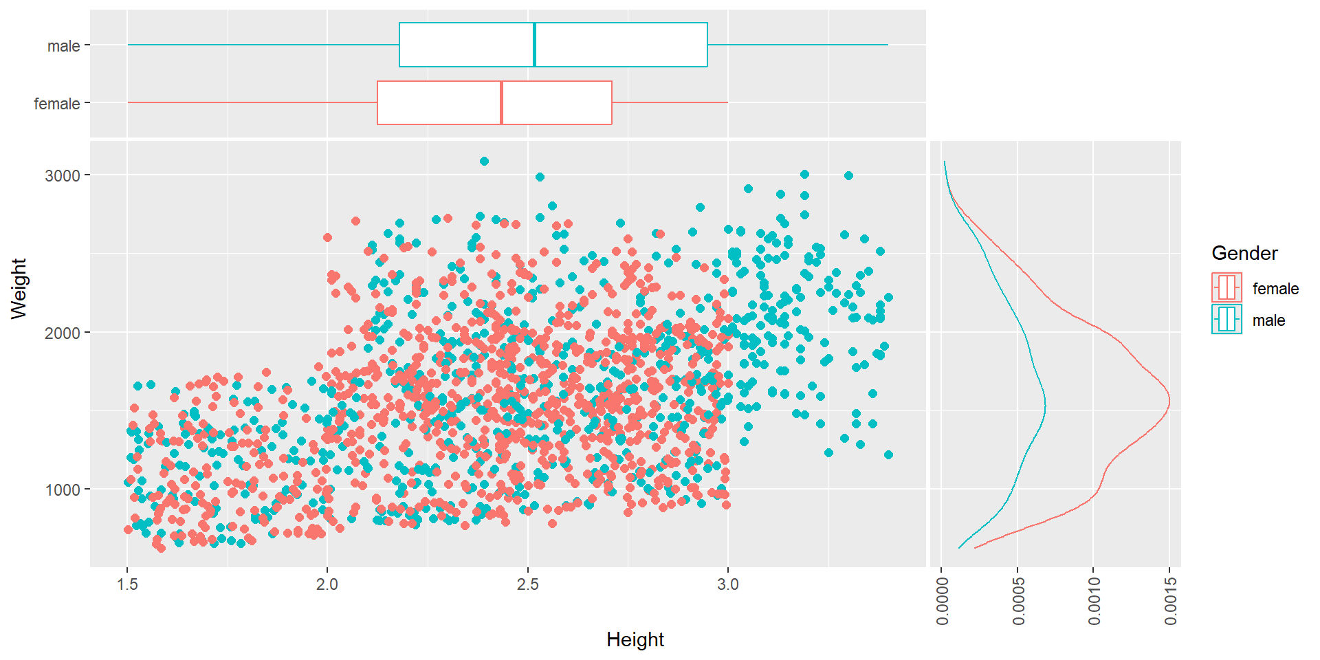
Level up the plots or take an alternative graph.

Task 1

Task 2

library(drone)
ggplot(worldbankdata, aes(x=Cooking, y=Electricity, col=Region)) + geom_point()