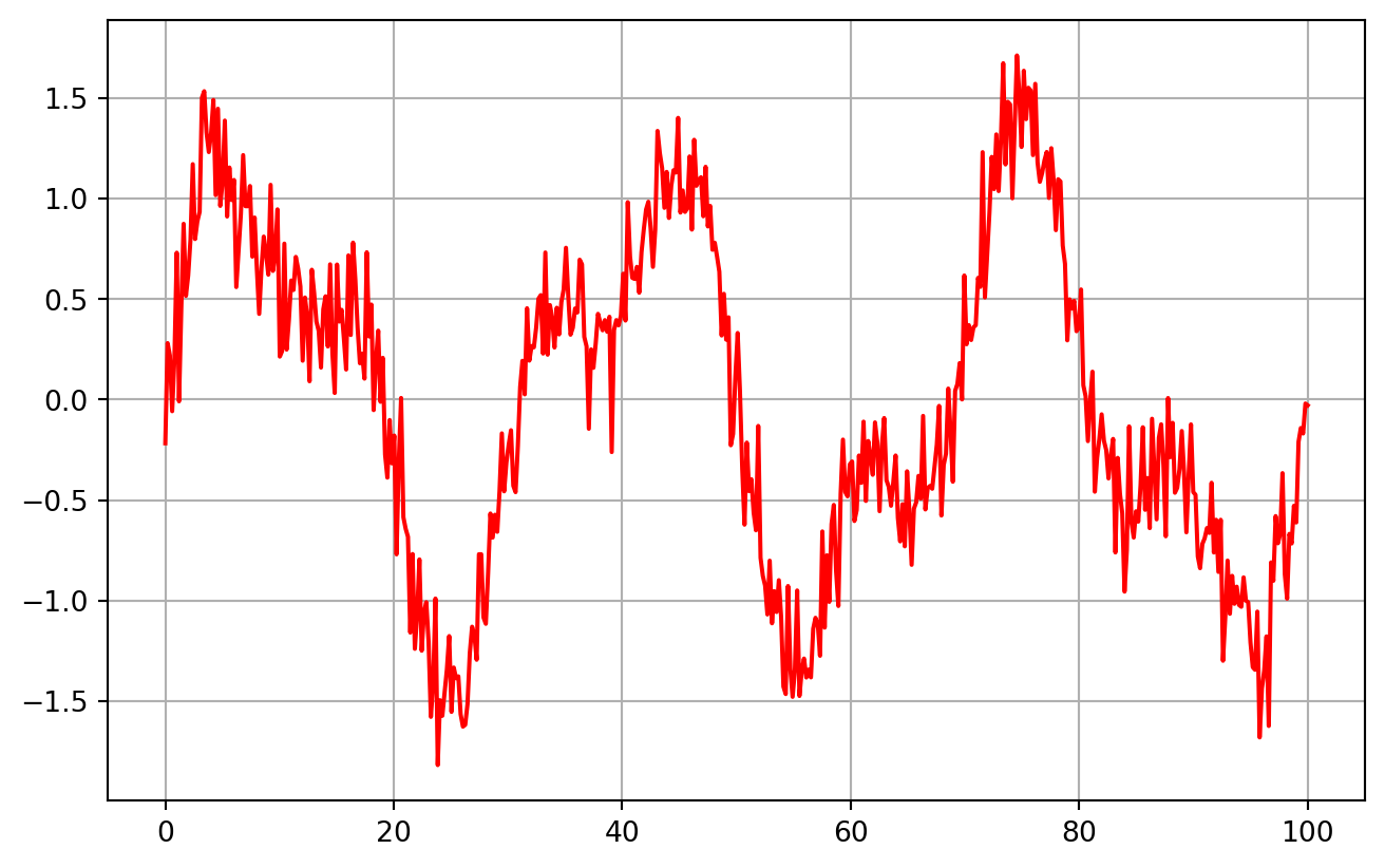
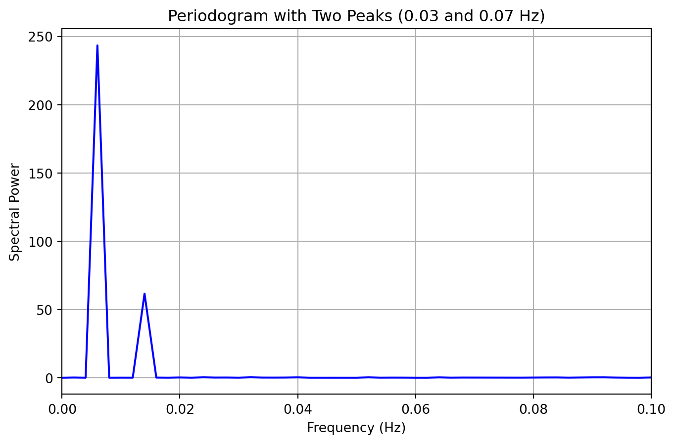
import numpy as npimport matplotlib.pyplot as pltfrom scipy.signal import periodogram# Simulate time seriesnp.random.seed(123)n =500# More points for better frequency resolutiont = np.linspace(0, 100, n) # Longer duration for better frequency resolutionsignal = np.sin(2* np.pi *0.03* t) +0.5* np.sin(2* np.pi *0.07* t) # 0.03 and 0.07 Hz componentsnoise = np.random.normal(0, 0.2, n)time_series = signal + noise# Compute periodogramfrequencies, power = periodogram(time_series)plt.figure(figsize=(8, 5))plt.plot(t, time_series, color='red', lw=1.5)plt.grid()plt.show()# Plot periodogramplt.figure(figsize=(8, 5))plt.plot(frequencies, power, color='blue', lw=1.5)plt.xlim(0, 0.1) # Focus on frequencies between 0 and 0.1plt.title("Periodogram with Two Peaks (0.03 and 0.07 Hz)")plt.xlabel("Frequency (Hz)")plt.ylabel("Spectral Power")plt.grid()plt.show()