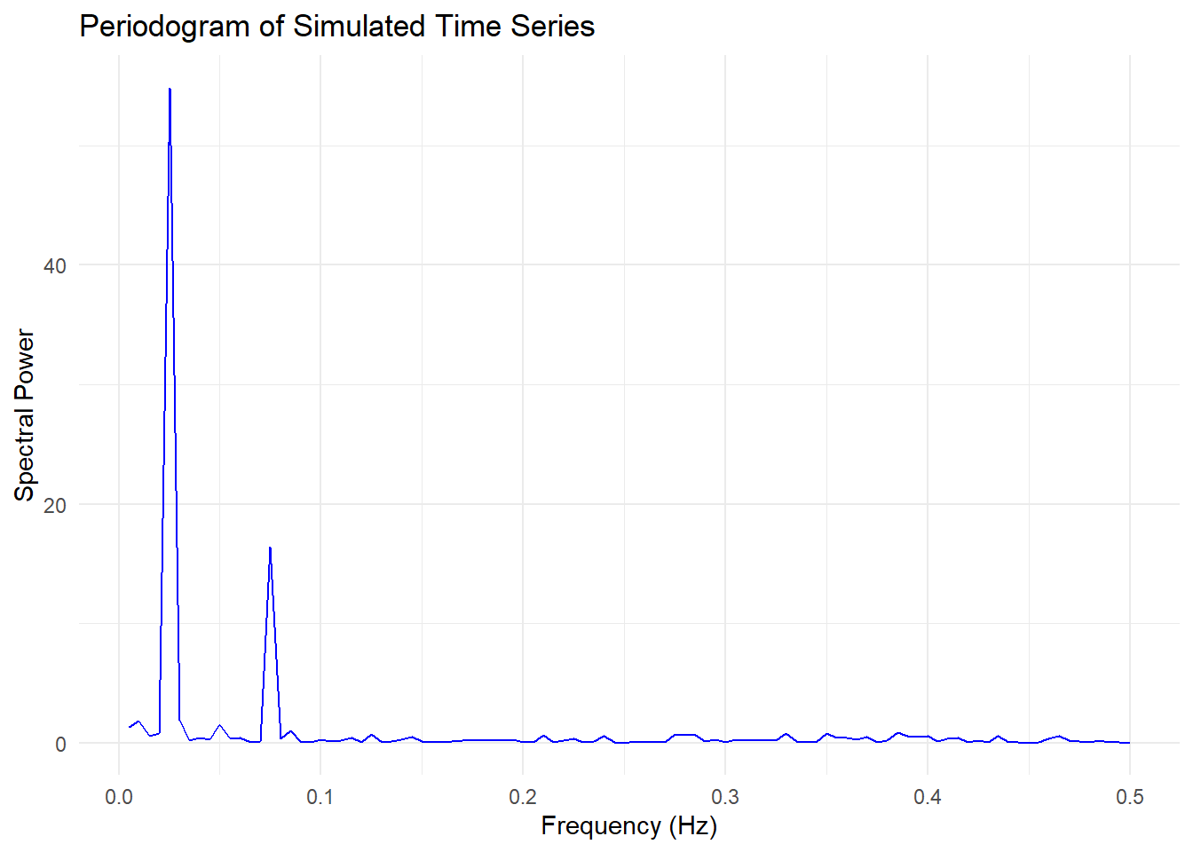
A periodogram is a fundamental tool in time series analysis used to identify dominant frequencies (cycles) in the data. It estimates the spectral density of a time series, helping to detect periodic patterns.
A time series may contain cycles at different frequencies.
The periodogram helps identify which frequencies contribute most to the variance.
Peaks in the periodogram indicate dominant periodic components.
##Simulated Example
We’ll generate a simulated time series with multiple frequency components and compute its periodogram.
Steps:
Simulate a time series with known sinusoidal components.
Compute the periodogram using the Fast Fourier Transform (FFT).
Visualize the results.
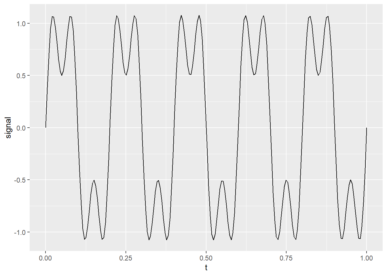
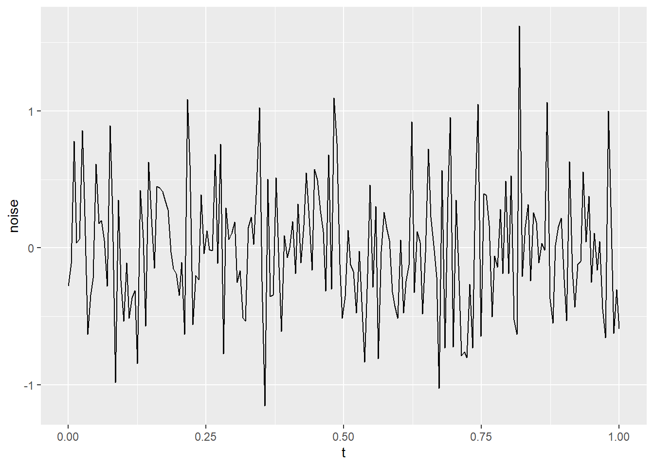
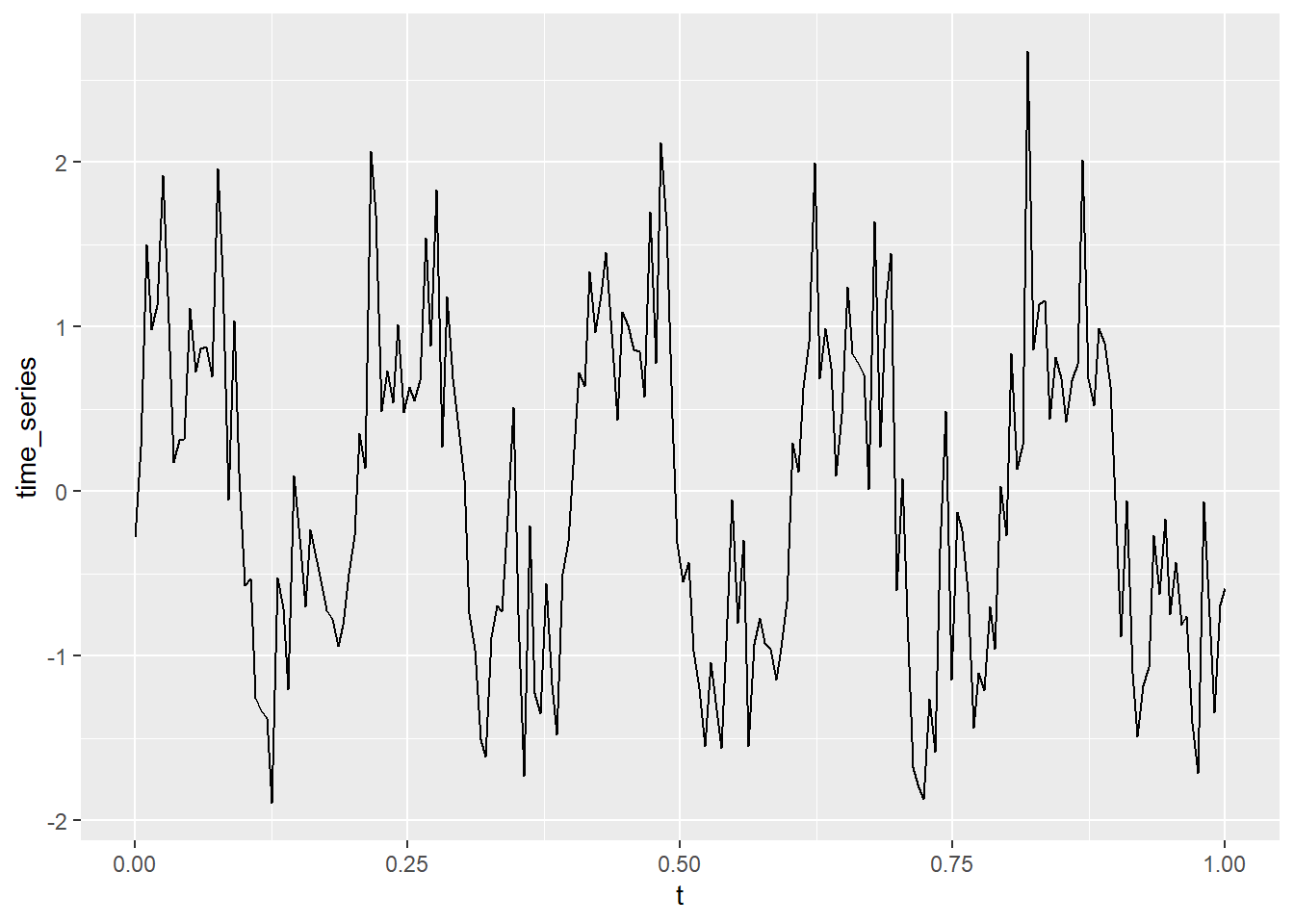
set.seed(123)library(ggplot2)# Simulate time series with two sine waves + noisen <-200t <-seq(0, 1, length.out = n)signal <-sin(2* pi *5* t) +0.5*sin(2* pi *15* t) # 5Hz and 15Hz componentsnoise <-rnorm(n, mean =0, sd =0.5)time_series <- signal + noisedft <-data.frame(t, signal, noise, time_series)ggplot(dft, aes(x = t, y = signal)) +geom_line()
ggplot(dft, aes(x = t, y = noise)) +geom_line()
ggplot(dft, aes(x = t, y = time_series)) +geom_line()
# Compute periodogramspectrum_data <-spectrum(time_series, log ="no", plot =FALSE)# Convert frequency and power into a dataframedf <-data.frame(Frequency = spectrum_data$freq, Power = spectrum_data$spec)# Plot the periodogramggplot(df, aes(x = Frequency, y = Power)) +geom_line(color ="blue") +theme_minimal() +labs(title ="Periodogram of Simulated Time Series",x ="Frequency (Hz)",y ="Spectral Power")
Why Do Peaks Appear in [0, 0.1]?
The frequencies in your signal are 5 Hz and 15 Hz.
However, the frequency axis in the periodogram ranges from 0 to 0.5 (Nyquist frequency) when using normalized units.
If you are using spectrum() in R or periodogram() in Python, the frequencies are often expressed as proportions of the Nyquist frequency.
Nyquist Frequency = (Sampling Rate) / 2
If the sampling rate is 100 Hz, then:
5 Hz appears at 5/100 = 0.05
15 Hz appears at 15/100 = 0.15
So, you are seeing the 5 Hz peak in the range [0, 0.1].