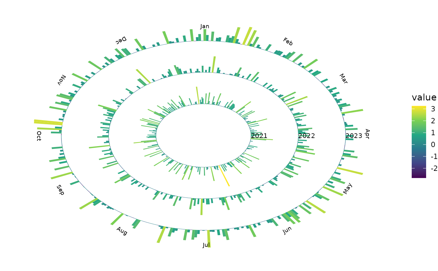
Create a spiral bar plot for time-series data.
Usage
geom_tsspiralbar(
  mapping = NULL,
  data = NULL,
  stat = StatTSSpiralBar,
  position = "identity",
  na.rm = FALSE,
  ring_spacing = 1,
  ...
)
Arguments
- mapping
Set of aesthetic mappings created by
ggplot2::aes().- data
A data frame, tibble, or tsibble.
- stat
Statistical transformation used by the layer.
- position
Position adjustment.
- na.rm
Logical. Should missing values be removed silently?
- ring_spacing
Numeric value controlling the distance between yearly rings.
- ...
Other arguments passed to
ggplot2::layer().
Details
Each year is represented by a radial ring. The angular position represents time within the year, while the radial height of each bar represents the magnitude of the time-series value.
January 1 starts at 12 o'clock and the spiral proceeds clockwise.
Examples
library(ggplot2)

set.seed(123)

dat <- data.frame(
  date = seq.Date(
    as.Date("2021-01-01"),
    as.Date("2023-12-31"),
    by = "day"
  ),
  value = rnorm(1095)
)

ggplot(
  dat,
  aes(
    x = date,
    y = value,
    fill = value
  )
) +
  geom_tsspiralbar(
    ring_spacing = 2
  ) +
  scale_fill_viridis_c() +
  theme_void()