Grammar of graphics
The Grammar of Graphics is a structured way of thinking about and building data visualizations
Key Components of the Grammar of Graphics
Data: the dataset you want to visualize.
Aesthetics (aes): how variables are mapped to visual properties (x, y, color, size, shape).
Geometries (geoms): the type of plot you draw (points, lines, bars, boxplots).
Scales: control how data values map to aesthetics (e.g., continuous vs. categorical colors, log scales).
Coordinate system: the space in which the data is drawn (Cartesian, polar, map projections).
Facets: splitting data into subplots for comparison.
Statistical transformations (stats): summaries or transformations (e.g., binning in histograms, smoothing in regression lines).
Themes: non-data elements like fonts, backgrounds, grid lines.
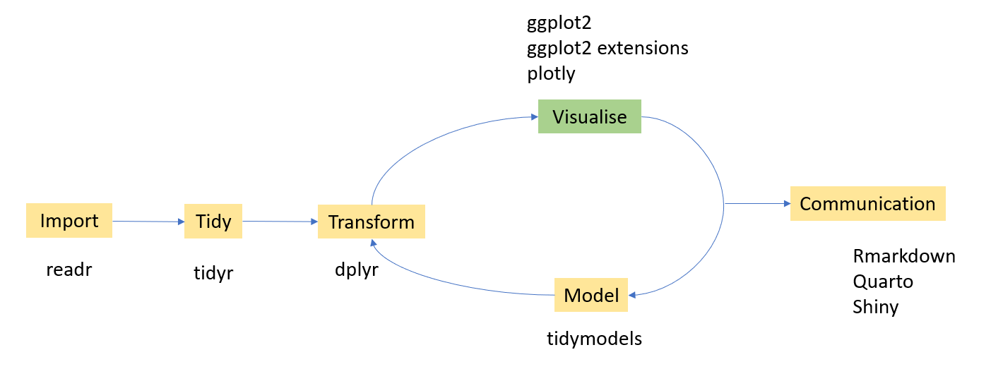
Ingredients for plotting
Data
data ("mtcars" )head (mtcars)
                   mpg cyl disp  hp drat    wt  qsec vs am gear carb
Mazda RX4         21.0   6  160 110 3.90 2.620 16.46  0  1    4    4
Mazda RX4 Wag     21.0   6  160 110 3.90 2.875 17.02  0  1    4    4
Datsun 710        22.8   4  108  93 3.85 2.320 18.61  1  1    4    1
Hornet 4 Drive    21.4   6  258 110 3.08 3.215 19.44  1  0    3    1
Hornet Sportabout 18.7   8  360 175 3.15 3.440 17.02  0  0    3    2
Valiant           18.1   6  225 105 2.76 3.460 20.22  1  0    3    1
Canvas to draw the plot
library (tidyverse)ggplot ()
Data + Aesthetics (aes)
ggplot (mtcars,aes (x= wt, y= mpg))
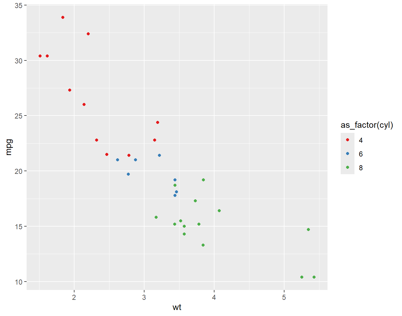
ggplot (mtcars,aes (x= wt, y= mpg,col= as_factor (cyl)))
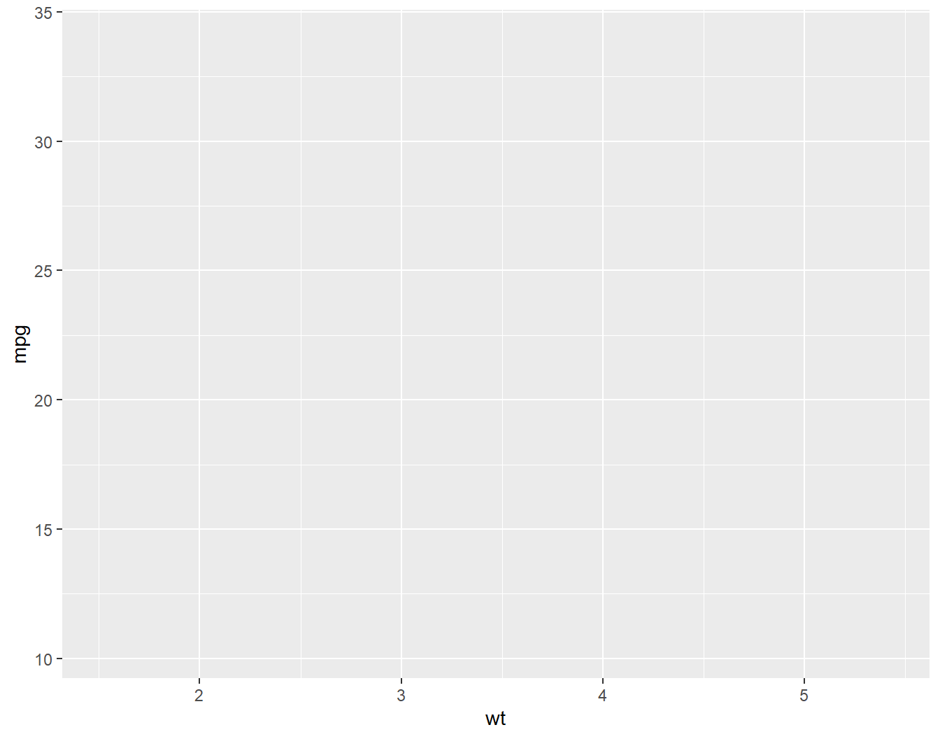
Data + Aesthetics (aes) + Geometries (geoms)
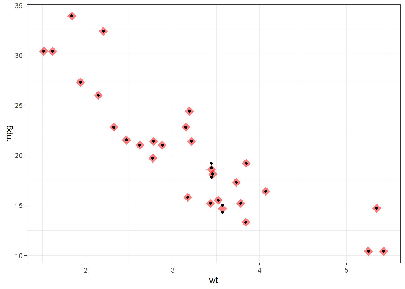
ggplot (mtcars,aes (x= wt, y= mpg)) + geom_point ()
ggplot (mtcars,aes (x= wt, y= mpg)) + geom_point ()
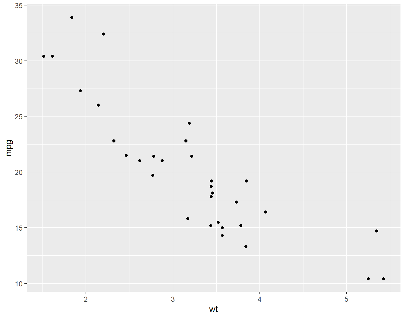
ggplot (mtcars,aes (x= wt, y= mpg)) + geom_smooth ()
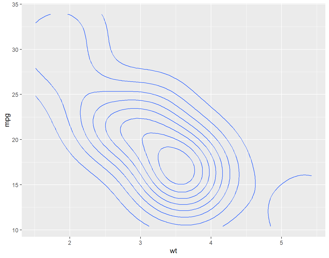
ggplot (mtcars,aes (x= wt, y= mpg)) + geom_density_2d ()
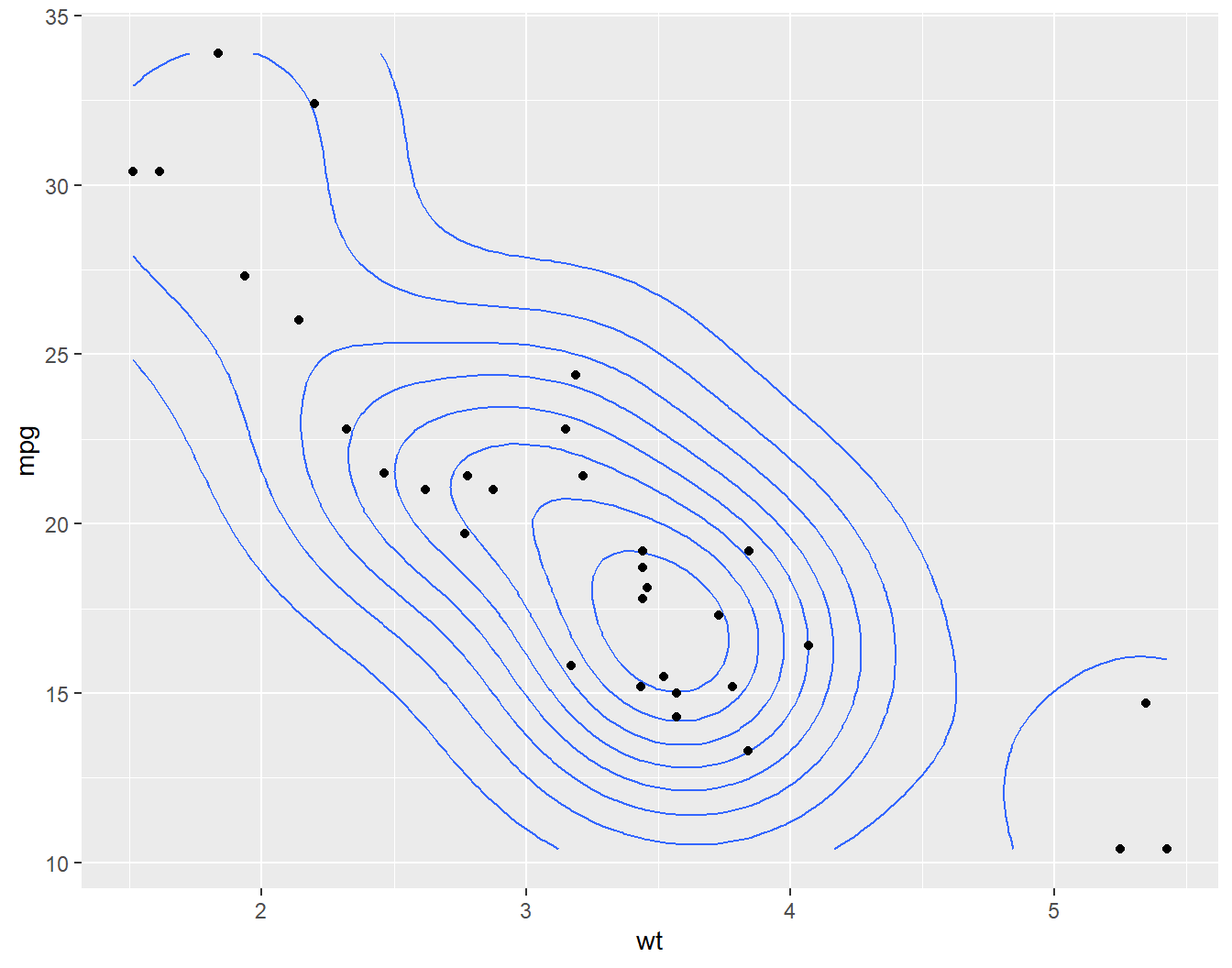
ggplot (mtcars,aes (x= wt, y= mpg)) + geom_density_2d () + geom_point ()
Add scale layer
ggplot (mtcars, aes (x = wt, y = mpg, col = as_factor (cyl))) + geom_point () + scale_color_brewer (palette = "Set1" )
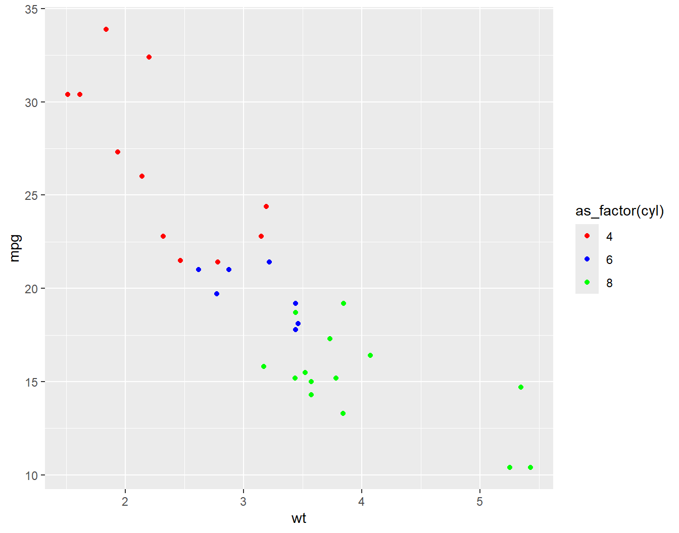
ggplot (mtcars, aes (x = wt, y = mpg, col = as_factor (cyl))) + geom_point () + scale_color_manual (values = c ("red" , "blue" , "green" ))
Add coord layer
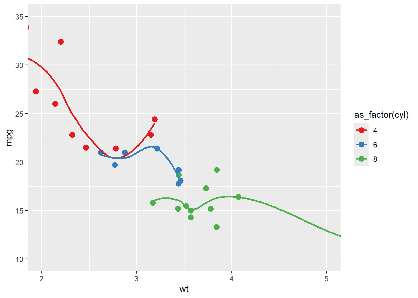
ggplot (mtcars, aes (x = wt, y = mpg, col = as_factor (cyl))) + geom_point (size = 3 ) + geom_smooth (se = FALSE ) + scale_color_brewer (palette = "Set1" ) + coord_cartesian (xlim = c (2 , 5 ), ylim = c (10 , 35 ))
`geom_smooth()` using method = 'loess' and formula = 'y ~ x'
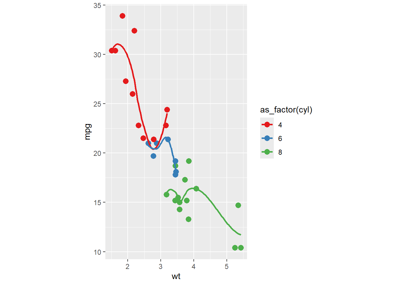
ggplot (mtcars, aes (x = wt, y = mpg, col = as_factor (cyl))) + geom_point (size = 3 ) + geom_smooth (se = FALSE ) + scale_color_brewer (palette = "Set1" ) + coord_fixed (ratio = 3 / 10 )
`geom_smooth()` using method = 'loess' and formula = 'y ~ x'
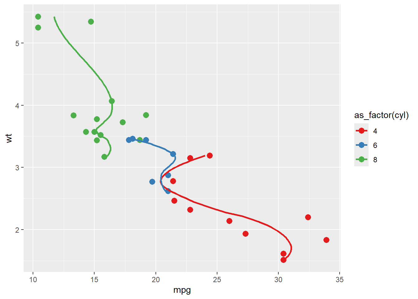
ggplot (mtcars, aes (x = wt, y = mpg, col = as_factor (cyl))) + geom_point (size = 3 ) + geom_smooth (se = FALSE ) + scale_color_brewer (palette = "Set1" ) + coord_flip ()
`geom_smooth()` using method = 'loess' and formula = 'y ~ x'
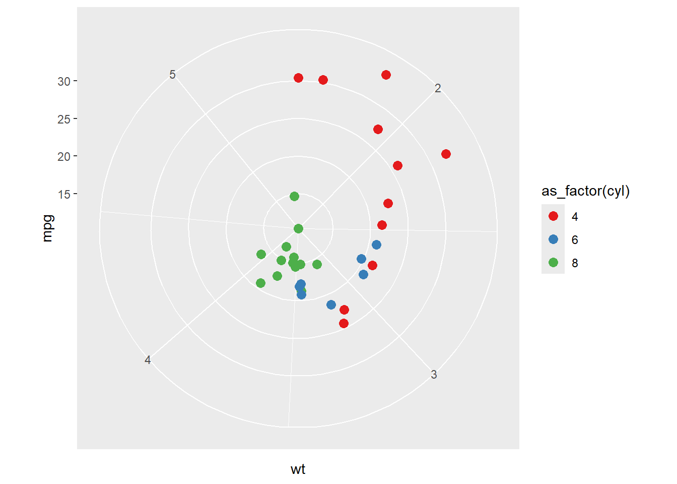
ggplot (mtcars, aes (x = wt, y = mpg, col = as_factor (cyl))) + geom_point (size = 3 ) + scale_color_brewer (palette = "Set1" ) + coord_polar ()
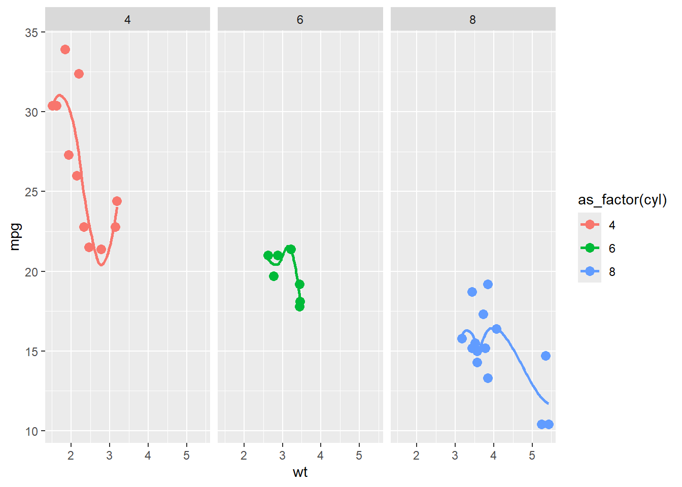
Add facet layer
ggplot (mtcars, aes (x = wt, y = mpg, col = as_factor (cyl))) + geom_point (size = 3 ) + geom_smooth (se = FALSE ) + facet_wrap (~ cyl)
`geom_smooth()` using method = 'loess' and formula = 'y ~ x'
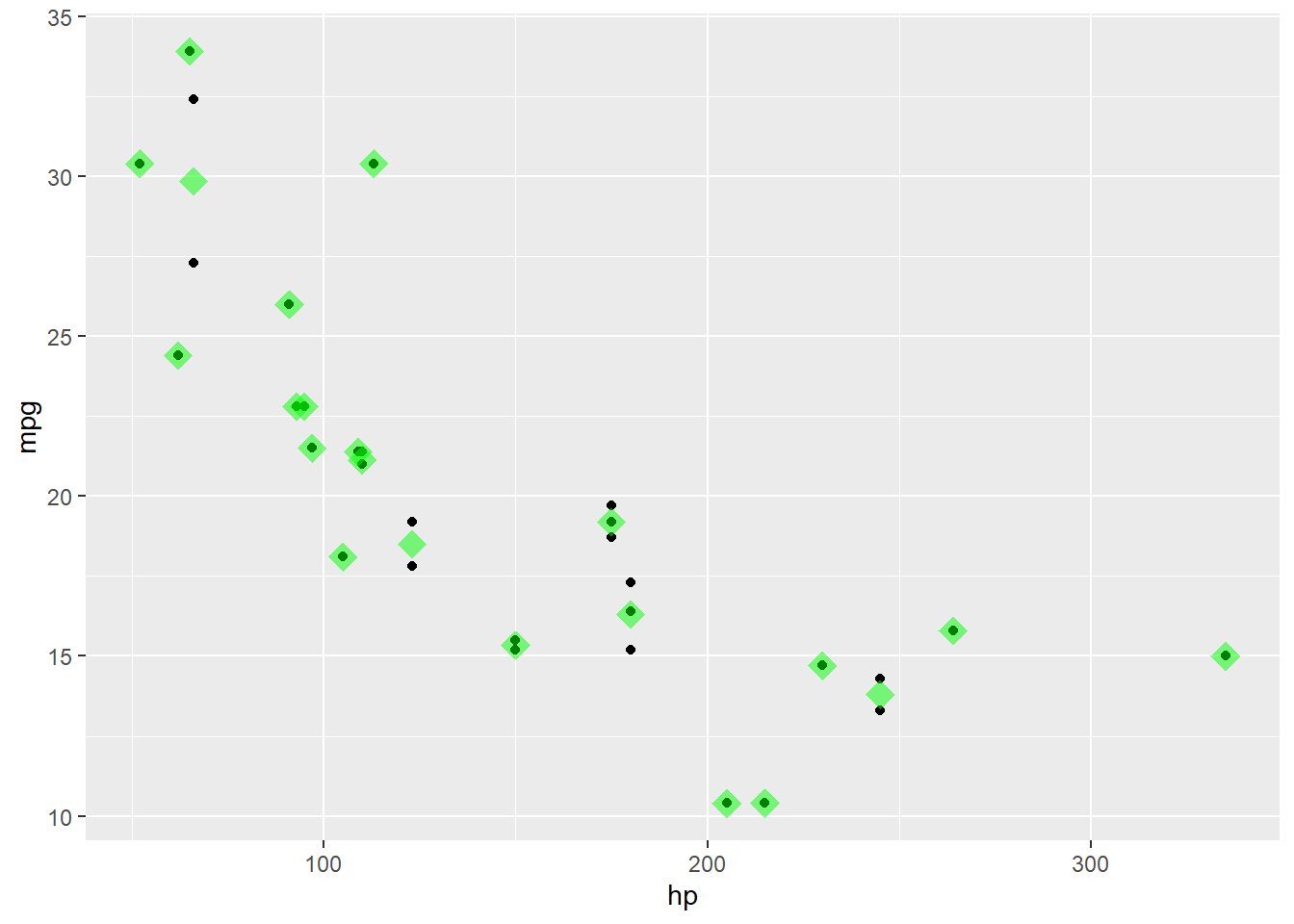
Add stat layer
ggplot (mtcars, aes (x = wt, y = mpg)) + geom_point () + stat_summary (fun = "mean" , geom = "point" , size = 5 , shape = 18 , col= "red" , alpha= 0.5 ) + scale_color_brewer (palette = "Set1" )
ggplot (mtcars, aes (x = wt, y = mpg)) + stat_summary (fun = "mean" , geom = "point" , size = 5 , shape = 18 , col= "red" , alpha= 0.5 ) + geom_point () + scale_color_brewer (palette = "Set1" )
ggplot (mtcars, aes (x = hp, y = mpg)) + geom_point () + stat_summary (fun = "mean" , geom = "point" , size = 5 , shape = 18 , col= "green" , alpha= 0.5 ) + scale_color_brewer (palette = "Set1" )
theme layer
ggplot (mtcars, aes (x = wt, y = mpg)) + stat_summary (fun = "mean" , geom = "point" , size = 5 , shape = 18 , col= "red" , alpha= 0.5 ) + geom_point () + scale_color_brewer (palette = "Set1" ) + theme_bw ()
ggplot (mtcars, aes (x = wt, y = mpg)) + stat_summary (fun = "mean" , geom = "point" , size = 5 , shape = 18 , col= "red" , alpha= 0.5 ) + geom_point () + scale_color_brewer (palette = "Set1" ) + theme_dark ()
Some examples with gapminder dataset
library (gapminder)data (gapminder)
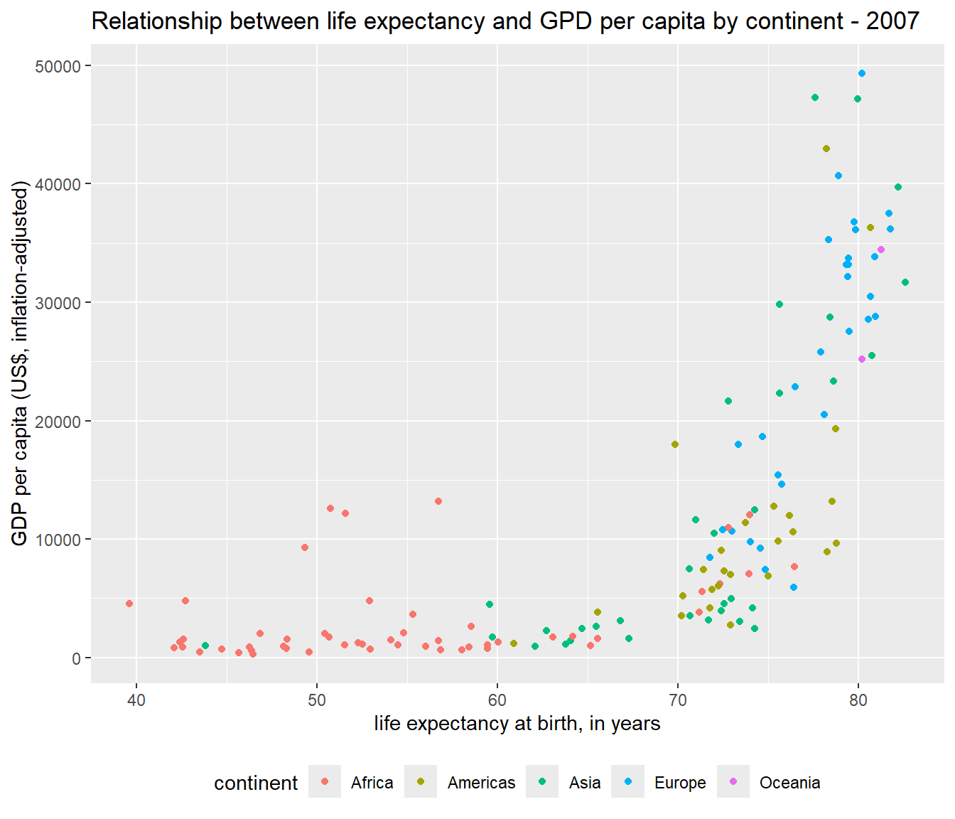
Visualize the relationship between life expectancy, GDP per capita and continent in 2007.
<- gapminder %>% filter (year== 2007 )ggplot (gapminder2007,aes (x= lifeExp, y= gdpPercap,col= continent))+ geom_point ()+ theme (legend.position = "bottom" ) + labs (title= "Relationship between life expectancy and GPD per capita by continent - 2007" ,x = "life expectancy at birth, in years" ,y = "GDP per capita (US$, inflation-adjusted)" )
]
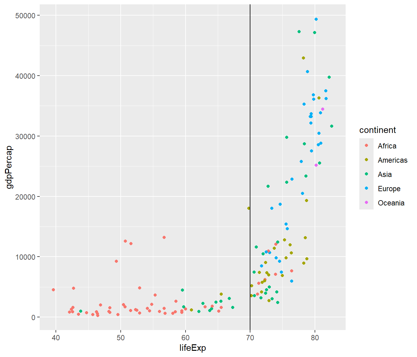
Add a vertical line
<- gapminder %>% filter (year == 2007 )ggplot (gapminder2007,aes (x = lifeExp, y = gdpPercap, col= continent)) + geom_point () + geom_vline (xintercept = 70 )
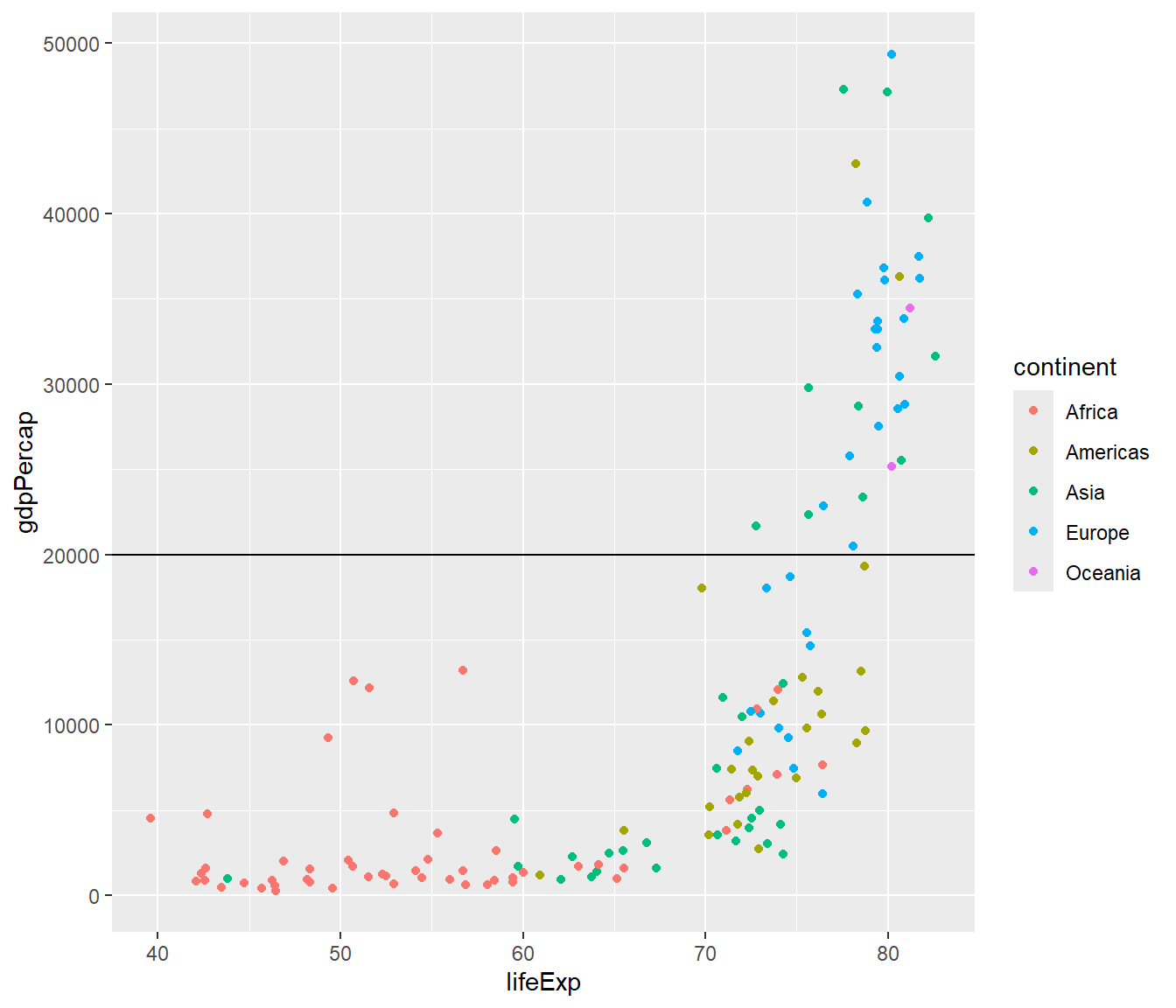
Add a horizontal line
<- gapminder %>% filter (year == 2007 )ggplot (gapminder2007,aes (x = lifeExp, y = gdpPercap, col= continent)) + geom_point () + geom_hline (yintercept = 20000 )
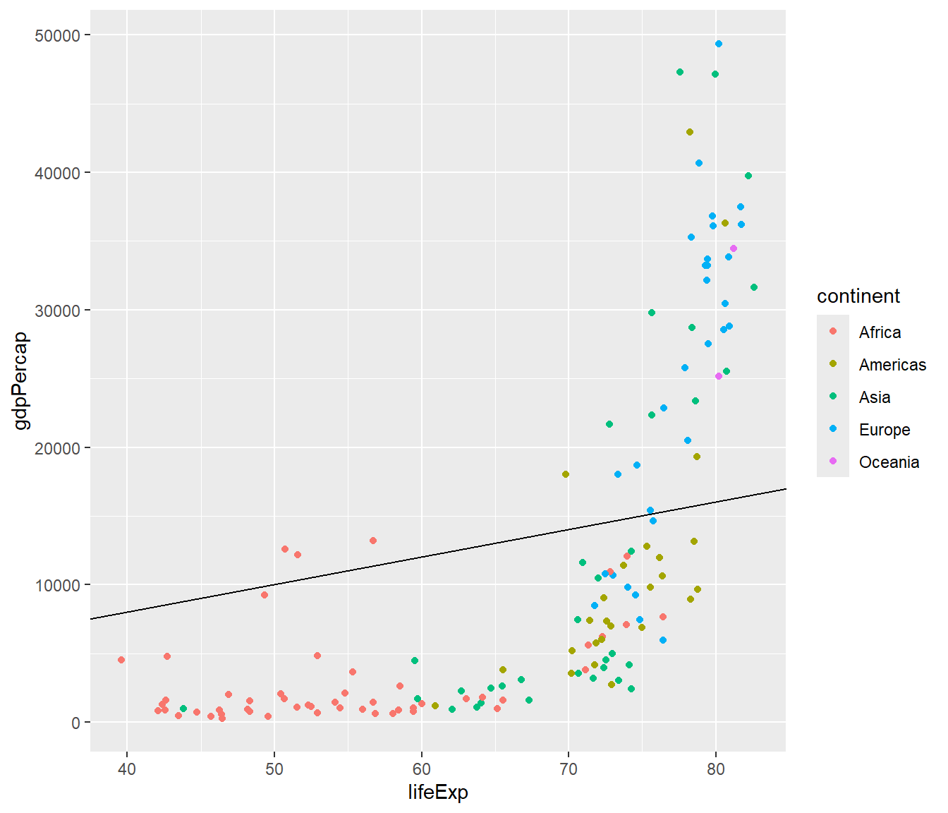
Add a diagonal line
<- gapminder %>% filter (year == 2007 )ggplot (gapminder2007,aes (x = lifeExp, y = gdpPercap, col= continent)) + geom_point () + geom_abline (intercept = 20 , slope= 200 )
All geoms in ggplot2
 [1] "geom_abline"            "geom_area"              "geom_bar"
 [4] "geom_bin_2d"            "geom_bin2d"             "geom_blank"
 [7] "geom_boxplot"           "geom_col"               "geom_contour"
[10] "geom_contour_filled"    "geom_count"             "geom_crossbar"
[13] "geom_curve"             "geom_density"           "geom_density_2d"
[16] "geom_density_2d_filled" "geom_density2d"         "geom_density2d_filled"
[19] "geom_dotplot"           "geom_errorbar"          "geom_errorbarh"
[22] "geom_freqpoly"          "geom_function"          "geom_hex"
[25] "geom_histogram"         "geom_hline"             "geom_jitter"
[28] "geom_label"             "geom_line"              "geom_linerange"
[31] "geom_map"               "geom_path"              "geom_point"
[34] "geom_pointrange"        "geom_polygon"           "geom_qq"
[37] "geom_qq_line"           "geom_quantile"          "geom_raster"
[40] "geom_rect"              "geom_ribbon"            "geom_rug"
[43] "geom_segment"           "geom_sf"                "geom_sf_label"
[46] "geom_sf_text"           "geom_smooth"            "geom_spoke"
[49] "geom_step"              "geom_text"              "geom_tile"
[52] "geom_violin"            "geom_vline"
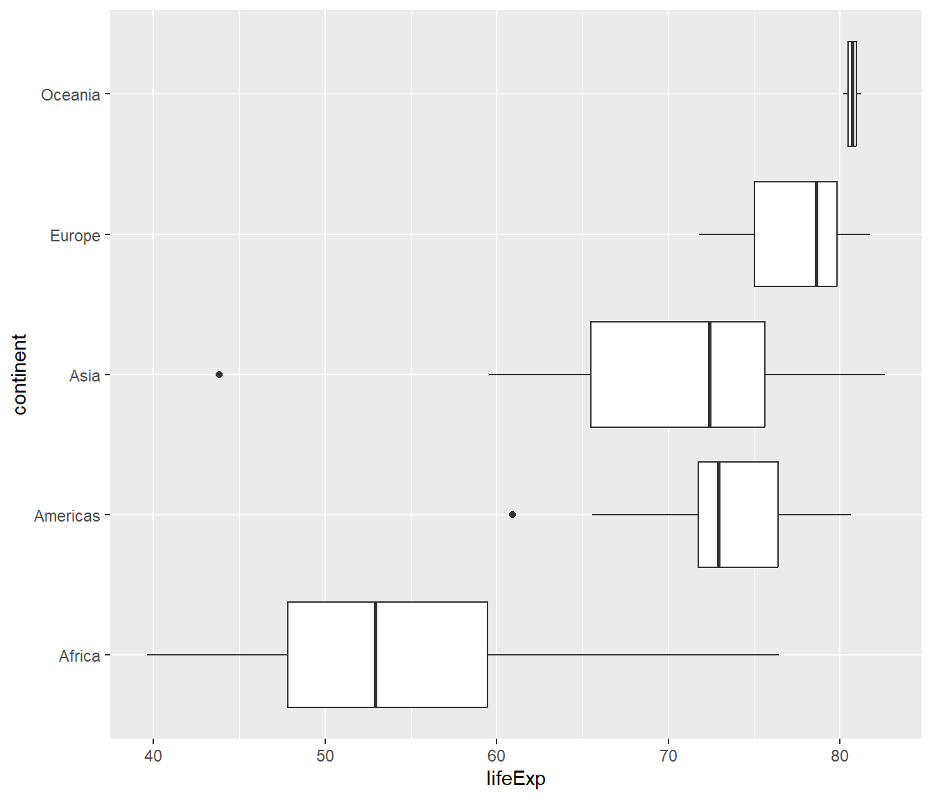
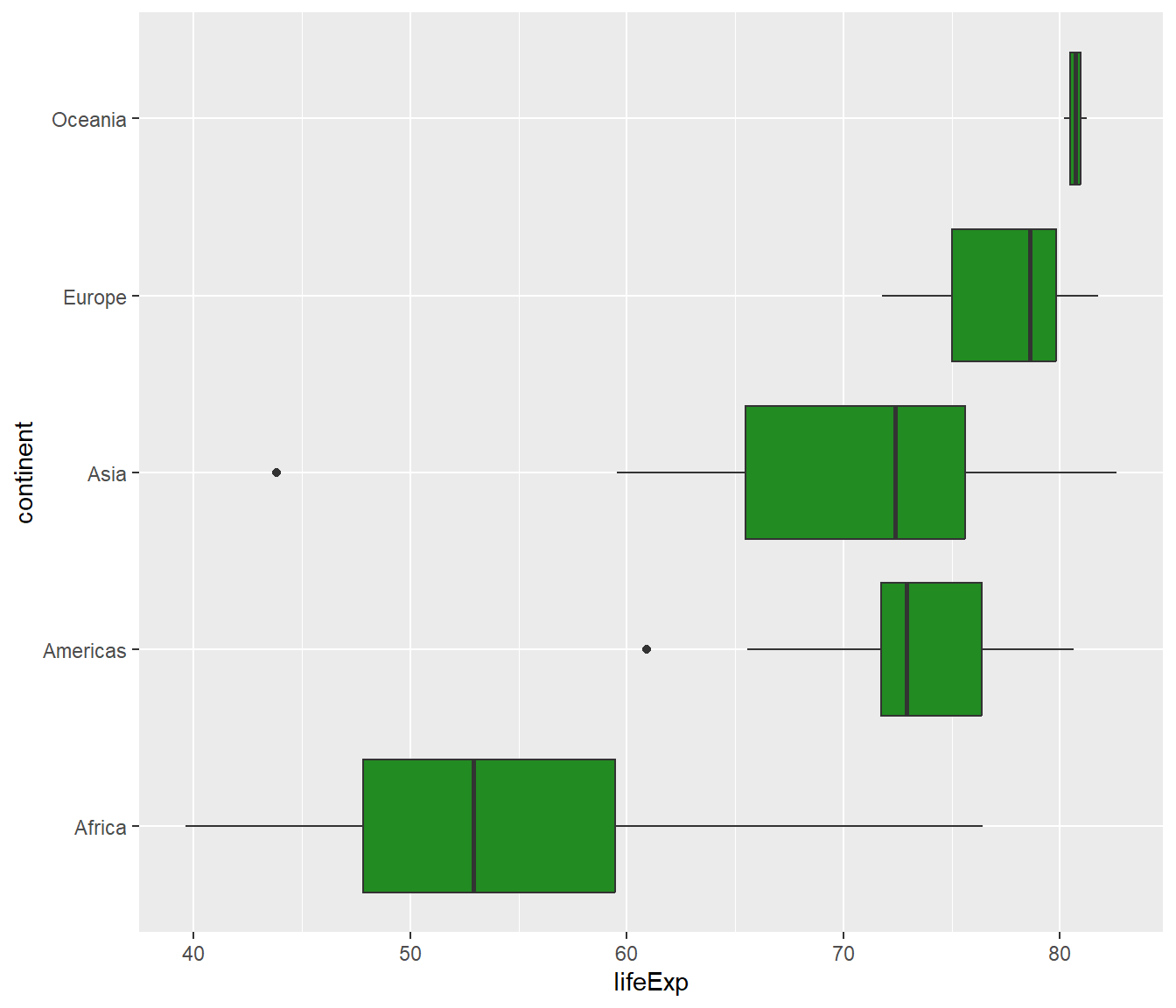
geom_boxplot
ggplot (gapminder2007, aes (x= lifeExp, y= continent))+ geom_boxplot ()
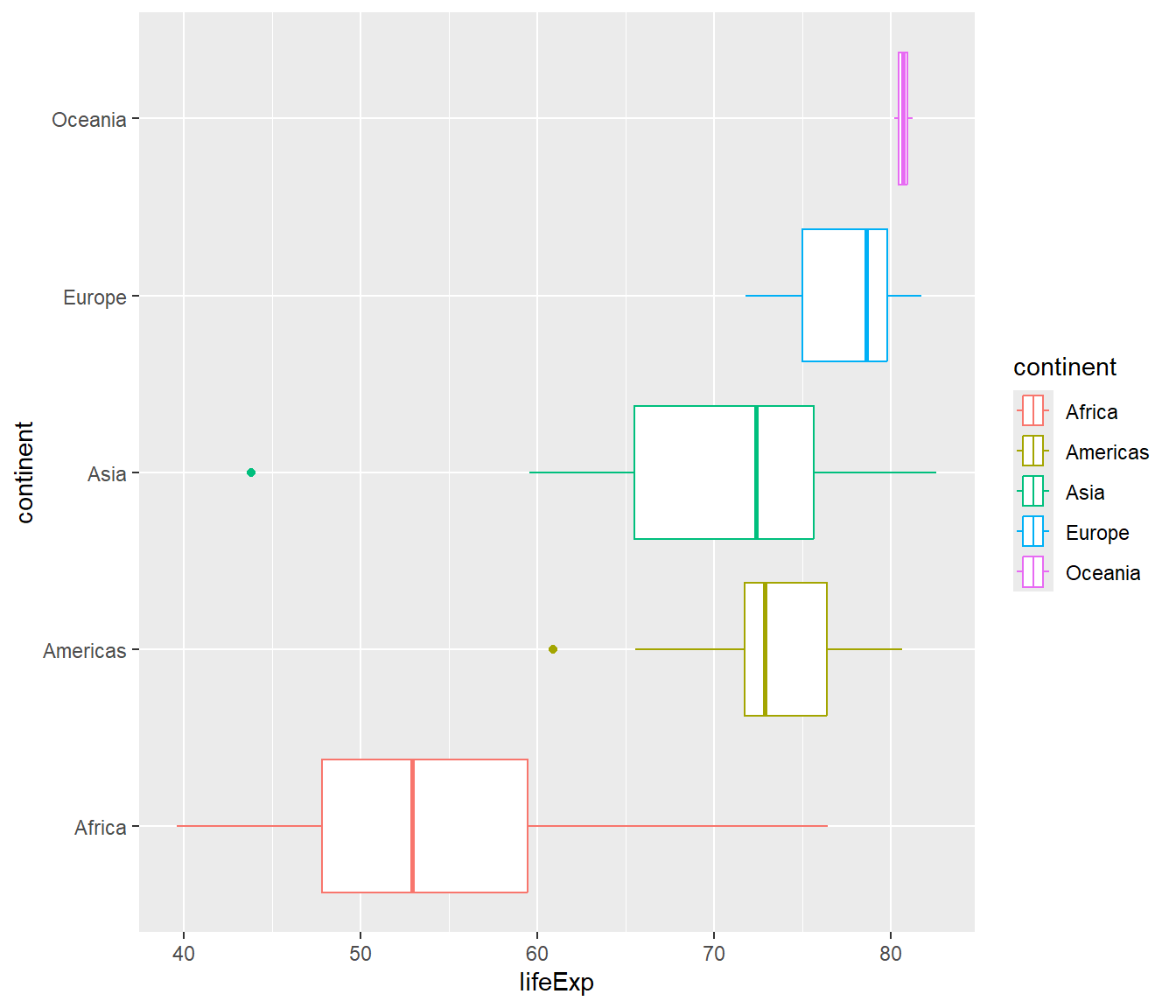
ggplot (gapminder2007, aes (x= lifeExp, y= continent, color= continent))+ geom_boxplot ()
ggplot (gapminder2007, aes (x= lifeExp, y= continent, fill= continent))+ geom_boxplot ()
]
ggplot (gapminder2007, aes (x= lifeExp, y= continent))+ geom_boxplot (fill= "forestgreen" )
]
ggplot (gapminder2007, aes (x= lifeExp, y= continent))+ geom_boxplot (fill= "forestgreen" , alpha= 0.5 )
]
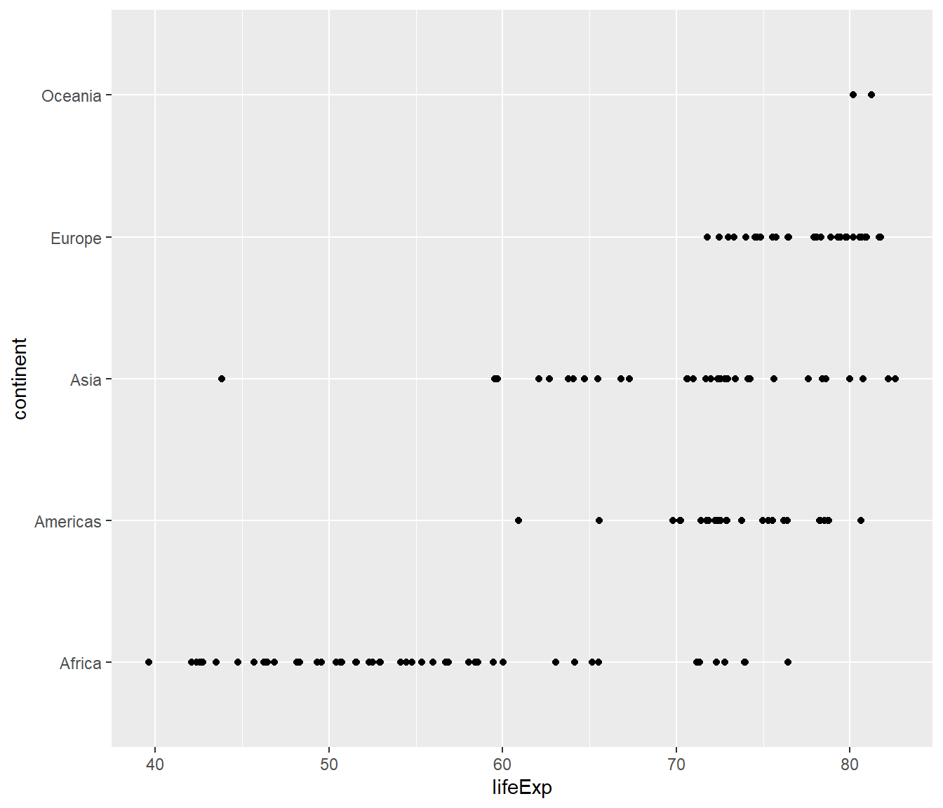
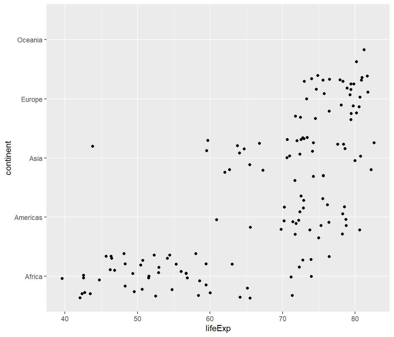
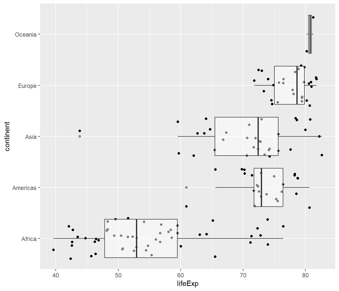
geom_jitter
ggplot (gapminder2007, aes (x= lifeExp, y= continent))+ geom_jitter ()
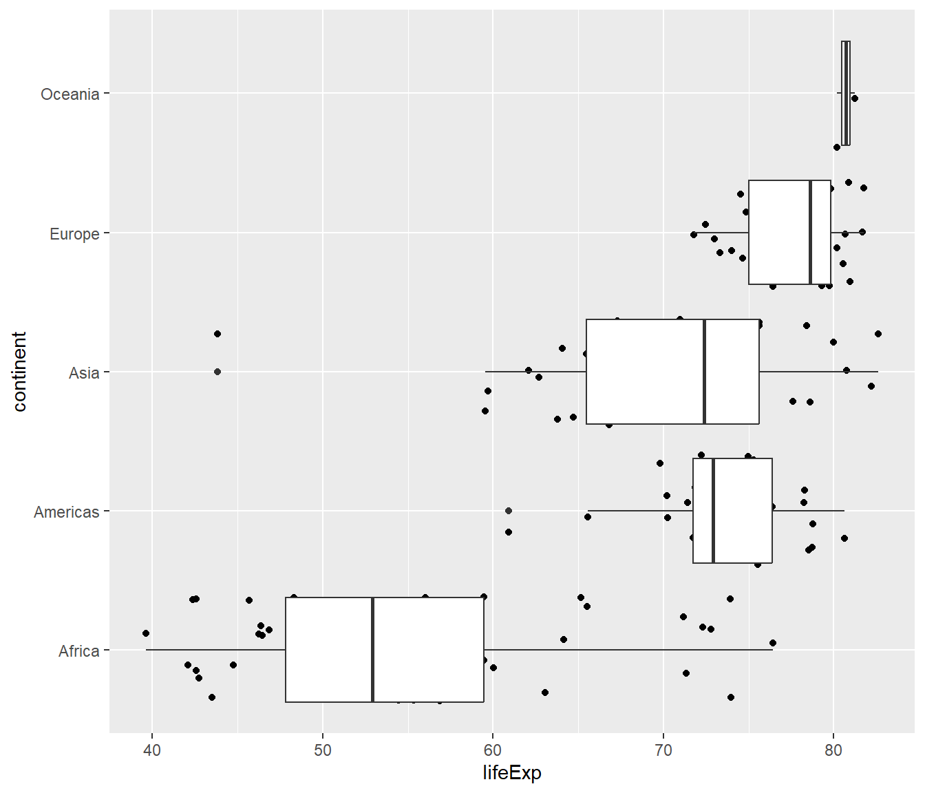
geom_jitter + geom_boxplot
ggplot (gapminder2007, aes (x= lifeExp, y= continent))+ geom_jitter () + geom_boxplot ()
ggplot (gapminder2007, aes (x= lifeExp, y= continent))+ geom_jitter () + geom_boxplot (alpha= 0.5 )
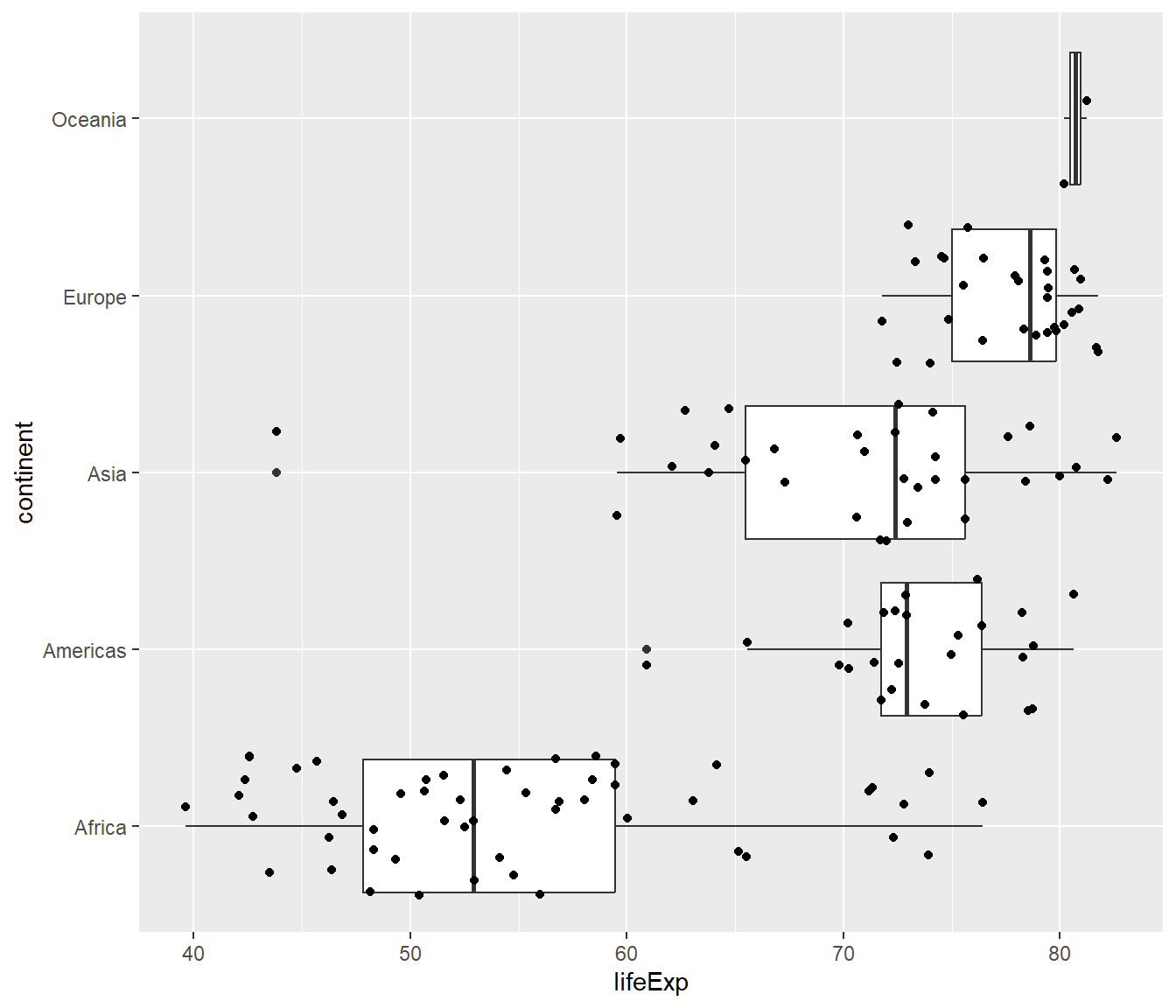
ggplot (gapminder2007, aes (x= lifeExp, y= continent))+ geom_boxplot () + geom_jitter ()
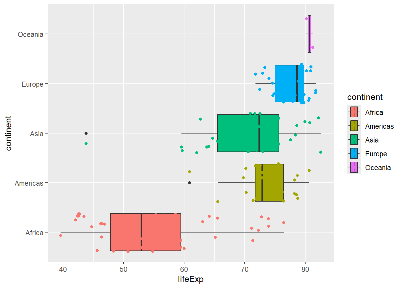
ggplot (gapminder2007, aes (x= lifeExp, y= continent, fill= continent))+ geom_boxplot () + geom_jitter (aes (col= continent))
geom_jitter + geom_boxplot (outlier.shape = NA)
ggplot (gapminder2007, aes (x= lifeExp, y= continent, fill= continent))+ geom_boxplot (outlier.shape = NA ) + geom_jitter (aes (col= continent))
.right-plot[
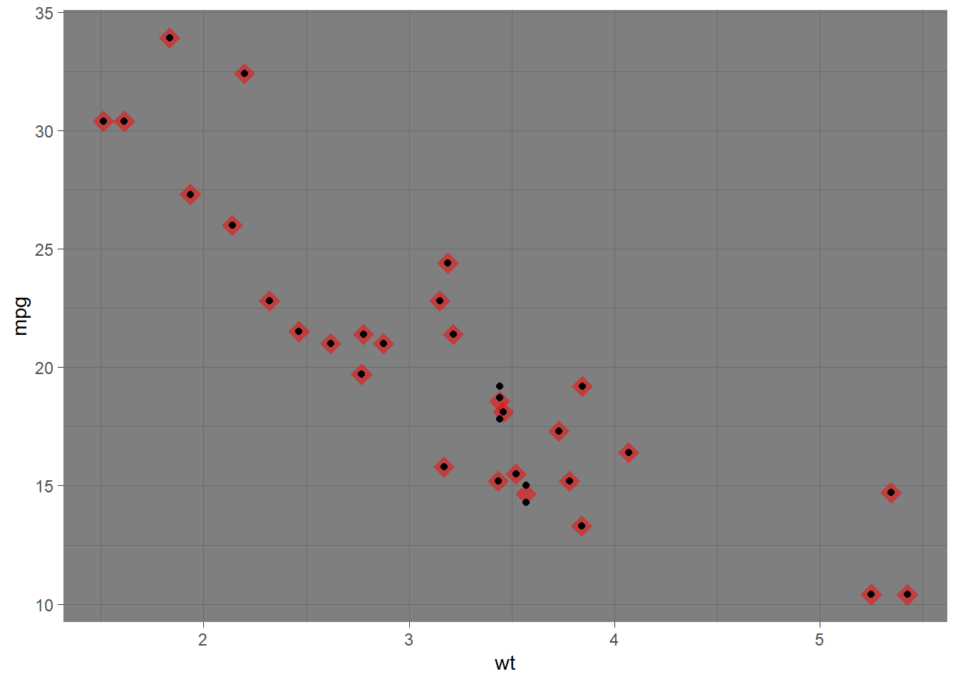
Write the code to obtain the following plot.
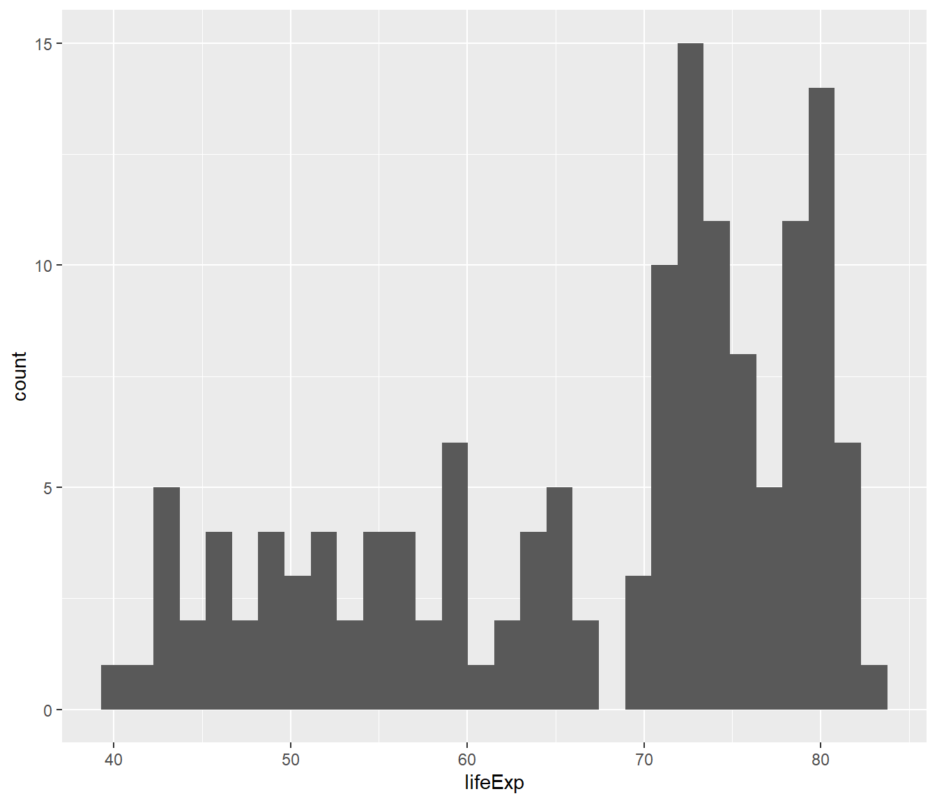
geom_histogram
ggplot (gapminder2007, aes (x= lifeExp))+ geom_histogram ()
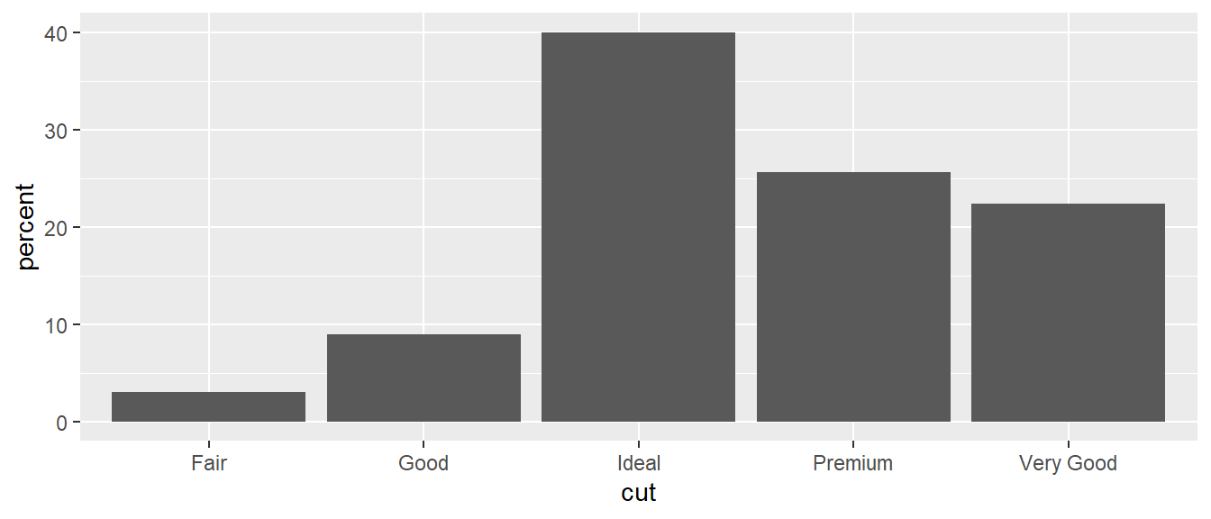
geom_bar (stat=“identity”)
<- data.frame (cut= c ("Fair" , "Good" , "Very Good" , "Premium" , "Ideal" ), percent= c (3 , 9 , 22.4 , 25.6 , 40 ))
        cut percent
1      Fair     3.0
2      Good     9.0
3 Very Good    22.4
4   Premium    25.6
5     Ideal    40.0
ggplot (data= cut.percent, aes (x= cut, y= percent)) + geom_bar (stat= "identity" )
geom_col
<- data.frame (cut= c ("Fair" , "Good" , "Very Good" , "Premium" , "Ideal" ), percent= c (3 , 9 , 22.4 , 25.6 , 40 ))
        cut percent
1      Fair     3.0
2      Good     9.0
3 Very Good    22.4
4   Premium    25.6
5     Ideal    40.0
ggplot (data= cut.percent, aes (x= cut, y= percent)) + geom_col ()
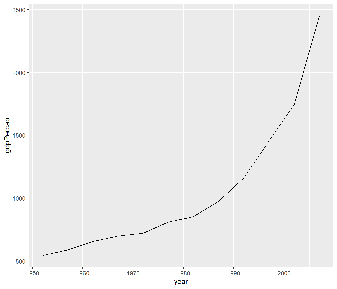
geom_line
%>% filter (country == "India" ) %>% ggplot (aes (x = year, y = gdpPercap)) + geom_line ()
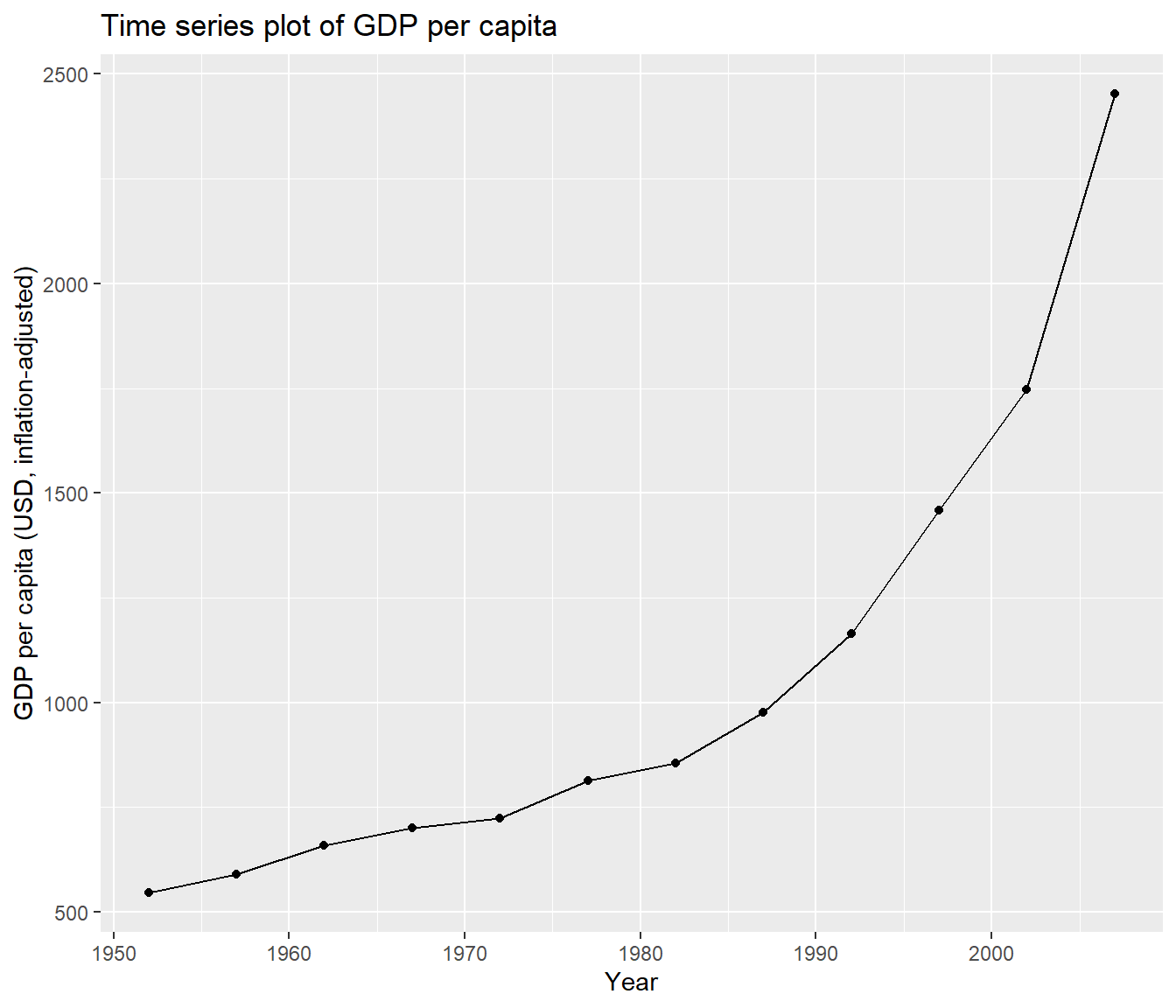
Your turn
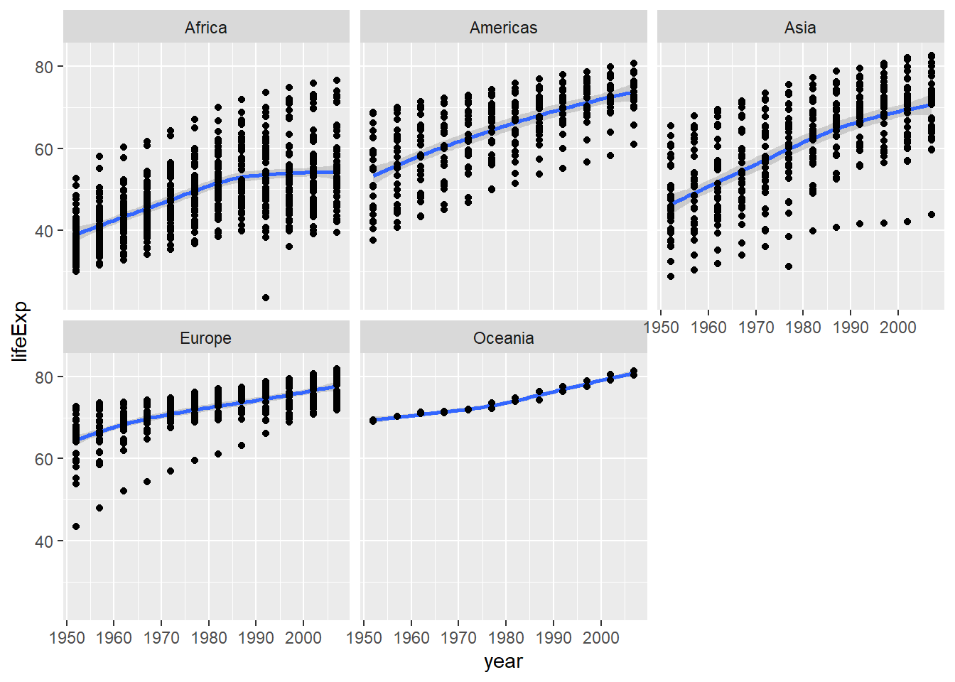
Write the code to obtain the following plot.
Data Wrangling + Data Visualization
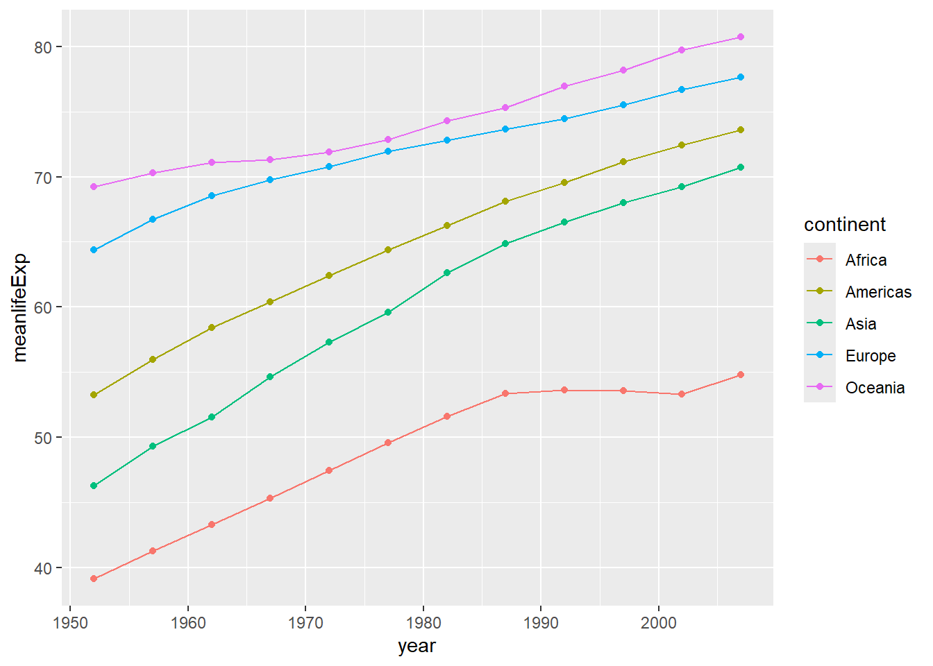
<- gapminder %>% group_by (continent, year) %>% summarise (meanlifeExp= mean (lifeExp))
`summarise()` has regrouped the output.
ℹ Summaries were computed grouped by continent and year.
ℹ Output is grouped by continent.
ℹ Use `summarise(.groups = "drop_last")` to silence this message.
ℹ Use `summarise(.by = c(continent, year))` for per-operation grouping
  (`?dplyr::dplyr_by`) instead.
# A tibble: 60 × 3
# Groups:   continent [5]
   continent  year meanlifeExp
   <fct>     <int>       <dbl>
 1 Africa     1952        39.1
 2 Africa     1957        41.3
 3 Africa     1962        43.3
 4 Africa     1967        45.3
 5 Africa     1972        47.5
 6 Africa     1977        49.6
 7 Africa     1982        51.6
 8 Africa     1987        53.3
 9 Africa     1992        53.6
10 Africa     1997        53.6
# ℹ 50 more rows
ggplot (avglifeExp, aes (x= year, y= meanlifeExp, col= continent))+ geom_line () + geom_point ()
Exercise
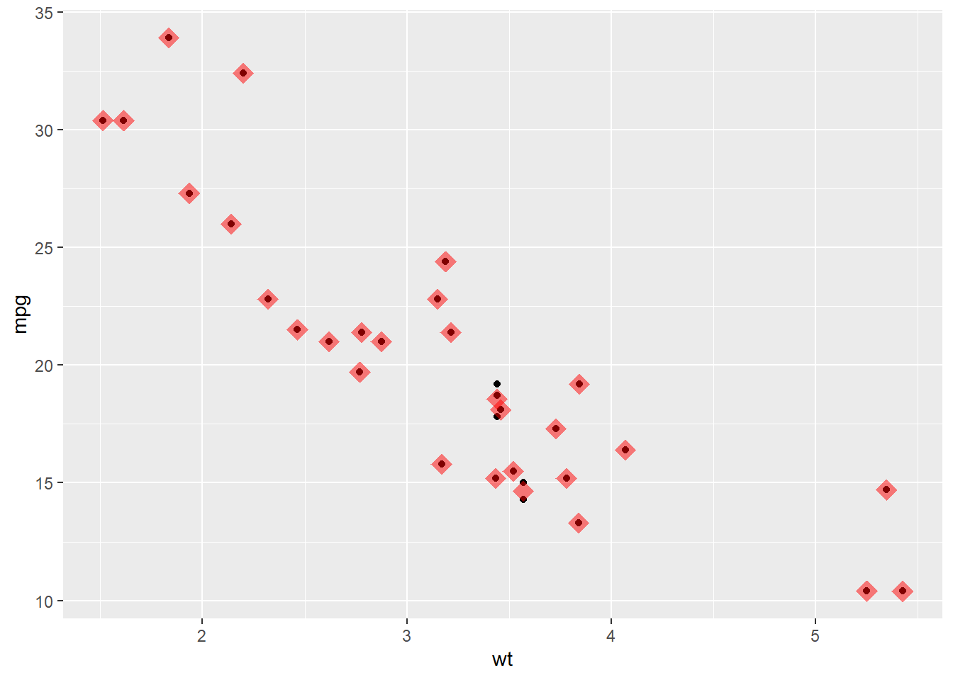
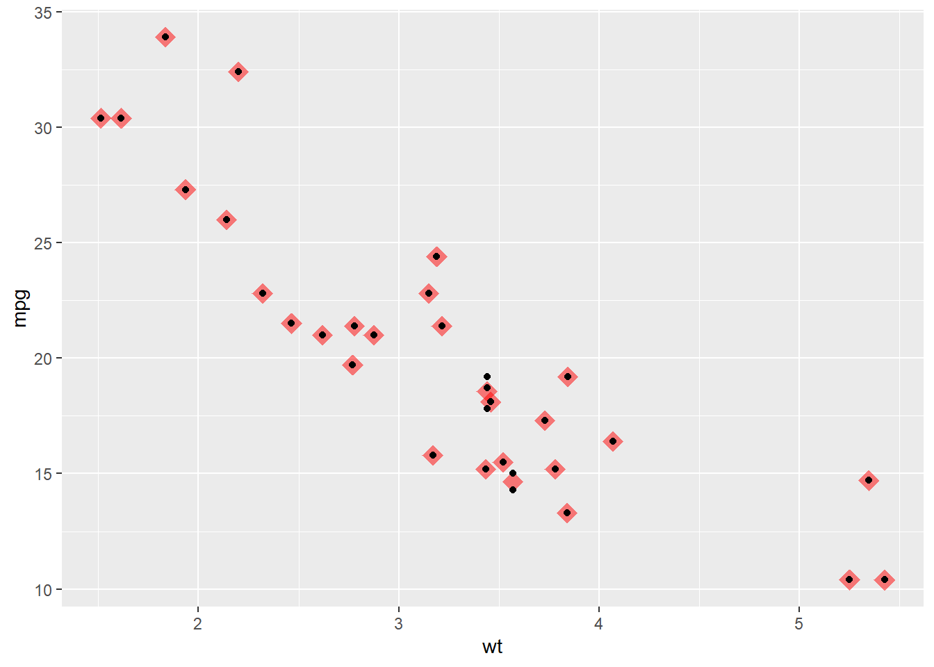
Write an R code to reproduce the plot below.
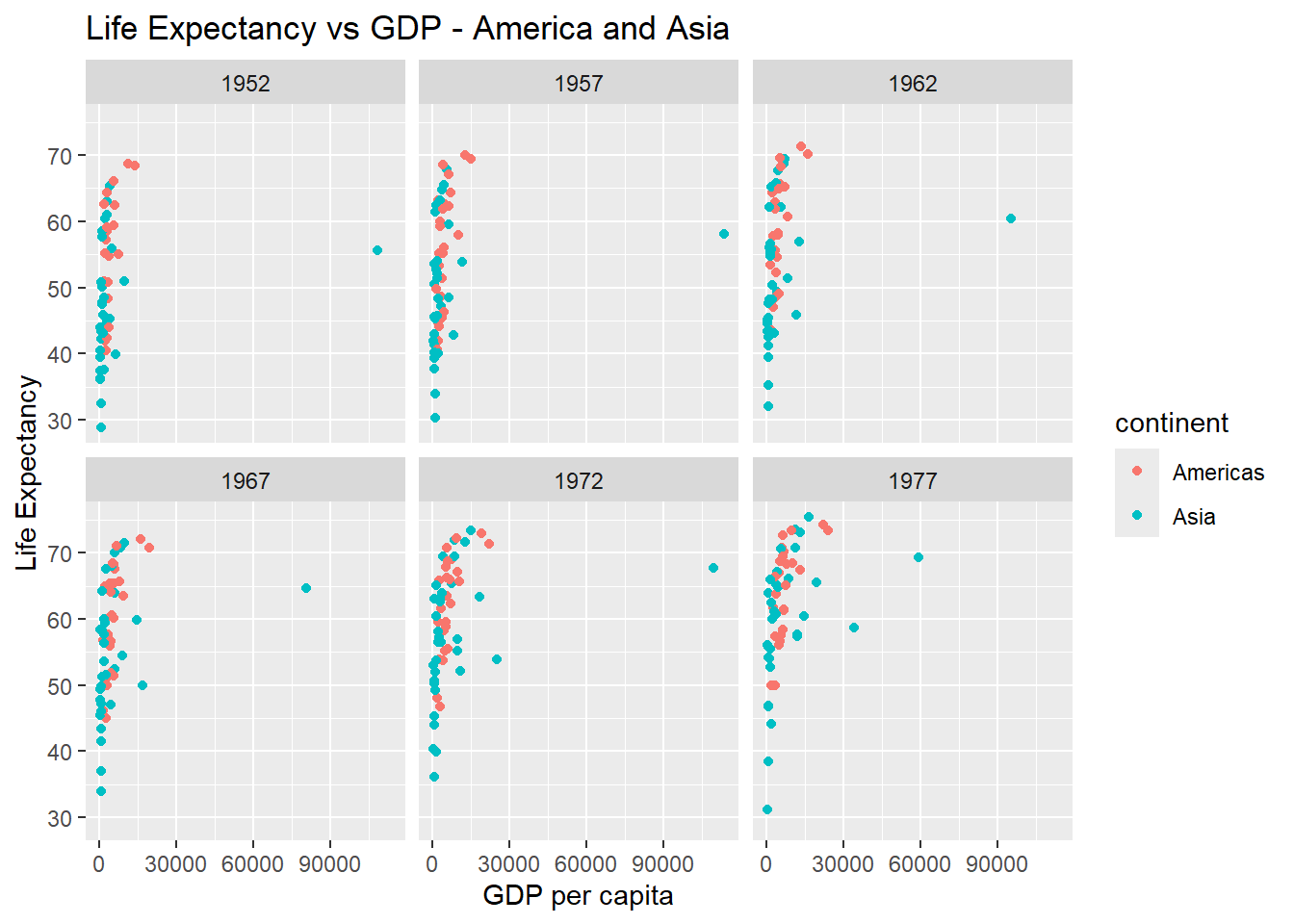
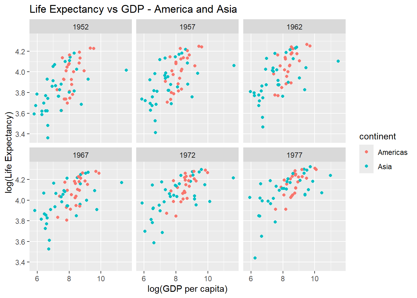
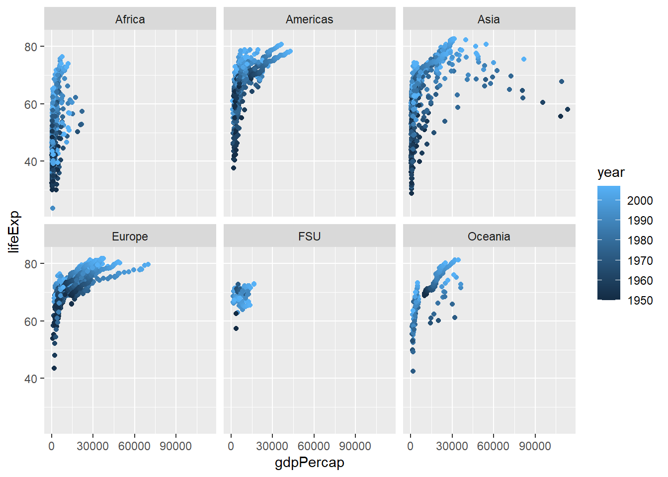
Write an R code to reproduce the plot below.
Write an R code to reproduce the plot below.
Write an R code to reproduce the plot below.