# A tibble: 333 × 9
   species island    bill_length_mm bill_depth_mm flipper_length_mm body_mass_g
   <fct>   <fct>              <dbl>         <dbl>             <int>       <int>
 1 Adelie  Torgersen           39.1          18.7               181        3750
 2 Adelie  Torgersen           39.5          17.4               186        3800
 3 Adelie  Torgersen           40.3          18                 195        3250
 4 Adelie  Torgersen           36.7          19.3               193        3450
 5 Adelie  Torgersen           39.3          20.6               190        3650
 6 Adelie  Torgersen           38.9          17.8               181        3625
 7 Adelie  Torgersen           39.2          19.6               195        4675
 8 Adelie  Torgersen           41.1          17.6               182        3200
 9 Adelie  Torgersen           38.6          21.2               191        3800
10 Adelie  Torgersen           34.6          21.1               198        4400
# ℹ 323 more rows
# ℹ 3 more variables: gender <fct>, year <int>, BMI_category <chr>5 Descriptive Statistics
5.1 What is Descriptive Statistics?
Describe the data
Descriptive statistics involves summarizing and organizing the data so they can be easily understood
Does not attempt to make inferences from the sample to the whole population
5.2 Dataset Use for Illustrations
5.3 Qualitative data: Univariate Analysis
Chart types we can use: Pie chart, Bar chart
Tables: Tables with counts and percentages
Extract qualitative variables
# A tibble: 333 × 4
   species island    gender BMI_category
   <fct>   <fct>     <fct>  <chr>
 1 Adelie  Torgersen male   Normal
 2 Adelie  Torgersen female Normal
 3 Adelie  Torgersen female Underweight
 4 Adelie  Torgersen female Normal
 5 Adelie  Torgersen male   Normal
 6 Adelie  Torgersen female Normal
 7 Adelie  Torgersen male   Overweight
 8 Adelie  Torgersen female Underweight
 9 Adelie  Torgersen male   Normal
10 Adelie  Torgersen male   Overweight
# ℹ 323 more rows
Nominal Scale Data
Tabular representations
Frequency tables/ Contingency Tables
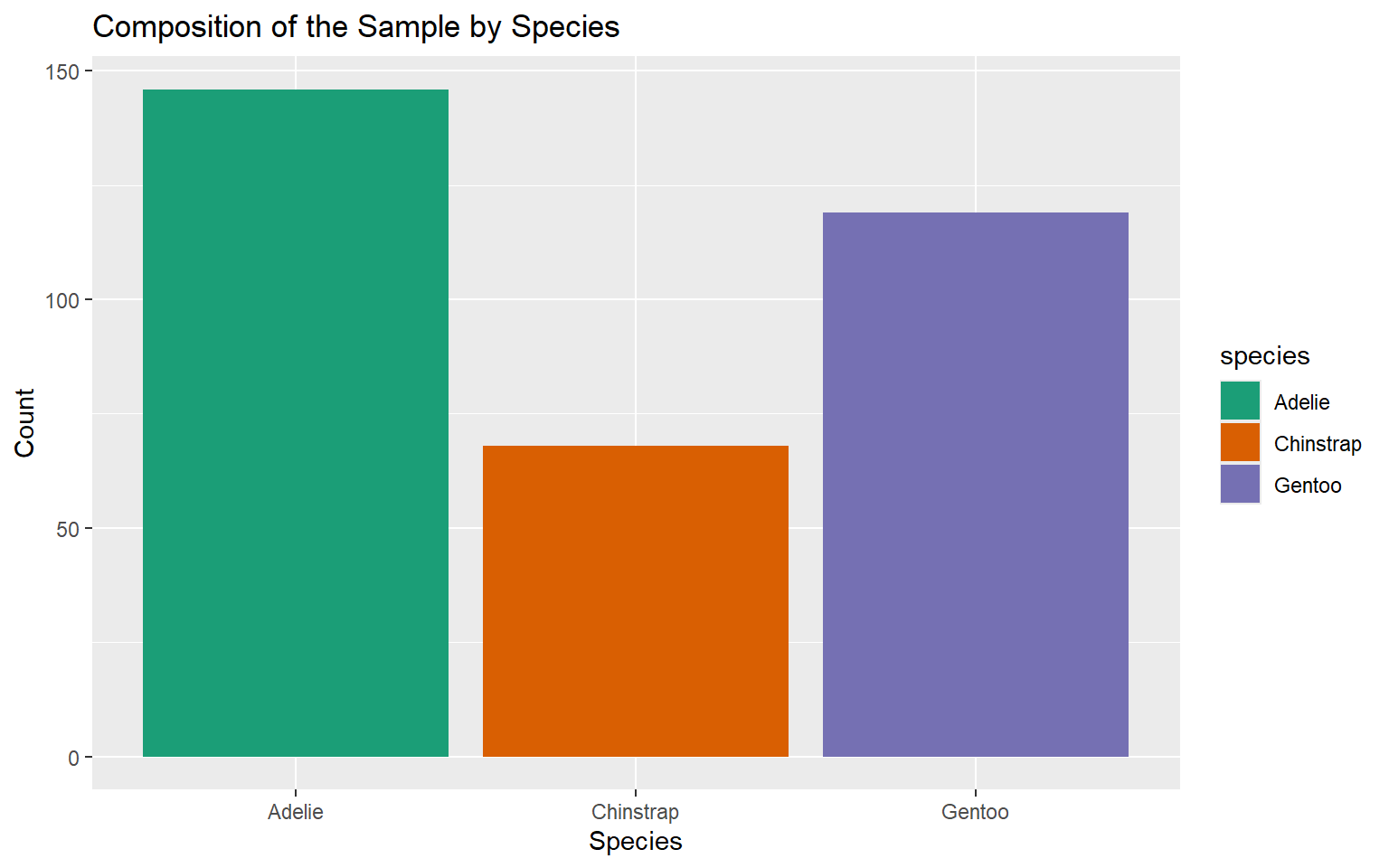
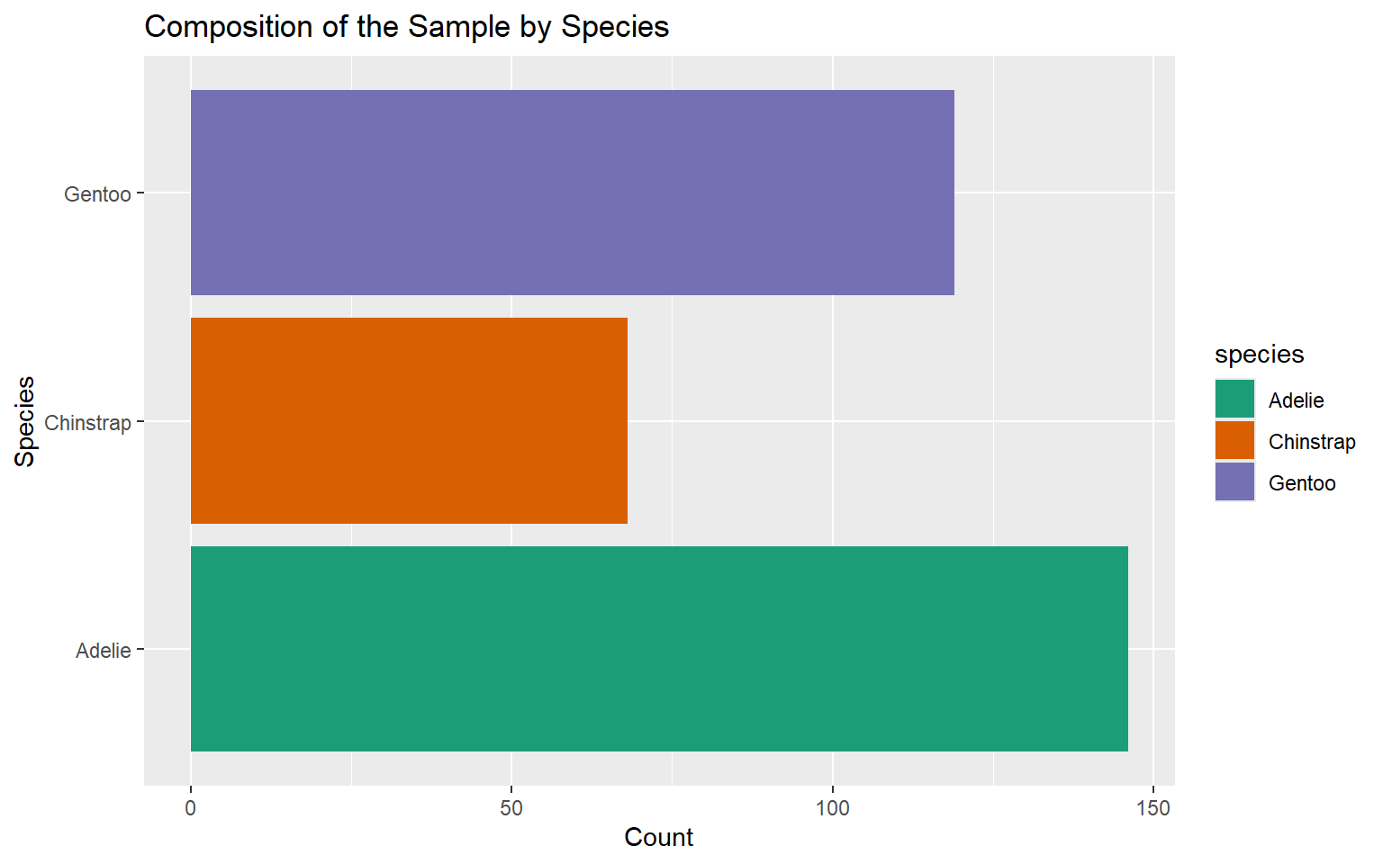
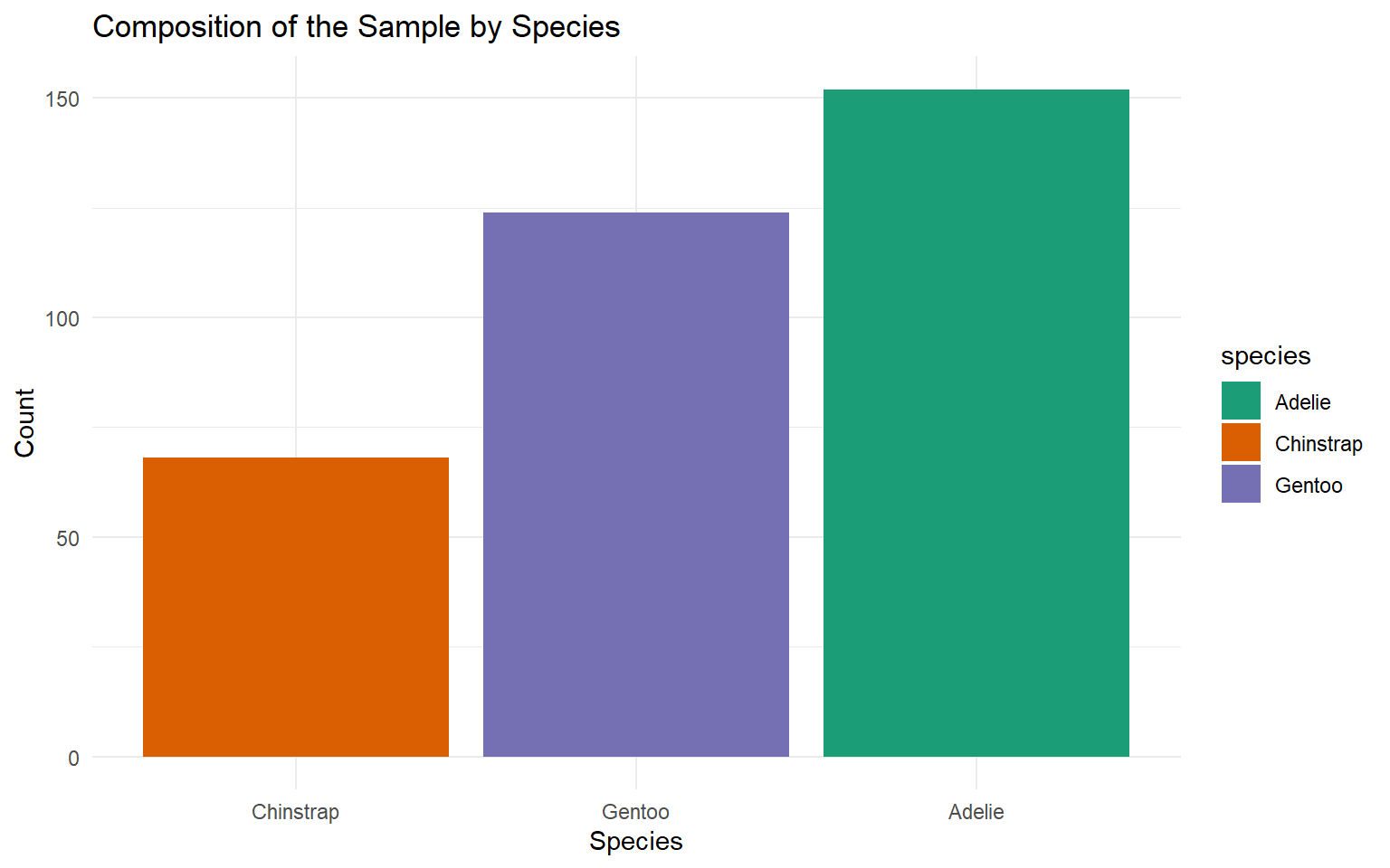
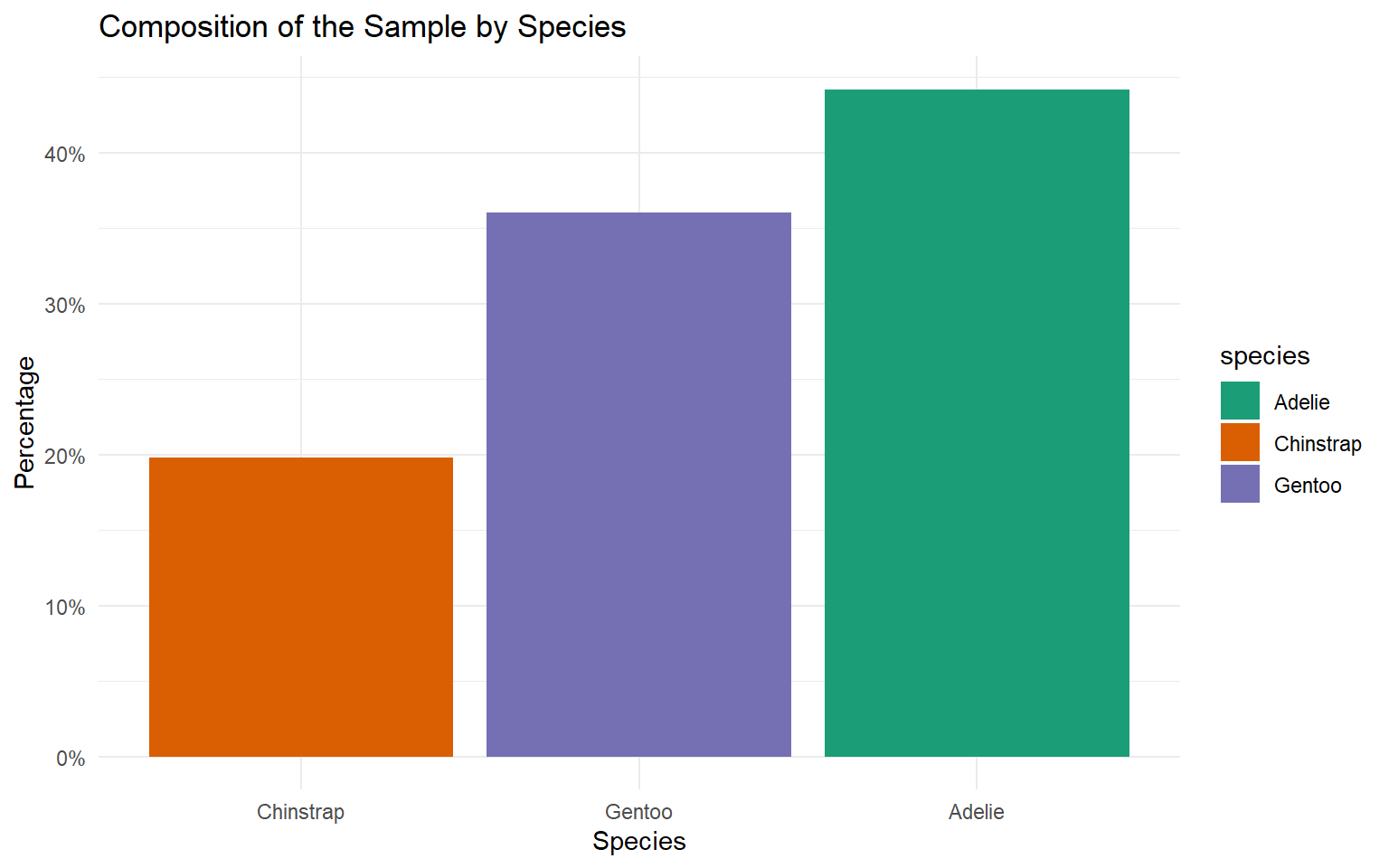
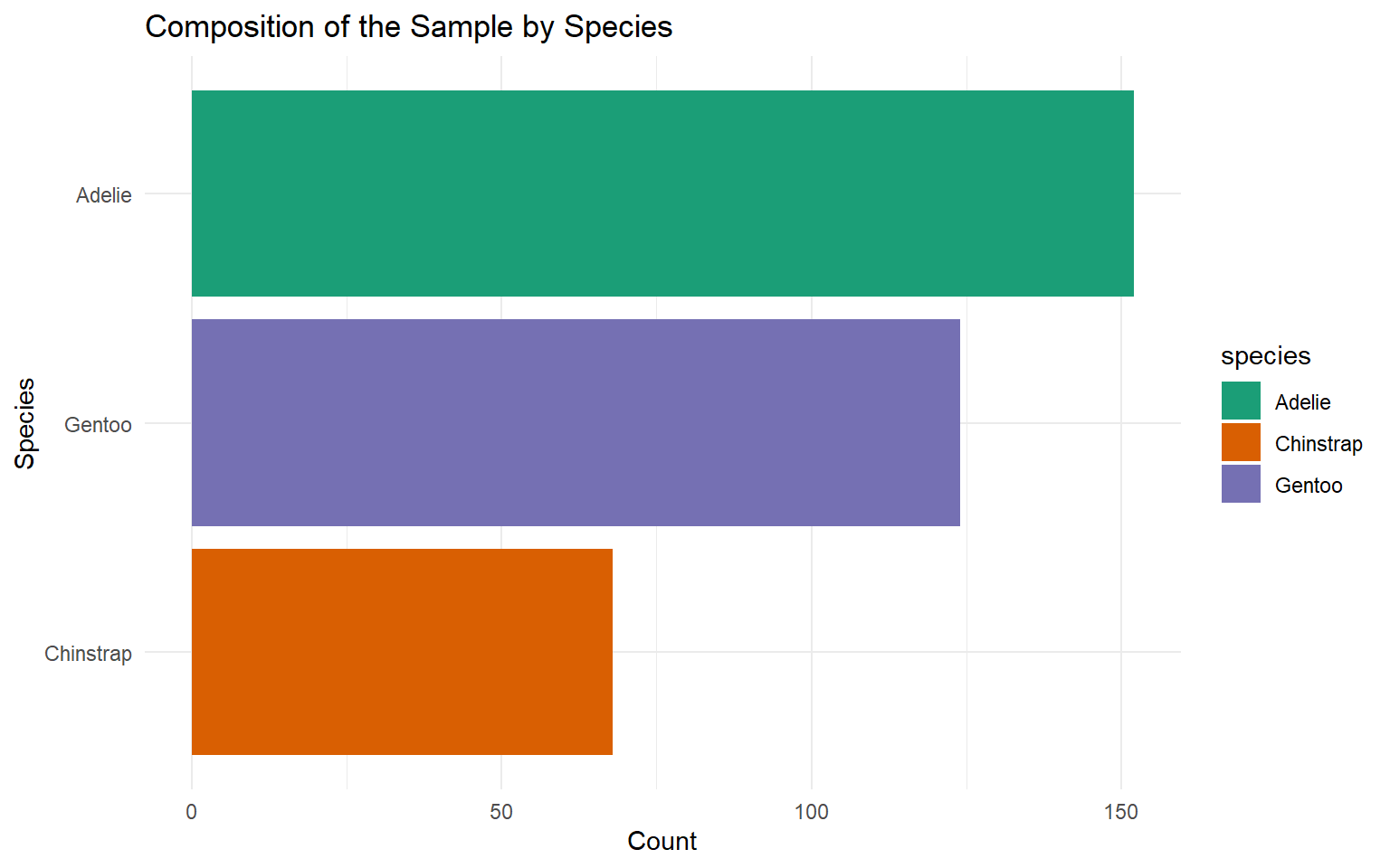
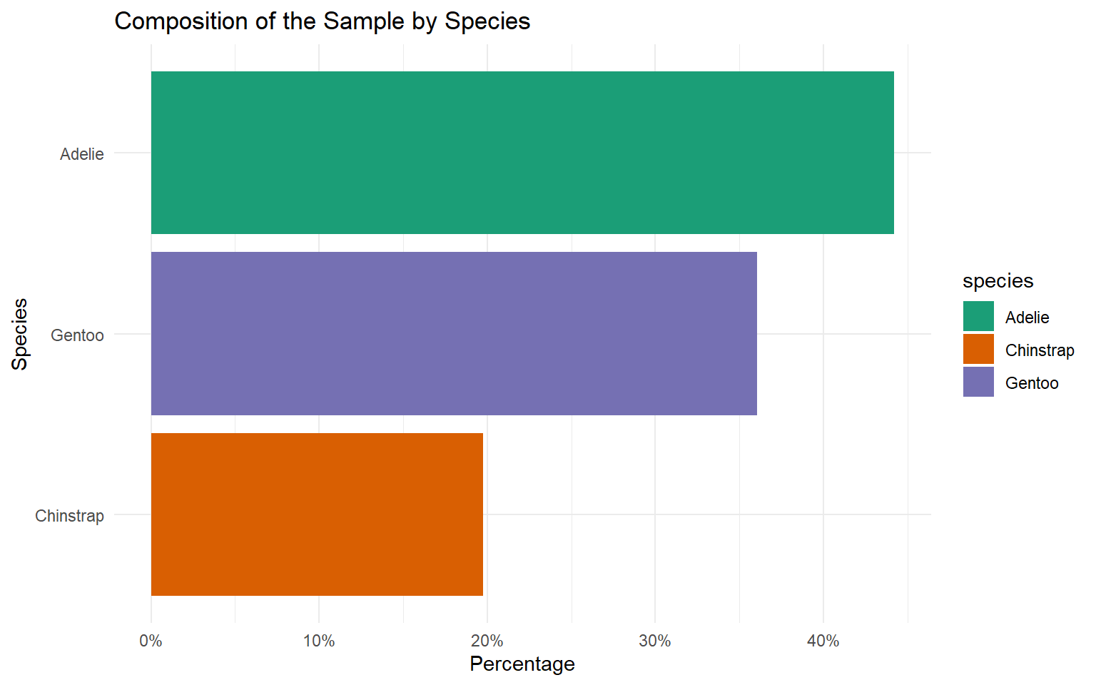
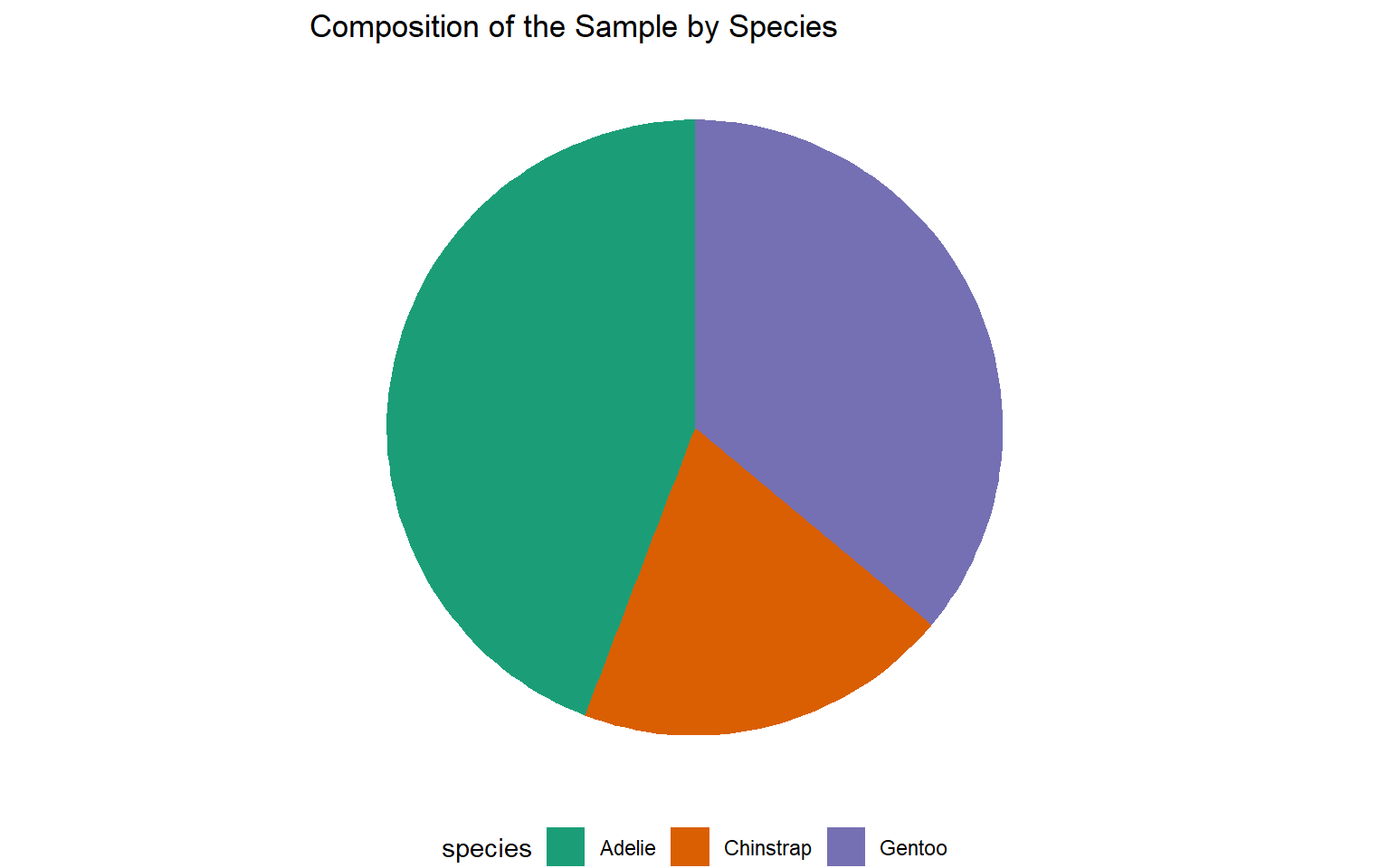
| Species | Count | Percentage (%) |
|---|---|---|
| Adelie | 146 | 43.84 |
| Chinstrap | 68 | 20.42 |
| Gentoo | 119 | 35.74 |
| Total | 333 | 100.00 |
Graphical Representations
Simple Bar Charts
Pie Charts
Vertical Bar Chart
Counts Bar Chart
Percentage Bar Chart

Horizontal Bar Chart
Counts Bar Chart
Percentage Bar Chart

Sort bars for easy comparison
Pie chart
Which is the best?


Pie charts are easier to compare for relative proportions.
Pie charts are best for a small number of categories.
Bar charts are better for comparing precise values.
Bar charts can handle more categories without becoming cluttered.
Note: Our visual system is typically better at comparing lengths or heights than angles. This inherent characteristic of human perception makes bar charts more effective than pie charts for comparing values or proportions.
Your turn
What other types of charts are suitable for visualizing nominal scale data?
Ordinal Scale Data
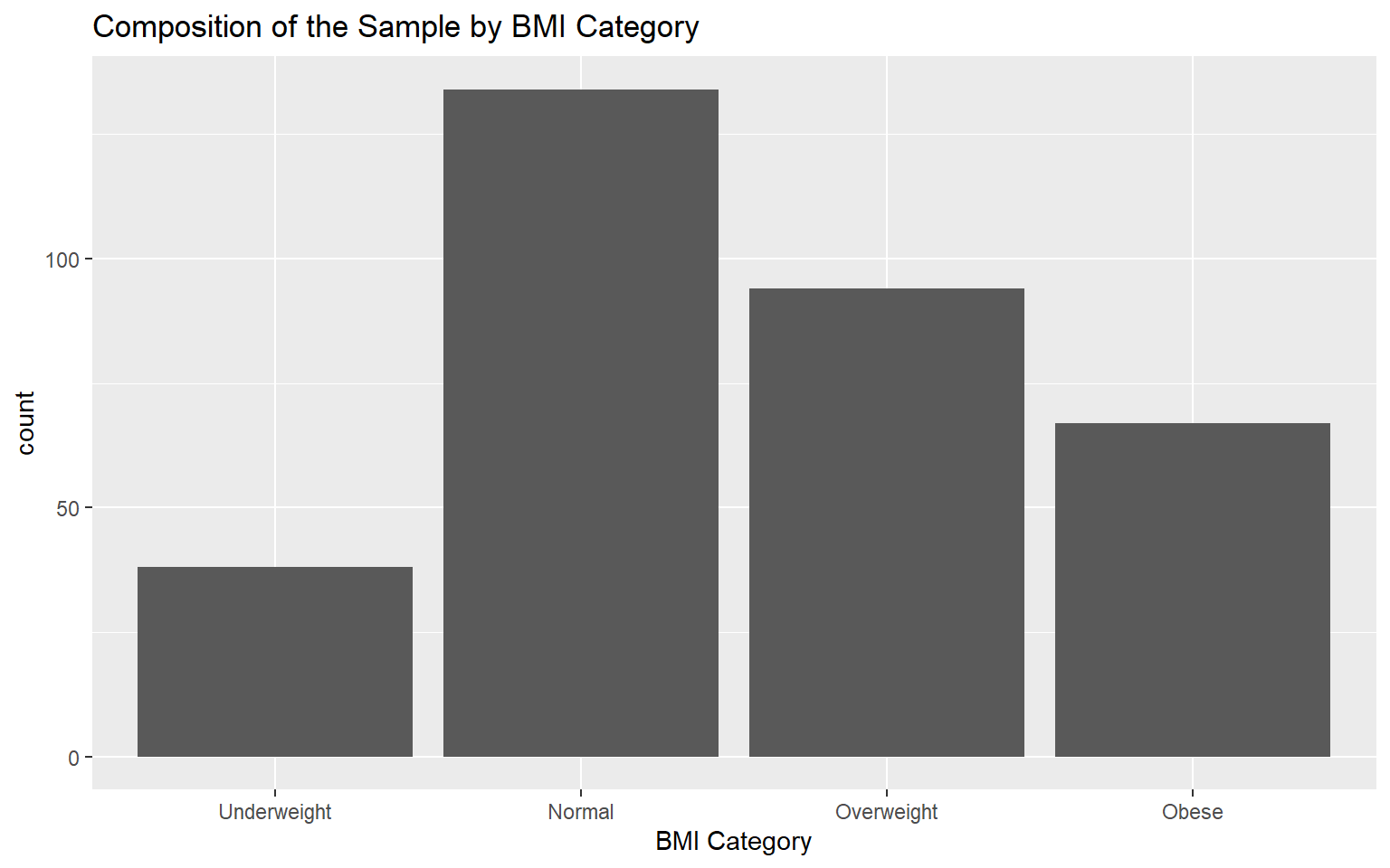
Tabular Representation: One-wau tables
| BMI Category | Count | Cumulative Count | Percentage | Cumulative Percentage |
|---|---|---|---|---|
| Underweight | 38 | 38 | 11.41 | 11.41 |
| Normal | 134 | 172 | 40.24 | 51.65 |
| Overweight | 94 | 266 | 28.23 | 79.88 |
| Obese | 67 | 333 | 20.12 | 100.00 |
Graphical representation
Question: In this case, is it necessary to sort the bars in our data visualization for better clarity and interpretation?
5.4 Qualitative data: Bivariate Analysis
Tabular Representation: Two-way tables
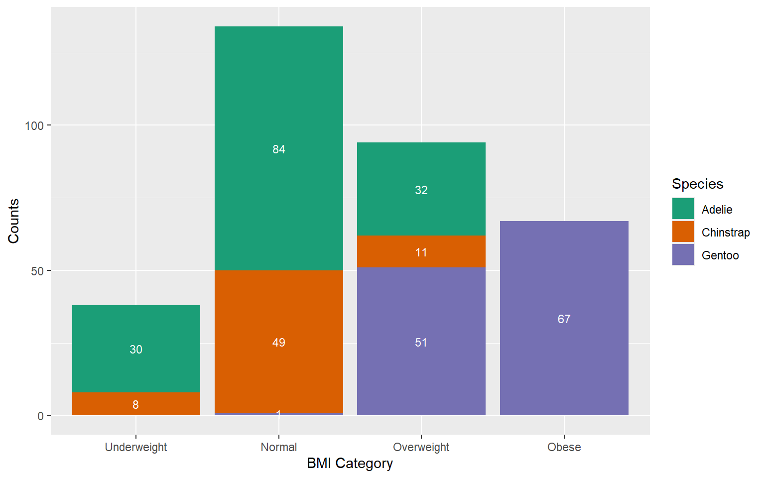
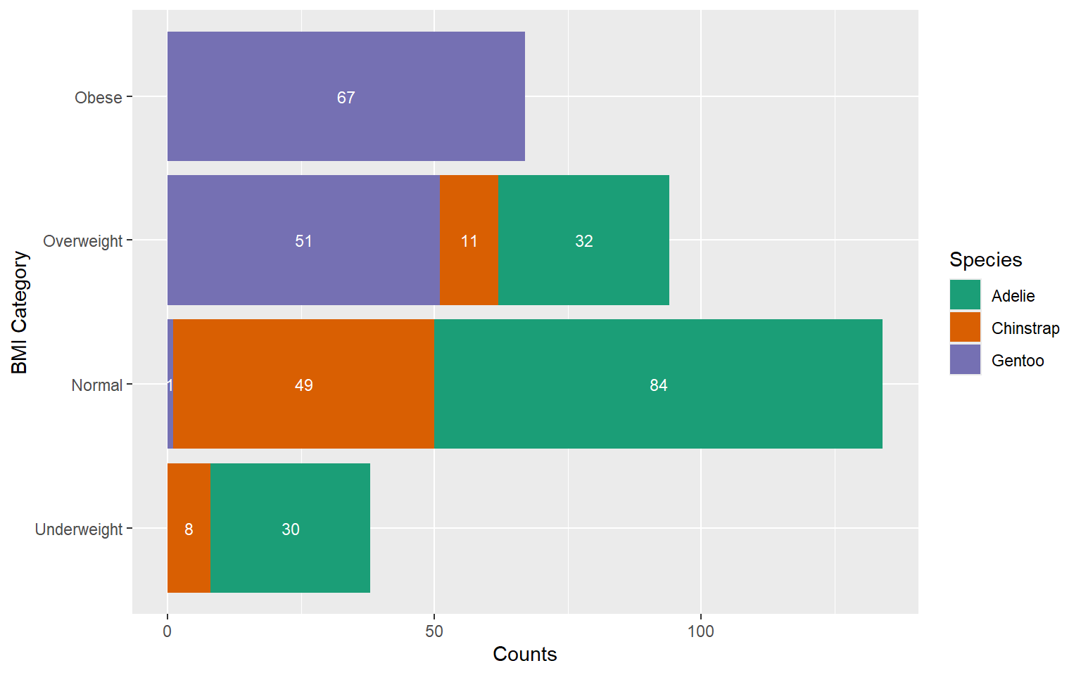
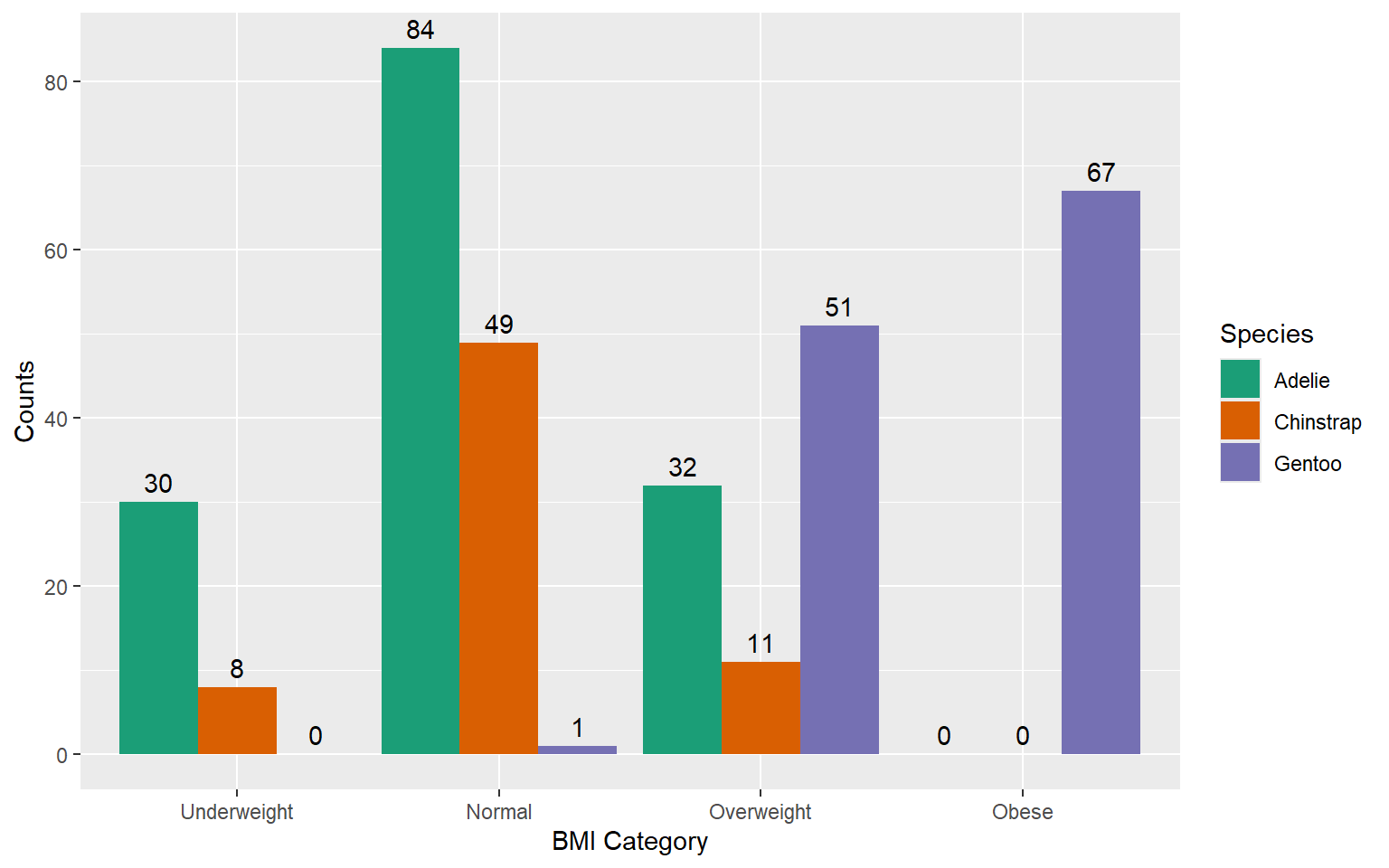
| species | Underweight | Normal | Overweight | Obese | Total |
|---|---|---|---|---|---|
| Adelie | 30 | 84 | 32 | 0 | 146 |
| Chinstrap | 8 | 49 | 11 | 0 | 68 |
| Gentoo | 0 | 1 | 51 | 67 | 119 |
| Total | 38 | 134 | 94 | 67 | 333 |
Let’s compute
- Row percentage: percent that each cell represents of the row total
- Column percentage: percent that each cell represents of the column total
- Overall percentage (total percentage): percent that each cell represents of the grand total
| species | Underweight | Normal | Overweight | Obese | Total |
|---|---|---|---|---|---|
| Adelie | 30 | 84 | 32 | 0 | 146 |
| Chinstrap | 8 | 49 | 11 | 0 | 68 |
| Gentoo | 0 | 1 | 51 | 67 | 119 |
| Total | 38 | 134 | 94 | 67 | 333 |
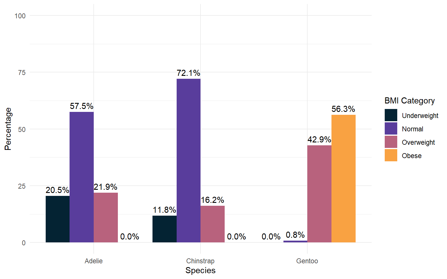
| species | Underweight | Normal | Overweight | Obese | Total |
|---|---|---|---|---|---|
| Adelie | 20.5% | 57.5% | 21.9% | 0.0% | 100.0% |
| Chinstrap | 11.8% | 72.1% | 16.2% | 0.0% | 100.0% |
| Gentoo | 0.0% | 0.8% | 42.9% | 56.3% | 100.0% |
| Total | 11.4% | 40.2% | 28.2% | 20.1% | 100.0% |
| species | Underweight | Normal | Overweight | Obese | Total |
|---|---|---|---|---|---|
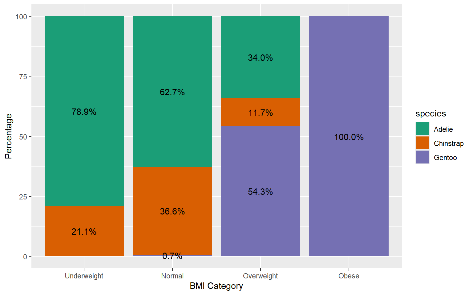
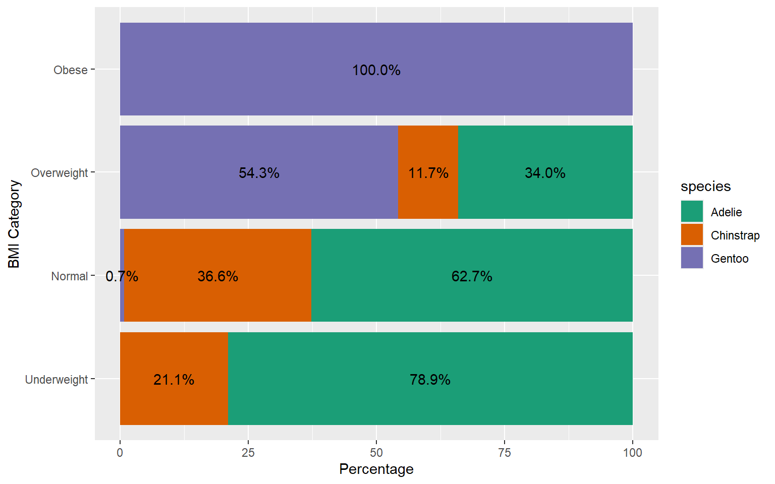
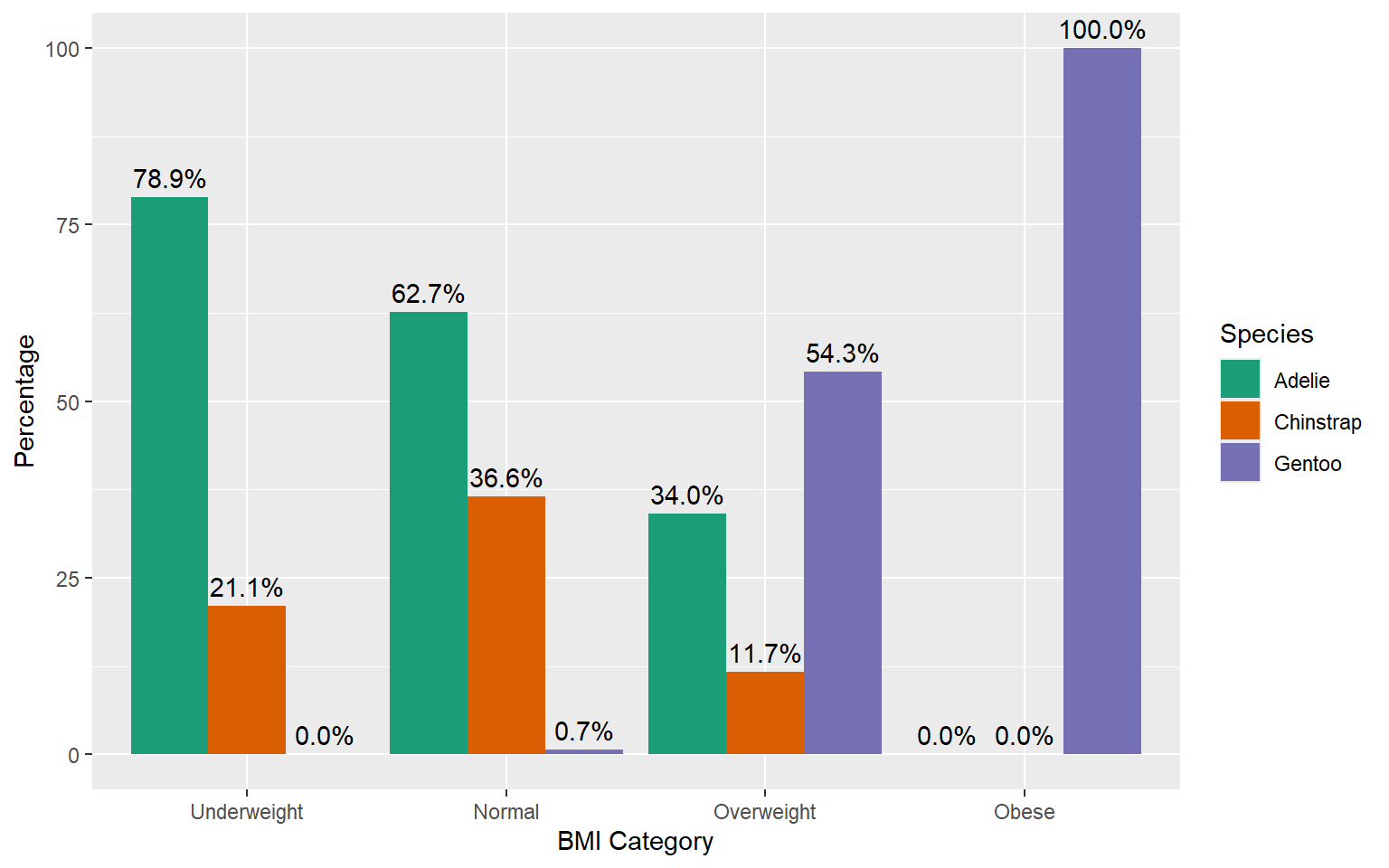
| Adelie | 78.9% | 62.7% | 34.0% | 0.0% | 43.8% |
| Chinstrap | 21.1% | 36.6% | 11.7% | 0.0% | 20.4% |
| Gentoo | 0.0% | 0.7% | 54.3% | 100.0% | 35.7% |
| Total | 100.0% | 100.0% | 100.0% | 100.0% | 100.0% |
| species | Underweight | Normal | Overweight | Obese | Total |
|---|---|---|---|---|---|
| Adelie | 9.0% | 25.2% | 9.6% | 0.0% | 43.8% |
| Chinstrap | 2.4% | 14.7% | 3.3% | 0.0% | 20.4% |
| Gentoo | 0.0% | 0.3% | 15.3% | 20.1% | 35.7% |
| Total | 11.4% | 40.2% | 28.2% | 20.1% | 100.0% |
Why is it important to represent both counts and percentages?
Percentages can sometimes be misleading when the sample size is small. By presenting both counts and percentages, the reader can see the actual numbers behind the percentages.
When comparing different groups or datasets, percentages help standardize the comparison by accounting for differences in group sizes.
When presenting the counts and percentages, you can combine them to a single table.
| species | Underweight | Normal | Overweight | Obese | Total |
|---|---|---|---|---|---|
| Adelie | 30 (20.5%) | 84 (57.5%) | 32 (21.9%) | 0 (0.0%) | 146 (100.0%) |
| Chinstrap | 8 (11.8%) | 49 (72.1%) | 11 (16.2%) | 0 (0.0%) | 68 (100.0%) |
| Gentoo | 0 (0.0%) | 1 (0.8%) | 51 (42.9%) | 67 (56.3%) | 119 (100.0%) |
| Total | 38 (11.4%) | 134 (40.2%) | 94 (28.2%) | 67 (20.1%) | 333 (100.0%) |
Graphical representation
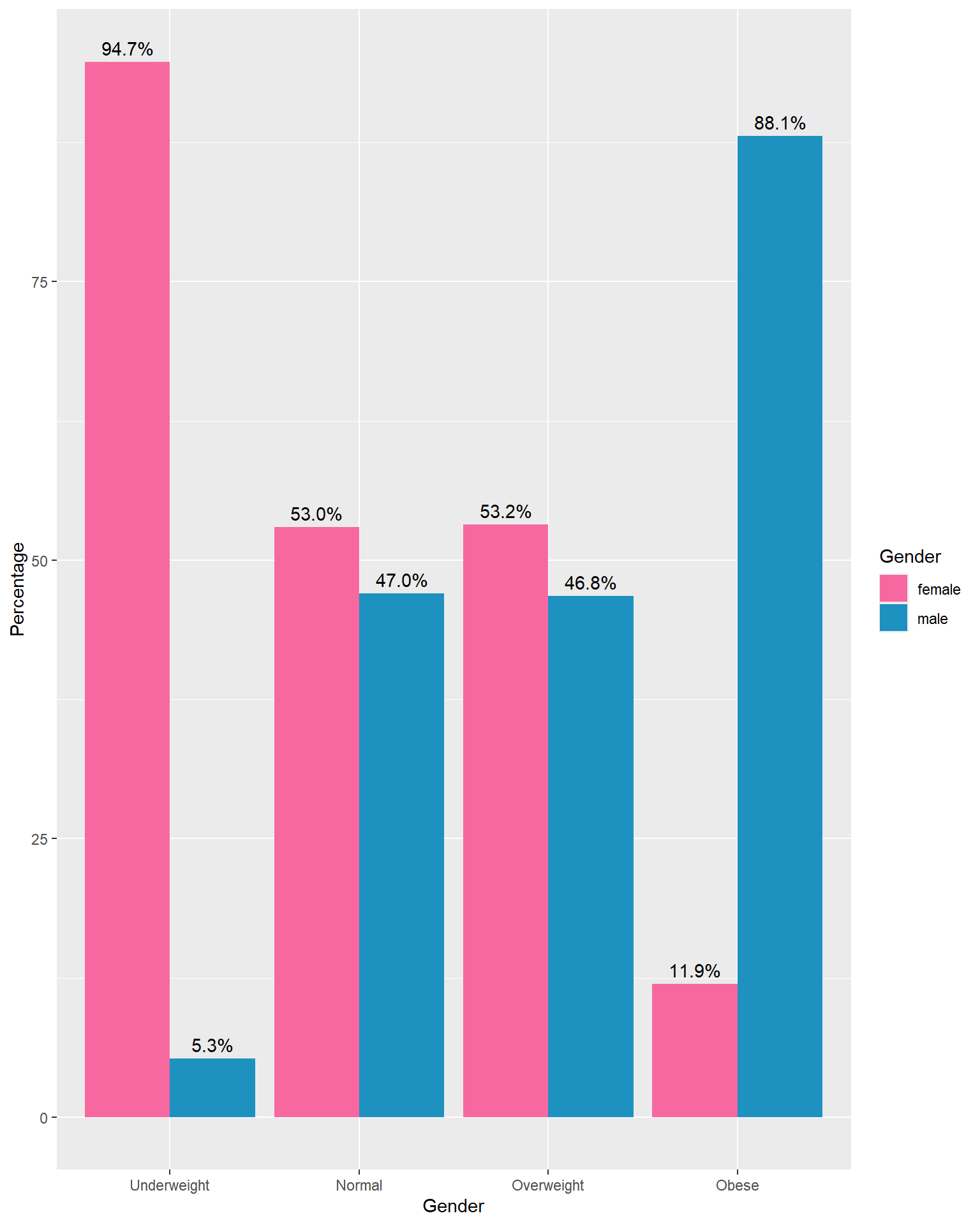
Grouped Bar Chart/ Clustered Bar Chart: With counts
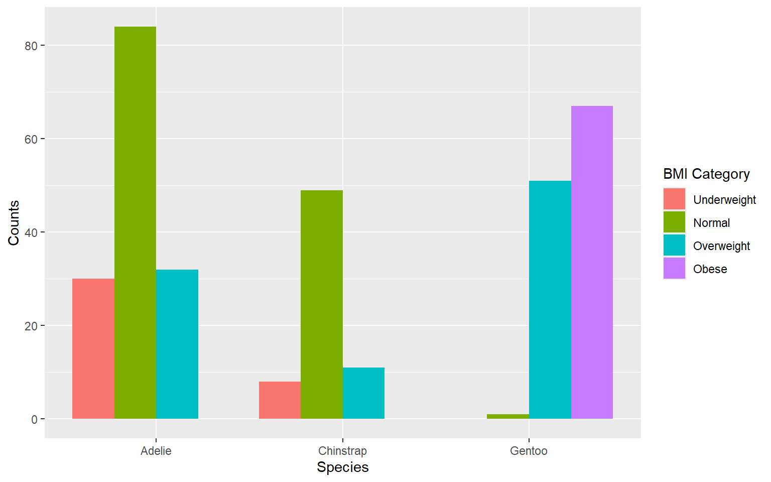
Always try to level up your plots.
Change the colour theme to emphasize the order.
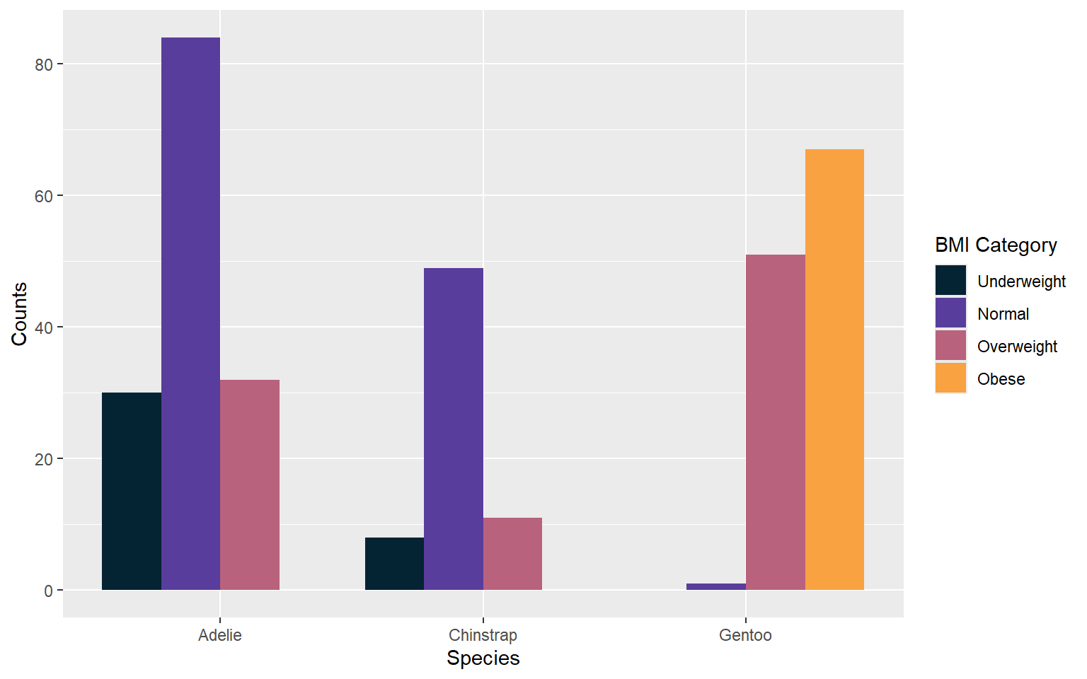
Add counts

Grouped Bar Chart/ Cluster Bar chart: With percentages
Advantages
Comparison within groups: It allows for easy comparison of values within each category group.
Comparison between groups: It also facilitates comparison between different category groups.
Disadvantages
If there are too many groups or variables, the bars can become narrow, making it difficult to read.
Complexity with many groups: With a large number of groups or variables, the chart can become crowded and hard to read.
Difficulty in showing totals: It’s not straightforward to show the total magnitude of each category since bars are grouped.
Staked Bar Chart
Stacked Bar Chart: Advantages
Allows viewers to see how totals accumulate as each category is stacked on top of one another.
Useful for comparing the total magnitude of each category across different groups or segments.
Ideal when the emphasis is on the total quantity of items in each category rather than their relative proportions.
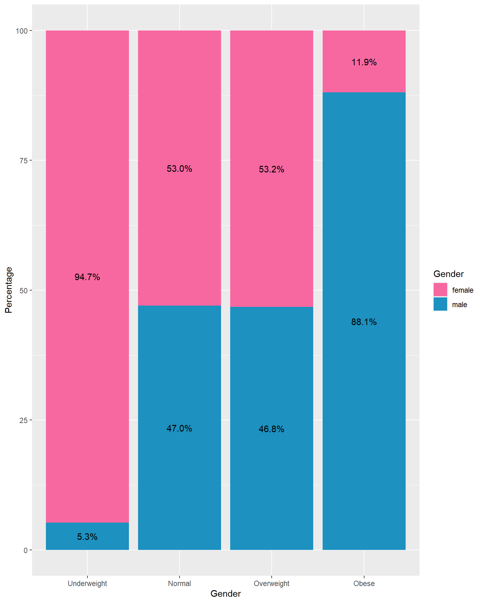
Stacked Percentage Chart
Use when you want to show the relative proportion or contribution of each category to the total.
Helpful for illustrating the distribution of percentages within categories across different groups or segments.
Suitable when you want to emphasize the composition or share of each category relative to the whole.
Stacked Bar Chart: Disadvantages
It can be challenging to compare individual segments between different groups because they are not aligned horizontally.
Small segments can be hard to interpret accurately when they are stacked on top of each other.
Counts
With percentages
You can also take the horizontal version of the bar charts as well.
With counts
With percentages
Count chart vs Percentage Cluster Bar Charts
Percentage charts: Advantages
Shows the proportion of each category relative to the whole, making it easier to understand the distribution.
Allows for fair comparisons between different groups or categories, regardless of their size.
Highlights the relative importance of different categories within each group.
Percentage charts: Disadvantages
- Doesn’t provide the raw counts, which might be necessary for understanding the actual volume or size of each category.
Count charts: Advantages
Clearly shows the frequency of each category, providing a direct understanding of the volume or size.
Useful when the actual count is crucial for decision-making.
Count charts: Disadvantages
- Difficulties arise when comparing groups, especially when their sizes differ.
Which is the best?
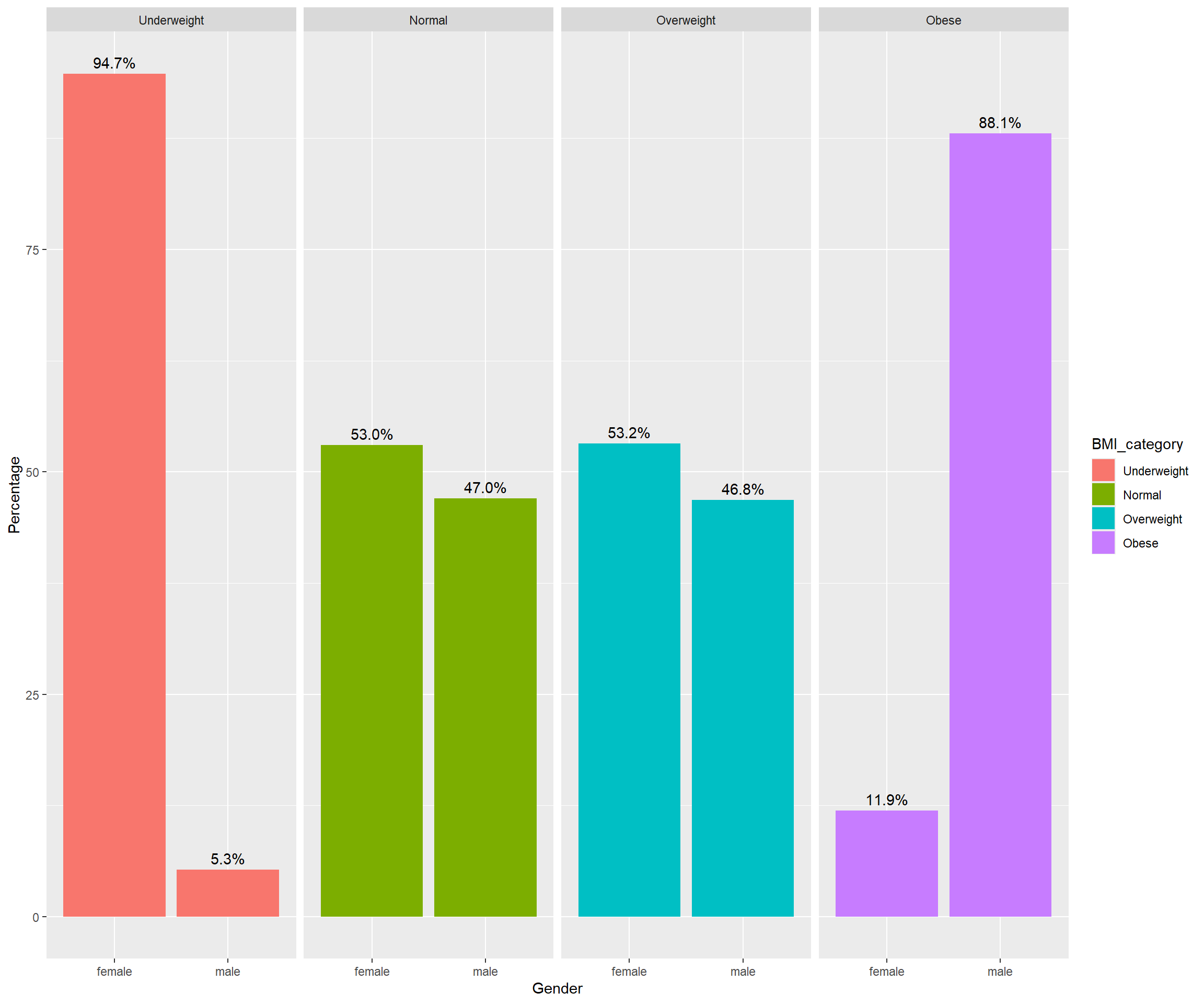
Facet Bar Chart
A facet bar chart is simply a set of bar charts that are split (or faceted) into multiple smaller plots, usually based on the values of one or more categorical variables.
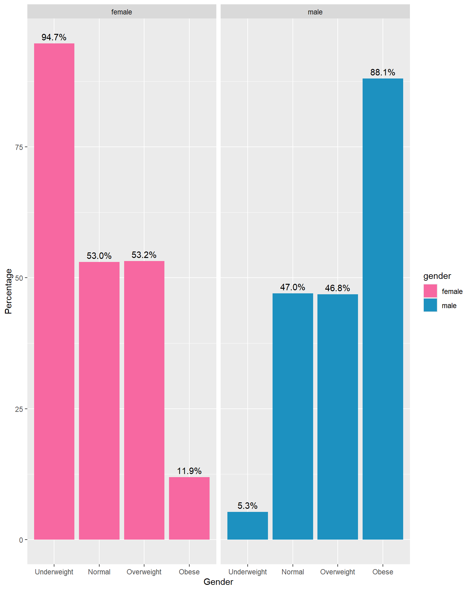
Facet by BMI Category
5.5 Quntitative data: Univariate Analysis
Graphical representations
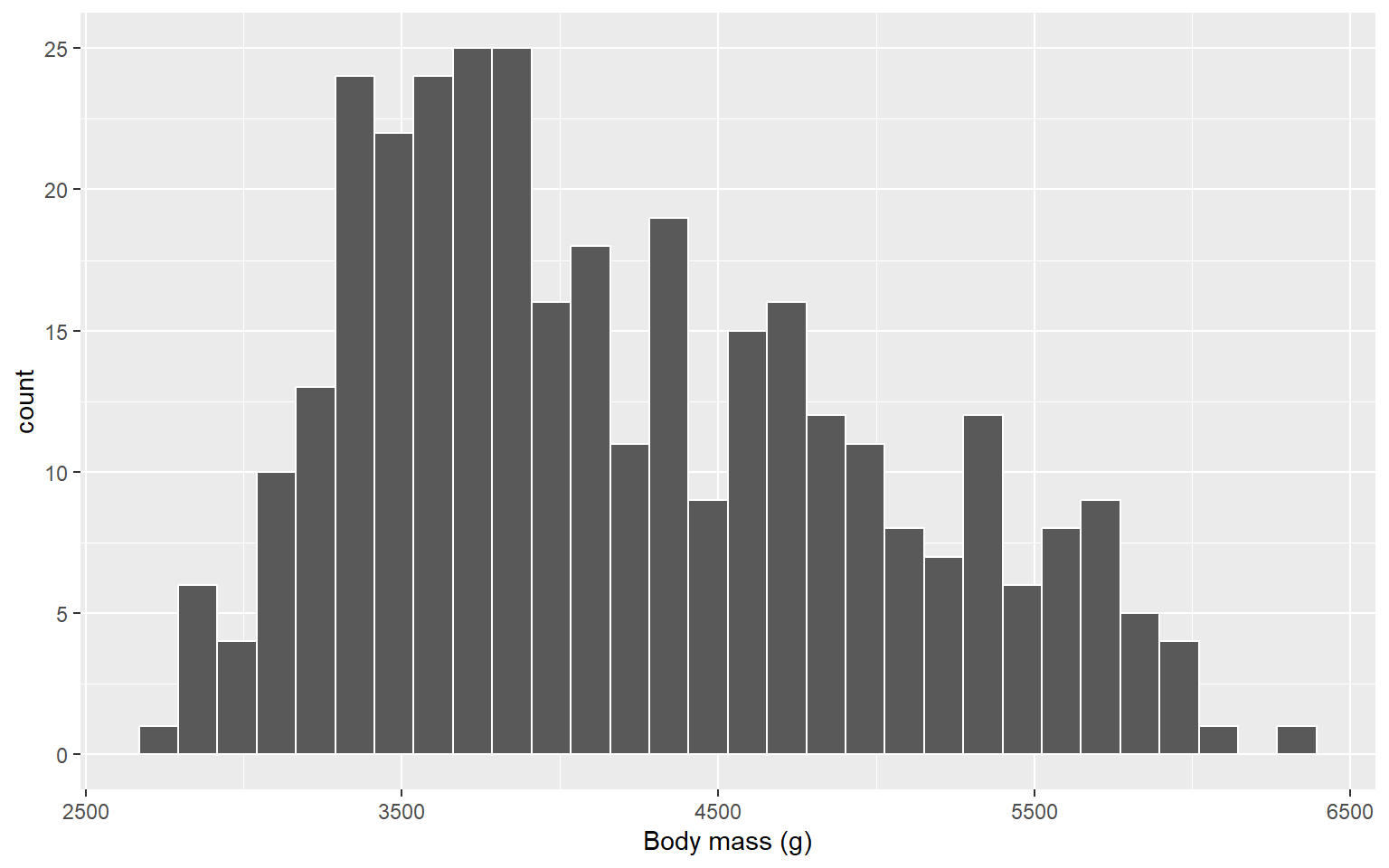
Histogram
A histogram shows the frequency distribution of a numeric variable.
The data range is divided into bins (intervals), and the height of each bar represents the number (or proportion) of observations falling in that interval.
-
Helps to identify:
Shape of distribution (normal, skewed, bimodal, etc.)
Spread of values
Outliers (indirectly, as bars may extend far out)
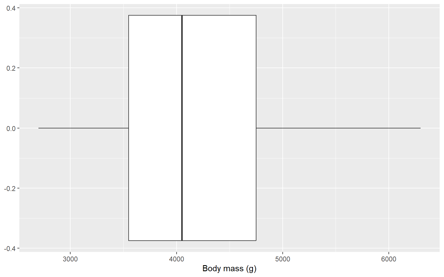
Box and Whisker Plot (or Box Plot)
summarizes the five-number summary (Q1 - 3IQR, Q1, Q2, Q3, Q3 + 3IQR)
Outliers are usually marked as individual points beyond whiskers.
5.6 Summary Measures
Measures of Central Tendency
Used to identify the center of data distribution.
It describes a whole set of data with a single value that represents the center of its distribution.
One number that best summarizes the entire set of measurement.
Measures of central tendency: mode, median, mean, weighted mean, harmonic mean, geometric mean, quadratic mean
Mode
The most frequently occurring value in a set of data.
Can be used to determine which category occurs most frequently
Example 1: Determine the mode for the following numbers.
2, 4, 8, 4, 6, 2, 7, 8, 4, 3, 8, 9, 4, 3, 10, 21, 4The mode can be determined for qualitative data as well as quantitative data.
Example 2: A group of 10 people were asked about their favorite shoe color.
Black, Blue, Brown, White, Black, Black, Black, Brown, Brown, BlackYour turn:
Compute the mode for the following numbers
Dataset 1
0.5, 0.1, 0.8, 0.8, 0.8, 0.7, 0.7, 0.7, 0.6, 0.2, 0.3, 0.1, 0.8, 0.7
Dataset 2
2, 4, 6, 8, 10, 12, 14, 16
Important facts about mode
Unimodal - only 1 mode
Bimodal - 2 modes
Multimodal - more than 2 modes
No mode: There is no mode when all observed values appear the same number of times in a data set.
Median
The middle value in an ordered array of numbers.
For an array with an odd number of observations, the median is the middle number.
For an array with an even number of observations, median is the mean of the two middle numbers.
Steps in calculating median
Arrange the data in an ordered array of numbers.
Count the number of observations. Suppose there are n number of observations.
Locate the middle value of the ordered array as follows
Median formula when n is odd
Median = (\frac{n+1}{2})^{th} \text{observation}
Median formula when n is even
Median = \frac{(\frac{n}{2})^{observation} + (\frac{n}{2} + 1)^{observation}}{2}
Your turn
Compute the median for the following numbers.
Dataset 1:
214, 215, 216, 105, 109, 8, 50, 1000, 150
Dataset 2:
2, 3, 10, 11, 50, 5, 8, 9, 10, 5
Mean (Arithmetic mean)
Population mean: \mu
Population size: N
\mu = \frac{\sum_{i=1}^Nx_i}{N}
Sample mean: \bar{x}
Sample size: n
\bar{x} = \frac{\sum_{i=1}^nx_i}{n}
Your turn
Determine the mean for the following numbers.
Q1:
214, 215, 216, 105, 109, 8, 50, 1000, 150
Q2:
2, 3, 10, 11, 50, 5, 8, 9, 10, 5
Measures of Dispersion
Range: Maximum - Minimum
Advantages
Easy measure
Easy to understand
Disadvatages
It only takes into account the maximum and the minimum value.
Highly sensitive to outliers.
Does not provide information about the spread of data between the minimum and maximum values, nor does it indicate whether the data points are clustered or evenly distributed.
Variance
Variance is the mean squared deviations from the mean.
Measure of the spread of the data around the mean.
Population Variance
\text{Population variance} = \sum_{i=1}^N \frac{(x_i-\mu)^2}{N}
N - population size
\mu - population mean
Sample Variance
\text{Sample variance} = \sum_{i=1}^n \frac{(x_i-\bar{x})^2}{n-1}
n - sample size
\bar{x} - sample mean
Advantages:
- Variance considers all data points in the dataset.
Disadvantages:
Sensitive to outliers/ extreme values.
The units of variance are the square of the units of the original data, which can make interpretation difficult. For example, if the data are in meters, the variance will be in square meters.
Variance is less intuitive to understand than other measures of dispersion like the range or interquartile range. People often find the concept of squared deviations harder to grasp.
Standard deviation
\text{Standard deviation} = \sqrt{Variance}
The variance and the standard deviation are measures of the spread of the data around the mean. They summarise how close each observed data value is to the mean value.
Standard deviation is expressed in the same units as the original values (e.g., minutes or meters)
In datasets with a small spread all values are very close to the mean, resulting in a small variance and standard deviation.
Interquartile Range (IQR)
We will talk about this after looking at measures of relative standing/ measures of noncentral location.
- Measure of dispersion
IQR = Q_3 - Q_1
Measure considers the spread in the middle 50% of the data.
Not influenced by extreme values.
Measures of relative standing/ Measures of noncentral location
Quartiles
Percentiles
Quantiles
Quantiles are descriptive measures that split the ordered data into four quarters (four equal parts).
Q1 - first (lower) quantile
Q2 - second (middle) quantile
Q3 - third (upper) quantile
First quantile
The value which 25% of the observations are smaller and 75% are larger
Q_1 = \frac{n+1}{4} \text{ ordered observation}
Second quantile
Same as median
Third quantile
The value for which 75% of the observations are smaller and 25% are larger
Q_3 = \frac{3(n+1)}{4} \text{ ordered observation}
Percentiles
- Percentiles divides a given ordered data array into 100 equal parts, it divides the complete data set into hundred groups of 1% each. There are total of 99 percentiles denoted as P1, P2, P3,…, and, P99, and they are known as 1st percentile, 2nd percentile,…., 99th percentile respectively.
first decile = 10th percentile
Q1 = 25th percentile
Q2 = 50th percentile
Q3 = 75th percentile
ninth decile = 90th percentile
Location of a percentile
The following formula allows us to approximate the location of any percentile.
L_p = (n+1)\frac{p}{100}
where L_p is the location of the p^{th} percentile.
Tabular representation
library(dplyr)
library(palmerpenguins)
library(knitr)

penguins |>
  summarise(
    Minimum     = min(body_mass_g, na.rm = TRUE),
    Q1      = quantile(body_mass_g, 0.25, na.rm = TRUE),
    Median  = median(body_mass_g, na.rm = TRUE),
    Mean    = mean(body_mass_g, na.rm = TRUE),
    Q3      = quantile(body_mass_g, 0.75, na.rm = TRUE),
    Maximum     = max(body_mass_g, na.rm = TRUE),
    SD      = sd(body_mass_g, na.rm = TRUE),
    N       = n()
  ) |>
kable(caption = "Summary statistics for Penguin Body Mass (g)")| Minimum | Q1 | Median | Mean | Q3 | Maximum | SD | N |
|---|---|---|---|---|---|---|---|
| 2700 | 3550 | 4050 | 4201.754 | 4750 | 6300 | 801.9545 | 344 |
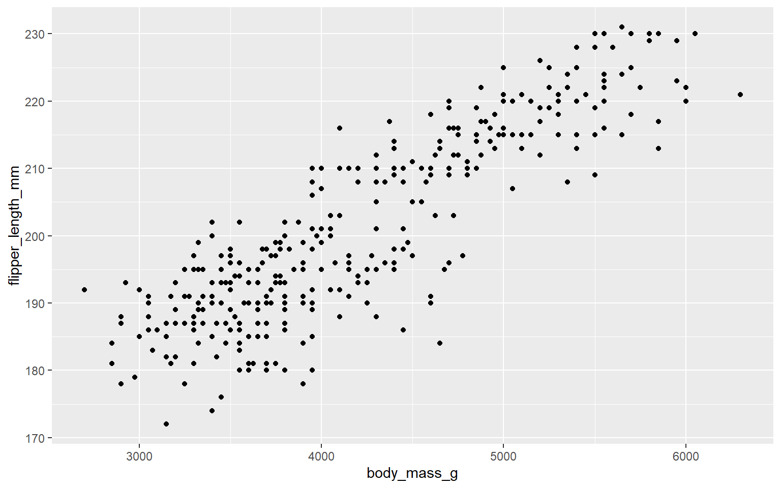
5.7 Quantitative data: Bivariate Analysis
Graphical Representation
Tabular representation
In addition to the descriptive measures we can also record the Pearson’s correlation coefficient.
In this case Pearson’s correlation coefficient is
# A tibble: 1 × 1
  correlation
        <dbl>
1       0.871
5.8 Qualitative vs Quantitative
5.9 Quantitative vs Quantitative with a Qualitative variable
5.10 Some rules
Don’t make them 3D: 3D charts can distort data and make it difficult to accurately interpret values.
Don’t use overly complex charts: Keep it simple. Overly complex charts can confuse the viewer and obscure the data.
Don’t use excessive colors: Too many colors can be distracting and make the chart hard to read. Stick to a simple color palette.
Don’t use misleading scales: Ensure the scales start at zero (when appropriate) and are consistent to avoid misrepresenting the data.
Don’t use pie charts for too many categories: Pie charts are hard to interpret with more than a few slices. Use a bar chart instead.
Don’t use inappropriate chart types: Match the chart type to the data you are presenting. For example, use line charts for trends over time and bar charts for comparing categories.
Don’t omit axis labels and titles: Always label your axes and give your chart a clear, descriptive title.
Don’t clutter with too much information: Avoid adding unnecessary elements like excessive gridlines, text, or data points.
Don’t ignore accessibility: Ensure your charts are readable for people with color blindness by using colorblind-friendly palettes and providing text alternatives.
Don’t make legends and labels too small: Ensure that legends and labels are large enough to be easily read.
Don’t use default settings without customization: Default settings might not be the best for your data. Customize your charts to improve clarity and impact.
Don’t ignore data source and context: Always provide the data source and context to help the audience understand where the data comes from and its relevance.