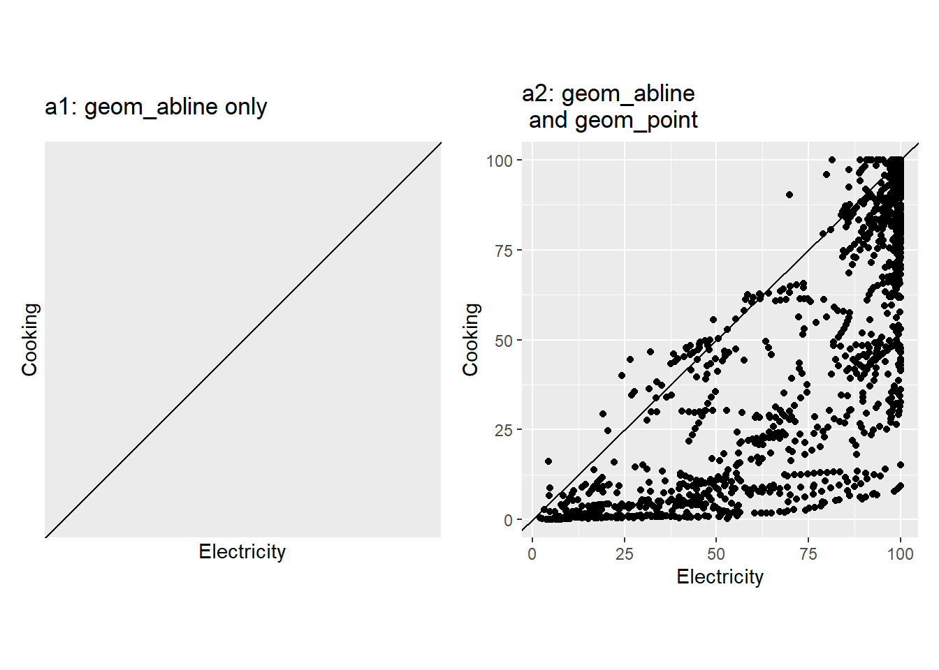
Description Draw a straight line (\(Y=mX+c\)) for a given slope (\(m\)) and intercept (\(c\)).
Understandable aesthetics
Unlike most other geoms, geom_abline does not depend on the x and y variables that we map for the main plot. geom_abline has its own independent characteristics: intercept and slope.
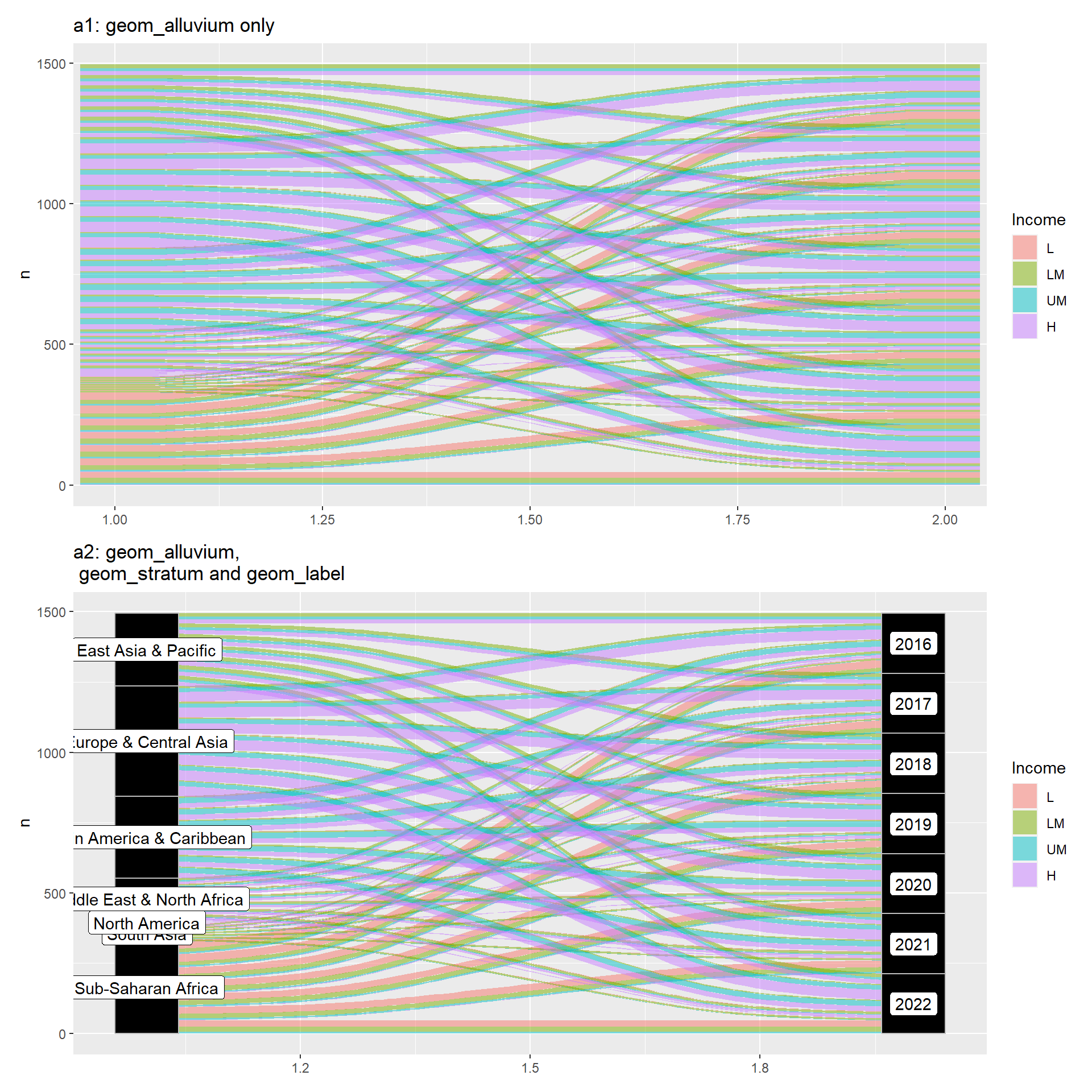
Create alluvial plot. An alluvial plot is a type of diagram that is particularly useful for visualizing categorical data and the flow or transition between different categorical variables over multiple stages or categories.
Understandable aesthetics
required aesthetics
Option 1 (See Example 1)
axis1 - First axis
axis2 - Second axis
y - Counts to determines the height/weight of the alluvium
Option 2 (alluvium time-series plot, see Example 2)
x - Time variable determining the horizontal axis
y - Determines the height/size of the flow
alluvium - According to this variable it defines the flow across the years. In our Example 2, Bangladesh and Sri Lanka.
optional aesthetics
alpha, colour, fill, linetype, size, group (group is used internally; arguments are ignored)
# A tibble: 14 × 4
# Groups:   Region, Year [4]
   Region                     Year Income     n
   <fct>                     <dbl> <fct>  <int>
 1 Latin America & Caribbean  2021 LM         5
 2 Latin America & Caribbean  2021 UM        19
 3 Latin America & Caribbean  2021 H         17
 4 Latin America & Caribbean  2022 LM         4
 5 Latin America & Caribbean  2022 UM        19
 6 Latin America & Caribbean  2022 H         18
 7 Sub-Saharan Africa         2021 L         24
 8 Sub-Saharan Africa         2021 LM        16
 9 Sub-Saharan Africa         2021 UM         6
10 Sub-Saharan Africa         2021 H          1
11 Sub-Saharan Africa         2022 L         22
12 Sub-Saharan Africa         2022 LM        18
13 Sub-Saharan Africa         2022 UM         6
14 Sub-Saharan Africa         2022 H          1
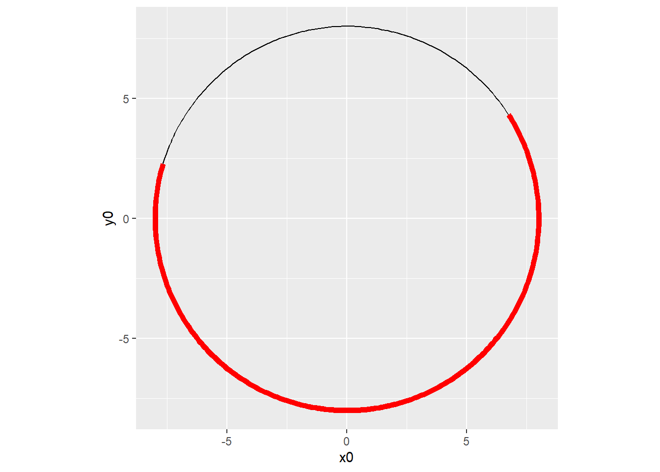
In the example below, geom_arc() is applied twice to show how the black arc forms the full circle, while the red arc highlights a specific portion of that circle.
library(ggforce)ggplot() +geom_arc(aes(x0 =0, y0 =0, r =8, start =1, end =8)) +geom_arc(aes(x0 =0, y0 =0, r =8, start =1, end =5), col ="red", size =2) +theme(aspect.ratio =1)
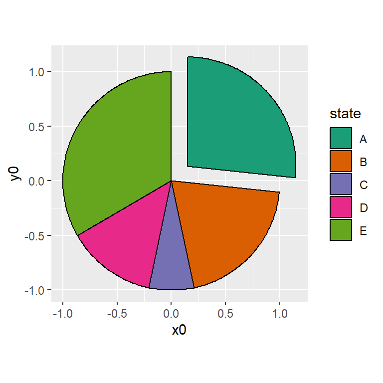
# Count observations in each Income categorydf <- worldbankdata |>filter(!is.na(Region)) |>count(Region, name ="count") |>mutate(Region = Region,focus1 =0,focus2 =c(0.2, 0, 0, 0, 0, 0, 0) )df
# A tibble: 7 × 4
  Region                     count focus1 focus2
  <fct>                      <int>  <dbl>  <dbl>
1 East Asia & Pacific         1343      0    0.2
2 Europe & Central Asia       2038      0    0
3 Latin America & Caribbean   1512      0    0
4 Middle East & North Africa   756      0    0
5 North America                108      0    0
6 South Asia                   288      0    0
7 Sub-Saharan Africa          1693      0    0
# Pie charta1 <-ggplot(df) +geom_arc_bar(aes(x0 =0, y0 =0,r0 =0, r =2,amount = count,fill = Region,explode = focus1 ), stat ="pie") +scale_fill_brewer(palette ="Dark2") +theme(aspect.ratio =1, legend.position ="bottom") +labs(fill ="Regions", title ="a1: with exploid = 0")a2 <-ggplot(df) +geom_arc_bar(aes(x0 =0, y0 =0,r0 =0, r =2,amount = count,fill = Region,explode = focus2 ), stat ="pie") +scale_fill_brewer(palette ="Dark2") +theme(aspect.ratio =1, legend.position ="bottom") +labs(fill ="Regions", title ="a2: with exploid = 0.2 for East Asia and Pacific")a1/a2
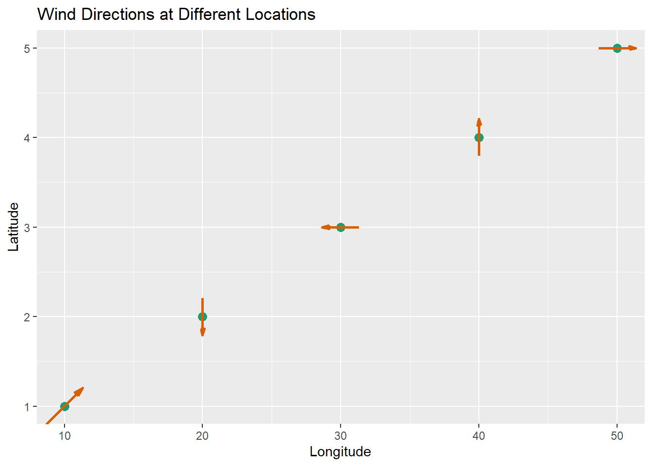
Draws directional arrows (like vectors) on a plot, which can represent directions or flows — such as wind directions, movement, or gradients. The arrow from (x, y) and pointing in the direction (dx, dy) (vector components).
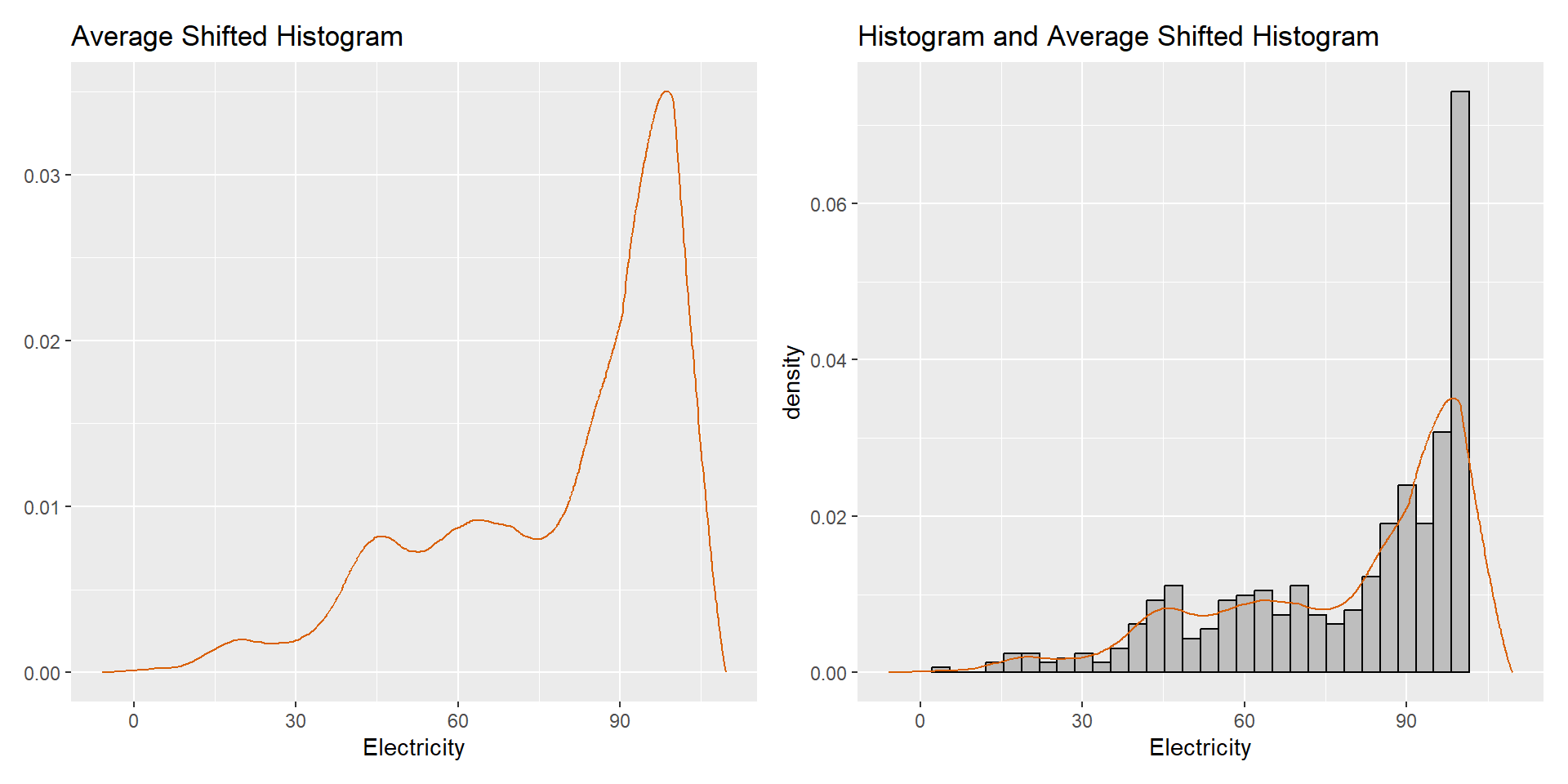
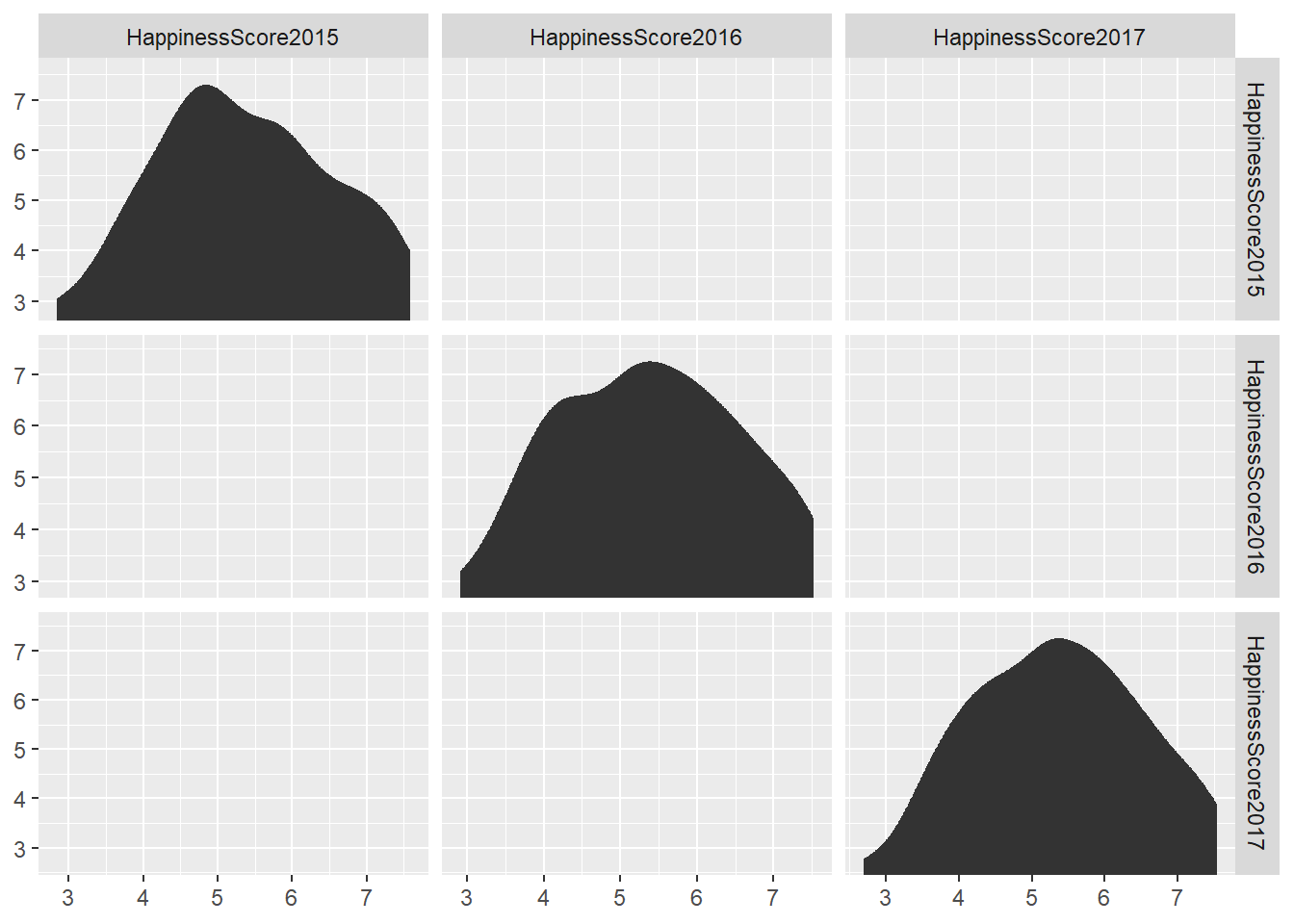
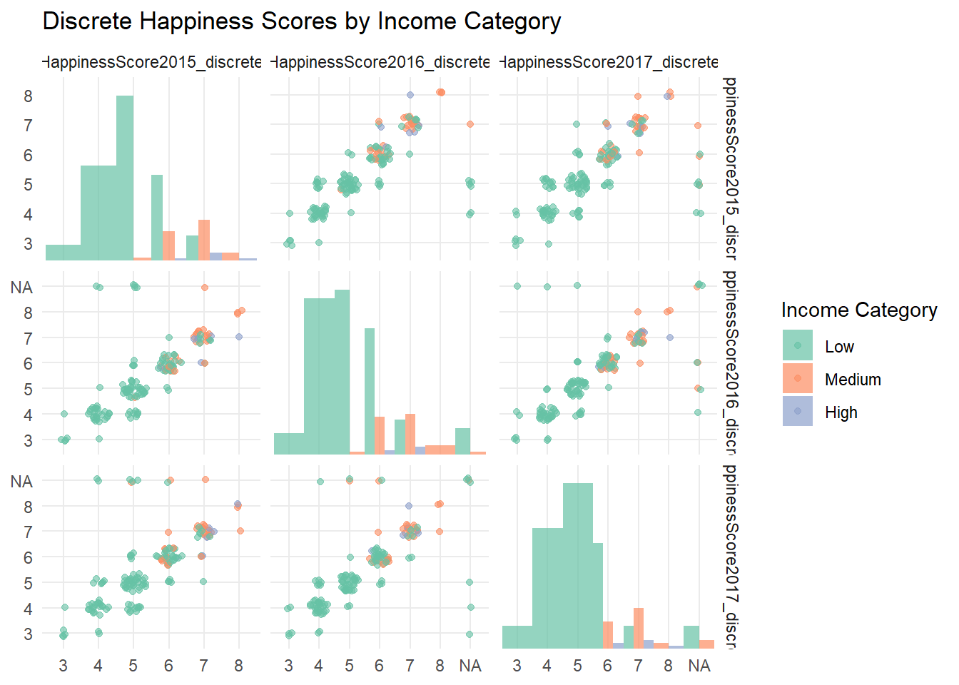
A matrix-style (commonly from GGally package) visualizations to automatically display variable distributions on diagonal panels, handling both continuous and discrete data while simplifying the mapping of panel variables.