worldbankdata |>
  filter(Year == 2021) |>
  group_by(Income) |>
  summarise(n = n()) |>
  ggplot(aes(x = Income, y = n)) +   geom_col()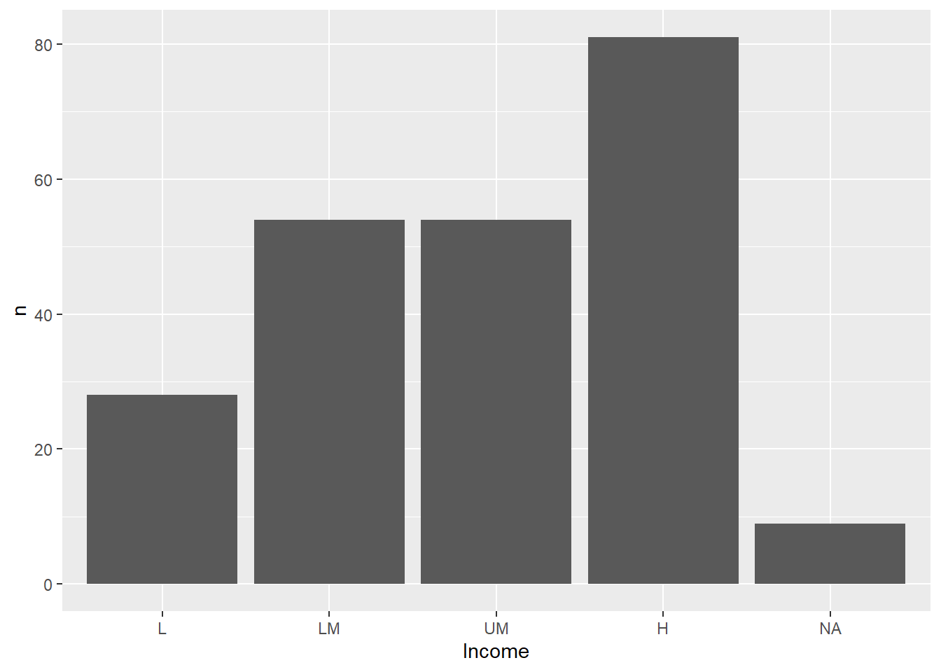
Package
ggplot2 (Wickham 2016)
Description
Create bar charts
Understandable aesthetics
Required aesthetics
x, y
Optional aesthetics
alpha, colour, fill, group, linetype, linewidth
See also
Example
worldbankdata |>
filter(Year == 2021) |>
group_by(Income) |>
summarise(n = n()) |>
ggplot(aes(x = Income, y = n)) + geom_col()
Package
ggpattern (FC, Davis, and ggplot2 authors 2023)
Description
Fill columns with a pattern. User can map a variable for pattern or set a pattern.
Understandable aesthetics
Required aesthetics
x, y
Optional aesthetics
pattern, fill, colour
See also
Example
worldbankdata |>
  filter(Year == 2021) |>
  group_by(Income) |>
  summarise(n = n()) |>
  ggplot(aes(x = Income, y = n)) +
  ggpattern::geom_col_pattern(aes(pattern = n, pattern_angle=n),
colour = 'black', fill="white") 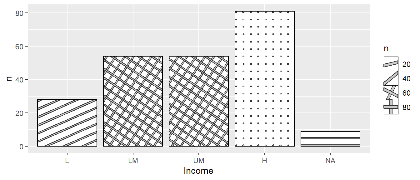
Package
ggplo2t (Wickham 2016)
Description
Counts the observations at every point on the plot, and then maps the count with the size of the point.
Understandable aesthetics
Required aesthetics
x, y
Optional aesthetics
alpha, colour, fill, group, shape, size, stroke
See also
Example
Here, both geom_point and geom_count are plotted to see the difference.
a1 <- ggplot(worldbankdata, aes(y = Cooking, x=Electricity)) +
  geom_point(alpha = 0.5) +
  labs(title = "a1: geom_point") +
  theme(aspect.ratio = 1)
a2 <- ggplot(worldbankdata, aes(y = Cooking, x=Electricity)) +
  geom_count() +
  labs(title = "a2: geom_count") +
  theme(aspect.ratio = 1)
a1 | a2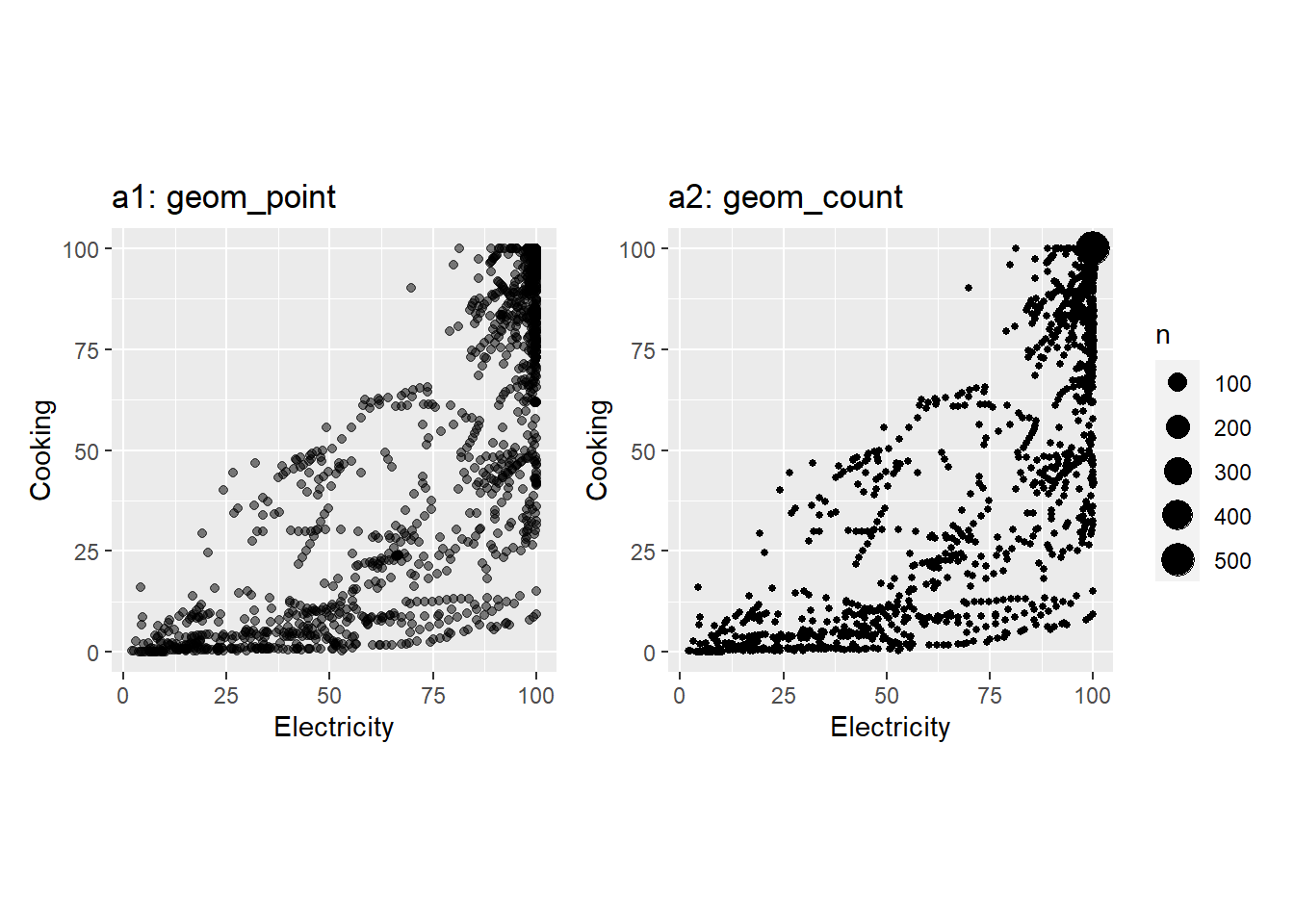
Package
ggforce (Pedersen 2022)
Description
Draw circles based on a center point and a radius.
Understandable aesthetics
required aesthetics
x0 - starting coordinate of x-axis , y0 - starting coordinate of x-axis, r - radius
optional aesthetics
color, fill, linewidth, linetype, alpha, lineend
See also
Example
worldbankdata |>
  filter(Year == 2021) |>
ggplot(aes(y = Cooking, x=Electricity, col=Income)) +
  geom_point() +
  scale_color_brewer(palette = "Dark2") +
  ggforce::geom_circle(aes(x0 = 26, y0 = 5, r = 20),
              inherit.aes = FALSE) +
    theme(aspect.ratio = 1)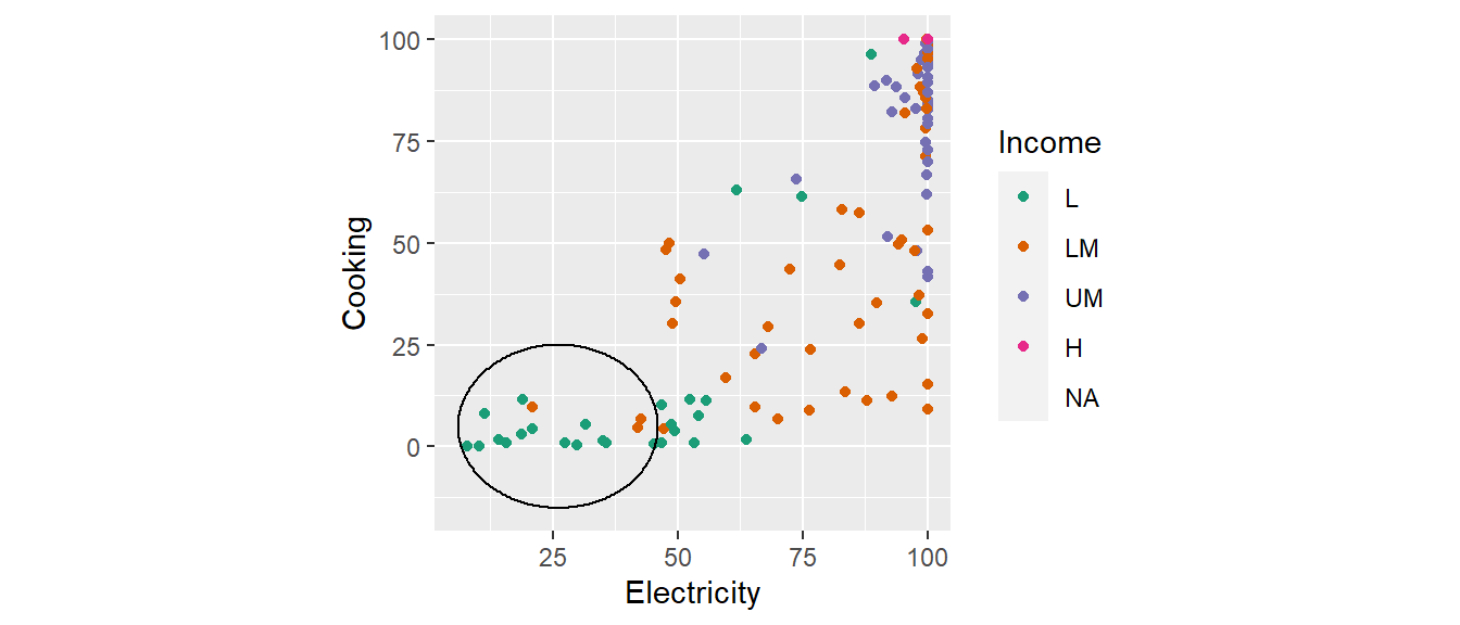
Package
ggplot2 (Wickham 2016)
Description
Create contour plots.
Understandable aesthetics
Required aesthetics
x, y
Optional aesthetics
alpha, colour, fill , group, linetype, linewidth, subgroup
See also
geom_contour_filled, geom_tile, geom_density_2d
Example
mean <- c(0.5, -0.5)
sigma <- matrix(c(1, 0.5, 0.5, 1), nrow=2)
data.grid <- expand.grid(x=seq(-3, 3, length.out=200),
                         y=seq(-3, 3, length.out=200))
df <- cbind(data.grid, prob = mvtnorm::dmvnorm(data.grid, mean=mean, sigma=sigma))
ggplot(df, aes(x=x, y=y, z=prob)) +
  geom_contour() +
  theme(aspect.ratio = 1)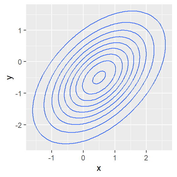
Package
ggplot2 (Wickham 2016)
Description
Create contour plots
Understandable aesthetics
x, y, alpha, colour, linetype, linewidth, group, weight
See also
geom_contour, geom_tile, geom_density_2d
Example
mean <- c(0.5, -0.5)
sigma <- matrix(c(1, 0.5, 0.5, 1), nrow=2)
data.grid <- expand.grid(x=seq(-3, 3, length.out=200),
                         y=seq(-3, 3, length.out=200))
df <- cbind(data.grid, prob = mvtnorm::dmvnorm(data.grid, mean=mean, sigma=sigma))
ggplot(df, aes(x=x, y=y, z=prob)) +
  geom_contour_filled() +
  theme(aspect.ratio = 1)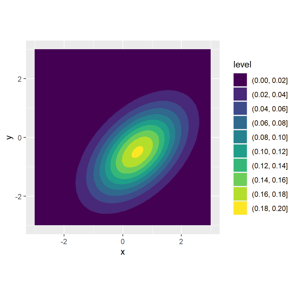
Package
ggplot2 (Wickham 2016)
Description
geom_segment() draws a straight line between between two points. geom_curve draws a curved line.
Understandable aesthetics
required aesthetics
x, y
optional aesthetics
alpha, colour, linetype, linewidth, group
The statistical transformation to use on the data for this layer
identity
See also
Examples
df <- data.frame(x1 = 0, x2 = 100, y1 = 0, y2 = 100)
ggplot(df) +
  geom_curve(aes(x = x1, y = y1, xend = x2, yend = y2))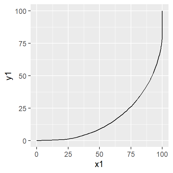
df <- data.frame(x2 = c( 3, 4, 4, 3, -3, -4, -4, -3),
                 y2 = c( 4, 3, -3, -4, -4, -3, 3, 3),
                 x1 = rep(0, 8),
                 y1 = rep(0, 8))

ggplot(df) +
  geom_curve(aes(x = x1, y = y1, xend = x2, yend = y2),
             curvature = 0.75, angle = -45,
             arrow = arrow(length = unit(0.25,"cm"))) +
  coord_equal() +
  xlim(-5, 5) + ylim(-5, 5)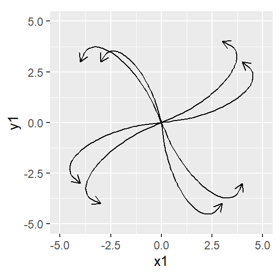
Package
ggplot2 (Wickham 2016)
Description
Plot a vertical interval defined by y, ymin and ymax or x, xmin and xmax.
Understandable aesthetics
required aesthetics
x or y
xmin or ymin
xmax or ymax
optional aesthetics
alpha, colour, linetype, linewidth, group
See also
Examples
Example 1
summarydf <- worldbankdata |>
  drop_na() |>
  select(Electricity, Income) |>
  group_by(Income) |>
  reframe(qs = quantile(Electricity, c(0.25, 0.5 ,0.75))) |>
  mutate(q=rep(c("Q1", "Q2", "Q3"), 4)) |>
  pivot_wider(names_from = q,
              values_from = qs)
summarydf
# A tibble: 4 × 4
Income Q1 Q2 Q3
<fct> <dbl> <dbl> <dbl>
1 L 16.6 32.2 50.7
2 LM 62.0 86.7 97.7
3 UM 95.9 99.5 100.0
4 H 100 100 100 ggplot(summarydf, aes(x=Income, ymin = Q1, y=Q2, ymax = Q3)) +
geom_crossbar(size=1,col="red", width = .5)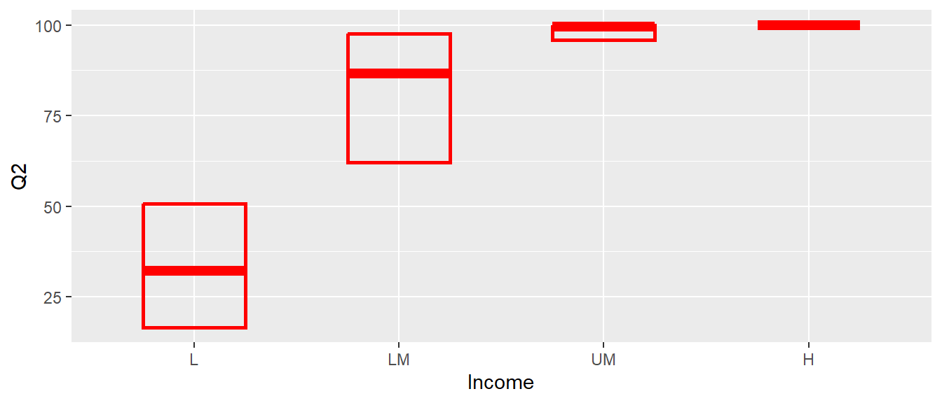
Example 2
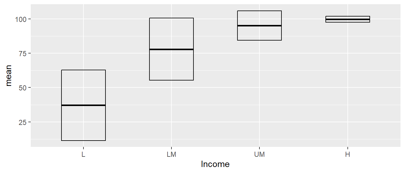
summary_stats <- worldbankdata |>
  drop_na() |>
  select(Electricity, Income) |>
  group_by(Income) |>
  reframe(mean = mean(Electricity),
          sd = sd(Electricity))
ggplot(summary_stats, aes(x = Income, y = mean, ymin = mean - sd, ymax = mean + sd)) +
  geom_crossbar(width = 0.5, fatten = 2)
Warning: The `fatten` argument of `geom_crossbar()` is deprecated as of ggplot2 4.0.0.
ℹ Please use the `middle.linewidth` argument instead.