| Variable | Description |
|---|---|
| Country | Country name |
| Region | World Bank regional classification |
| HappinessScore2015 | Happiness Score 2015 |
| GDPpercapita2015 | GDP per Capita 2015 |
| HappinessScore2016 | Happiness Score 2016 |
| GDPpercapita2016 | GDP per Capita 2016 |
| HappinessScore2017 | Happiness Score 2017 |
| GDPpercapita2017 | GDP per Capita 2017 |
| Income2015 | Income level categorization in 2015 |
| Income2016 | Income level categorization in 2016 |
| Income2017 | Income level categorization in 2017 |
Data and setting up your workflow
The goal of this chapter is to provide readers with an overview of the datasets used in the book’s examples. Having an initial understanding of the data helps readers easily navigate between the examples.
Installation of associated packages
To run the examples in the book you need to install the following packages. In addition, to this package list, the associated package corresponds to the geom should be installed. The drone package provides the datasets associated with this geom encyclopedia.
#install.packages(drone)
#install.packages("devtools")
devtools::install_github("thiyangt/drone")
install.packages(tidyverse)
install.packages(patchwork)
Data set use in the geom Encyclopedia
The datasets used in the book coming from country-wise statistics obtained from public reliable websites. Only two datasets are used to explain all geoms so that readers can build intuition by seeing the same data represented in multiple ways. The reasons for using these datasets are:
The dataset context is familiar and easily understood by individuals from diverse backgrounds.
Ability to create cross-sectional, time-series, spatial, and spatio-temporal visualizations.
Ability to visualize relationships between qualitative–qualitative, qualitative–quantitative, and quantitative–quantitative variables.
Experience addressing common data challenges such as missing values, overplotting, and large-scale datasets.
Why two datasets?
Different visualizations often require datasets to be in specific formats depending on the purpose of analysis or presentation. In this context, one dataset is organized in the long (tidy) format, while another is arranged in the wide format. The happiness_gdp_income dataset has time values spread across multiple columns, making it suitable for wide-format representation. In contrast, the worldbankdata dataset stores time in a single column, following the long-format structure. It is important to note that these datasets are not simply the reverse of each other; each format serves a distinct analytical or visualization purpose.
Dataset 1: happiness_gdp_income
The dataset is obtained from World Population Review report (World Population Review (n.d.)). Happiness score and GDP per Capita are accessed Chotchaeva (2017) via the link. Income level data are accessed from the World Bank Data Catalogue World Bank (2026b) via the link on 11 February 2026.
The variable description is given in Table tbl-WorldHappinessScore.
The first few rows of the dataset is shown below
library(drone)
head(happiness_gdp_income)
Country Region HappinessScore2015 GDPpercapita2015
1 Switzerland Western Europe 7.587 1.39651
2 Iceland Western Europe 7.561 1.30232
3 Denmark Western Europe 7.527 1.32548
4 Norway Western Europe 7.522 1.45900
5 Canada North America 7.427 1.32629
6 Finland Western Europe 7.406 1.29025
HappinessScore2016 GDPpercapita2016 HappinessScore2017 GDPpercapita2017
1 7.509 7.590 7.494 1.564980
2 7.501 7.669 7.504 1.480633
3 7.526 7.592 7.522 1.482383
4 7.498 7.575 7.537 1.616463
5 7.404 7.473 7.316 1.479204
6 7.413 7.475 7.469 1.443572
Income2015 Income2016 Income2017
1 High income High income High income
2 High income High income High income
3 High income High income High income
4 High income High income High income
5 High income High income High income
6 High income High income High incomehappiness_gdp_income: Data Profiling
Table tbl-hp provides a compact summary of the dataset.There are 5 variables. Among the 2 are character variables and 3 are numeric variables. Summary of both character variables and numeric variables are given in the output. For character variables,
n_missing tells how many values are missing for each variable.
complete_rate is the proportion of non-missing values.
n_unique is the number of unique values in the variable.
For numeric variables Table tbl-hp shows mean, sd (standard deviation), p0 (min), percentiles: p25, p50 (median), p75, p100 (max), and a small histogram for each numeric variable.
| Name | happiness_gdp_income |
| Number of rows | 158 |
| Number of columns | 11 |
| _______________________ | |
| Column type frequency: | |
| character | 2 |
| factor | 3 |
| numeric | 6 |
| ________________________ | |
| Group variables | None |
Variable type: character
| skim_variable | n_missing | complete_rate | min | max | empty | n_unique | whitespace |
|---|---|---|---|---|---|---|---|
| Country | 0 | 1 | 4 | 24 | 0 | 158 | 0 |
| Region | 0 | 1 | 12 | 31 | 0 | 10 | 0 |
Variable type: factor
| skim_variable | n_missing | complete_rate | ordered | n_unique | top_counts |
|---|---|---|---|---|---|
| Income2015 | 23 | 0.85 | FALSE | 4 | Hig: 44, Upp: 36, Low: 31, Low: 24 |
| Income2016 | 23 | 0.85 | FALSE | 4 | Hig: 43, Upp: 36, Low: 32, Low: 24 |
| Income2017 | 23 | 0.85 | FALSE | 4 | Hig: 42, Low: 35, Upp: 34, Low: 24 |
Variable type: numeric
| skim_variable | n_missing | complete_rate | mean | sd | p0 | p25 | p50 | p75 | p100 | hist |
|---|---|---|---|---|---|---|---|---|---|---|
| HappinessScore2015 | 0 | 1.00 | 5.38 | 1.15 | 2.84 | 4.53 | 5.23 | 6.24 | 7.59 | ▂▇▇▇▆ |
| GDPpercapita2015 | 0 | 1.00 | 0.85 | 0.40 | 0.00 | 0.55 | 0.91 | 1.16 | 1.69 | ▃▅▆▇▂ |
| HappinessScore2016 | 7 | 0.96 | 5.38 | 1.15 | 2.90 | 4.40 | 5.31 | 6.30 | 7.53 | ▂▆▇▇▅ |
| GDPpercapita2016 | 7 | 0.96 | 5.48 | 1.14 | 3.08 | 4.46 | 5.42 | 6.43 | 7.67 | ▃▆▇▇▅ |
| HappinessScore2017 | 9 | 0.94 | 5.36 | 1.14 | 2.69 | 4.50 | 5.28 | 6.11 | 7.54 | ▂▆▇▇▅ |
| GDPpercapita2017 | 9 | 0.94 | 0.99 | 0.41 | 0.00 | 0.67 | 1.07 | 1.32 | 1.87 | ▂▅▆▇▂ |
happiness_gdp_income: Data Quality Analysis
Figure fig-happy2 shows the types of variables we have in the dataset and missing value distribution.
library(tidyverse)
library(visdat)
vis_dat(happiness_gdp_income) +
  scale_fill_brewer(palette = "Dark2")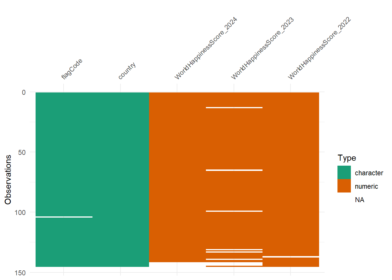
Figure fig-happy3 shows combination-wise missing values in the dataset happiness_gdp_income. There are 6 observations where only WorldHapinessScore_2023 missing and there are 3 observations where both WorldHapinessScore_2023 and WorldHapinessScore_2024 missing.
library(naniar)
gg_miss_upset(happiness_gdp_income) 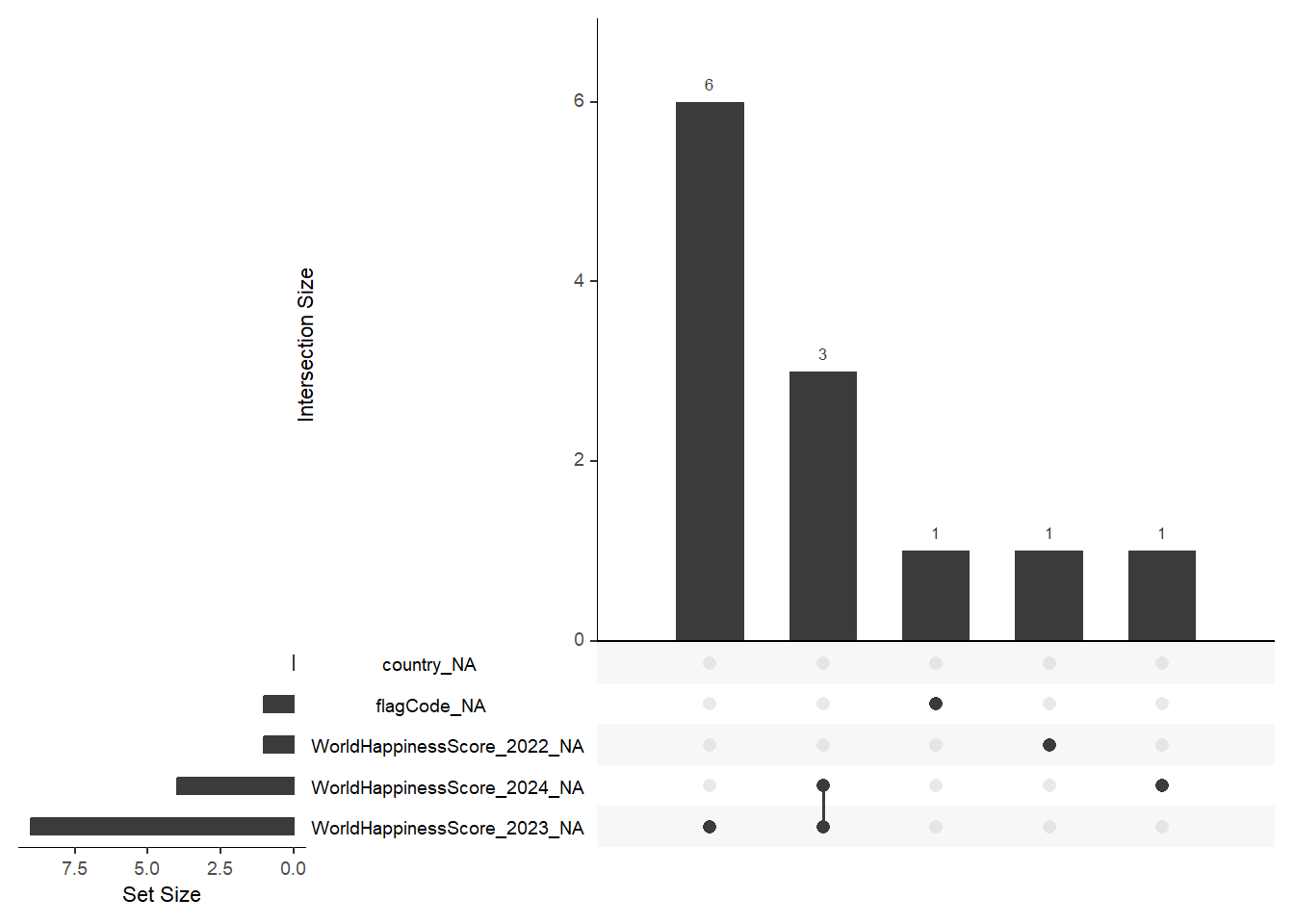
Dataset 2: worldbankdata
This dataset provides country-level development indicators compiled from the World Bank Data Catalogue (World Bank (2026a)). It includes information on access to clean cooking fuels, access to electricity, income group classification, and regional grouping across multiple years.
The variable description is given in Table tbl-worldbankdata.
| Variable | Description |
|---|---|
| Country | Country name |
| Code | ISO country code |
| Region | World Bank regional classification |
| Year | Year of observation |
| Cooking | Access to clean fuels and technologies for cooking (percentage of population). |
| Electricity | Access to electricity (percentage of population). |
| Income | Income group classification: L = Low income, LM = Lower middle income, UM = Upper middle income, HI = High income. |
To view the dataset use the following code.
library(drone)
library(tibble)
data(worldbankdata)
worldbankdata
# A tibble: 7,937 × 7
Country Code Region Year Cooking Electricity Income
<fct> <fct> <fct> <dbl> <dbl> <dbl> <fct>
1 Aruba ABW Latin America & Caribbean 1990 NA 100 H
2 Aruba ABW Latin America & Caribbean 2000 NA 91.7 H
3 Aruba ABW Latin America & Caribbean 2013 NA 100 H
4 Aruba ABW Latin America & Caribbean 2014 NA 100 H
5 Aruba ABW Latin America & Caribbean 2015 NA 100 H
6 Aruba ABW Latin America & Caribbean 2016 NA 100 H
7 Aruba ABW Latin America & Caribbean 2017 NA 100 H
8 Aruba ABW Latin America & Caribbean 2018 NA 100 H
9 Aruba ABW Latin America & Caribbean 2019 NA 100 H
10 Aruba ABW Latin America & Caribbean 2020 NA 100 H
# ℹ 7,927 more rowsworldbankdata: Data Profiling
Table tbl-worldbankdatasummary provides a compact summary of the dataset. The dataset contains 7 variables. Among them, 4 variables are factor variables and 3 variables are numeric variables. In addtion, Table tbl-worldbankdatasummary shows a comprehensive overview of your dataset, showing both the distribution of categorical variables and the summary statistics for numeric variables, including missing values and frequency counts.
| Name | worldbankdata |
| Number of rows | 7937 |
| Number of columns | 7 |
| _______________________ | |
| Column type frequency: | |
| factor | 4 |
| numeric | 3 |
| ________________________ | |
| Group variables | None |
Variable type: factor
| skim_variable | n_missing | complete_rate | ordered | n_unique | top_counts |
|---|---|---|---|---|---|
| Country | 0 | 1.00 | FALSE | 227 | Afg: 36, Alb: 36, Alg: 36, Ame: 36 |
| Code | 0 | 1.00 | FALSE | 218 | CIV: 48, CUW: 47, CZE: 47, FRO: 47 |
| Region | 199 | 0.97 | FALSE | 7 | Eur: 2038, Sub: 1693, Lat: 1512, Eas: 1343 |
| Income | 559 | 0.93 | FALSE | 4 | H: 2177, LM: 1978, L: 1704, UM: 1519 |
Variable type: numeric
| skim_variable | n_missing | complete_rate | mean | sd | p0 | p25 | p50 | p75 | p100 | hist |
|---|---|---|---|---|---|---|---|---|---|---|
| Year | 1 | 1.00 | 2004.59 | 10.41 | 1987.00 | 1996.00 | 2005.00 | 2014 | 2022 | ▇▇▇▇▇ |
| Cooking | 6047 | 0.24 | 65.48 | 38.46 | 0.00 | 27.30 | 84.75 | 100 | 100 | ▃▁▁▁▇ |
| Electricity | 5693 | 0.28 | 84.40 | 26.45 | 2.11 | 79.86 | 99.80 | 100 | 100 | ▁▁▁▁▇ |
worldbankdata: Data Quality Analysis
worldbankdata dataset contains some missing values. Figure fig-miss shows the distribution of types of variables and missing value distribution.
library(tidyverse)
library(visdat)
vis_dat(worldbankdata) +
  scale_fill_brewer(palette = "Dark2")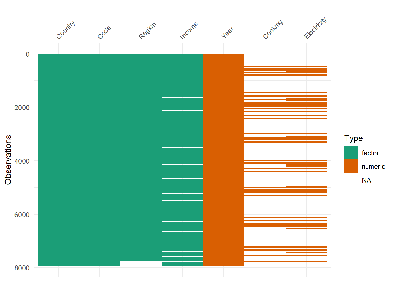
Figure fig-miss2 shows combinations of missingness across cases. This is especially useful for understanding patterns of missingness across variables. For example, there are 5122 rows where both Electricity and Cooking variable missing.
library(naniar)
gg_miss_upset(worldbankdata) 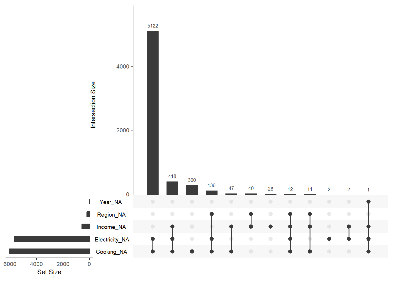
Chotchaeva, Karina. 2017. “World Happiness Report.” Zenodo. https://doi.org/10.5281/zenodo.1470906.
World Bank. 2026a. “GNI Per Capita: Operational Guidelines & Analytical Classifications.” https://datacatalog.worldbank.org/.
———. 2026b. “World Development Indicators.” https://datacatalog.worldbank.org/search/dataset/0037712/world-development-indicators.
World Population Review. n.d. “Happiest Countries in the World.” https://worldpopulationreview.com/country-rankings/happiest-countries-in-the-world.