geom_point
Description
Visualize observations using points
Understandable aesthetics
required aesthetics
x
y
optional aesthetics
alpha, colour, group, linetype, linewidth
**See also88
geom_jitter
**Example88
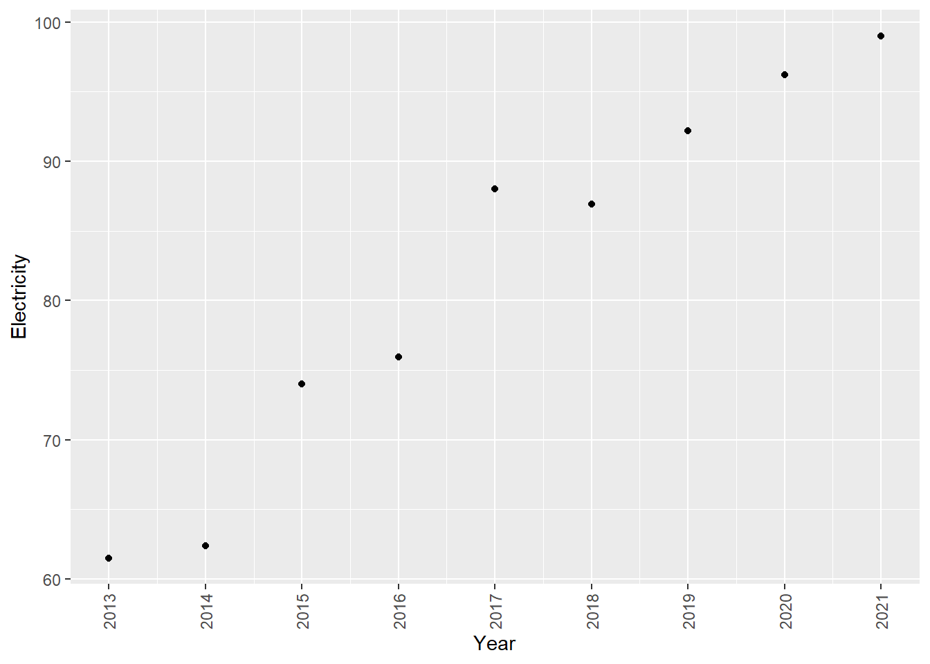
worldbankdata |>
  filter(Country == "Bangladesh") |>
  filter(Year >= 2013 & Year <= 2021) |>
  ggplot(aes(x=Year, y=Electricity)) +
  geom_point() +
  theme(axis.text.x = element_text(angle = 90, vjust = 0.5, hjust=1)) +
  scale_x_continuous(breaks = 2013:2021)
geom_path
Package
ggplot2 (Wickham 2016)
Description
Connects the observations in the order in which they appear in the dataset.
Understandable aesthetics
required aesthetics
x
y
optional aesthetics
alpha, colour, group, linetype, linewidth
See also
geom_line
Example
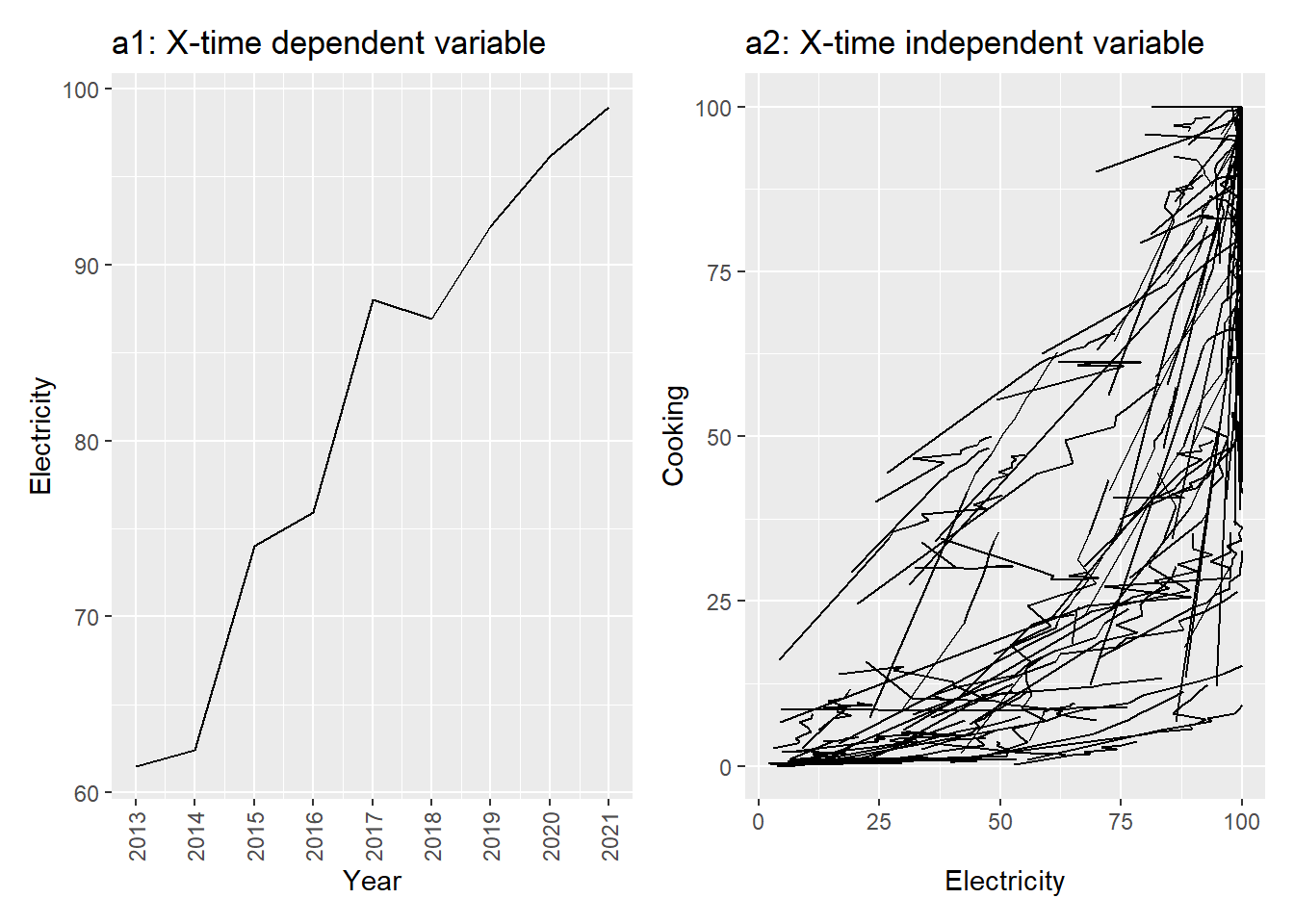
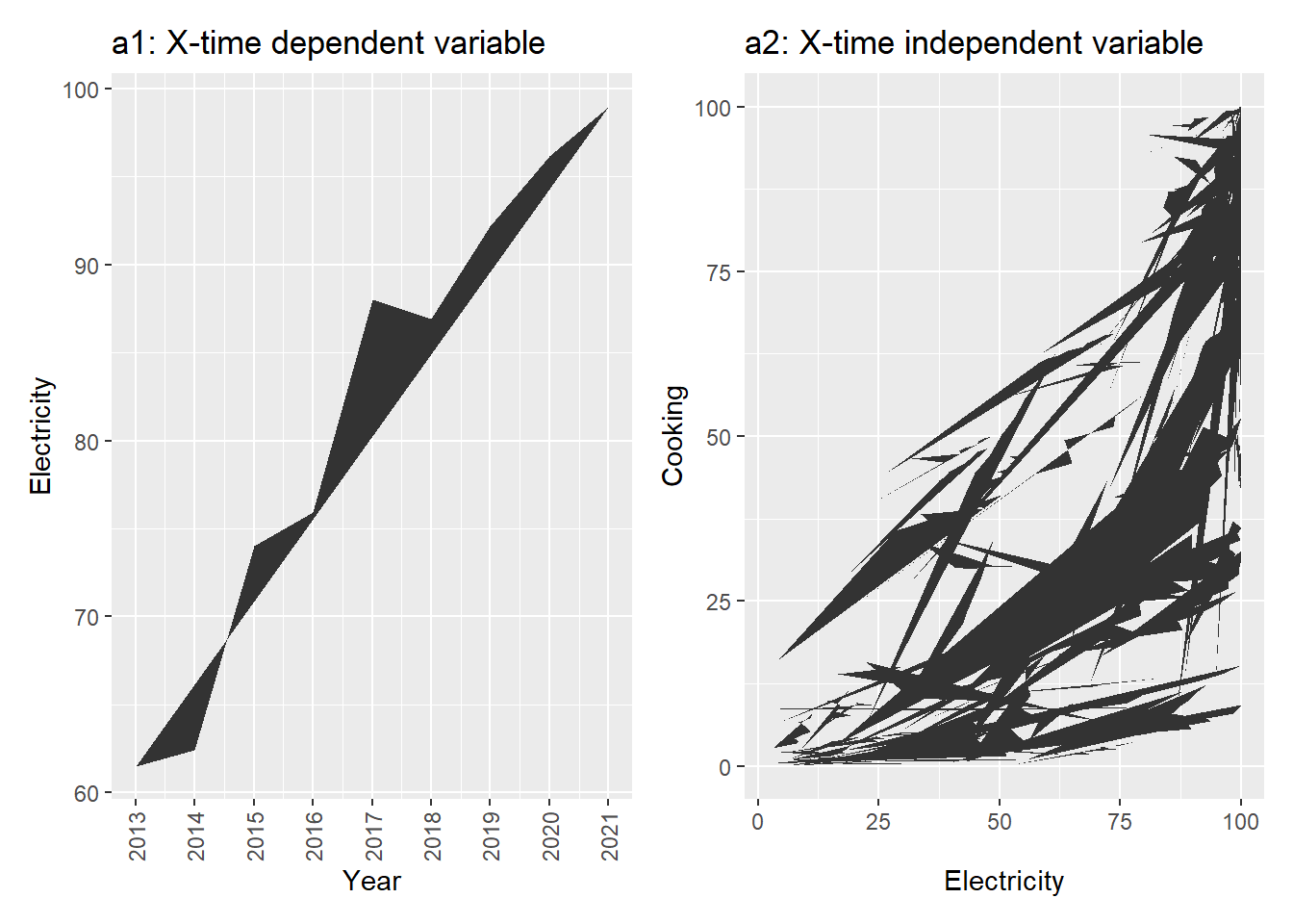
a1 <- worldbankdata |>
  filter(Country == "Bangladesh") |>
  filter(Year >= 2013 & Year <= 2021) |>
  ggplot(aes(x=Year, y=Electricity)) +
  geom_path() +
  theme(axis.text.x = element_text(angle = 90, vjust = 0.5, hjust=1)) +
  scale_x_continuous(breaks = 2013:2021)  +
  ggtitle("a1: X-time dependent variable")
a2 <- worldbankdata |>
  ggplot(aes(x=Electricity, y=Cooking)) +
  geom_path() + ggtitle("a2: X-time independent variable")
a1|a2
geom_pointrange
Package
ggplot2 (Wickham 2016)
Description
Representing a vertical interval defined by ymin, ymax and point represent by y for different levels of x.
Understandable aesthetics
required aesthetics
x or y,
ymin or xmin,
ymax or xmax
optional aesthetics
alpha, colour, group, linetype, linewidth
See also
geom_line, geom_crossbar, geom_errorbar, geom_linerange
Example
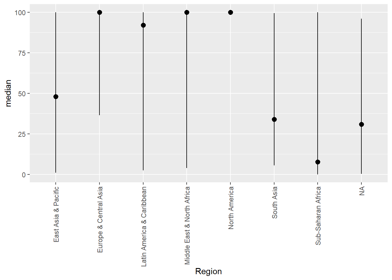
Method 1
worldbankdata |>
  group_by(Region) |>
  summarise(min = min(Cooking, na.rm = TRUE), max=max(Cooking,
                                                      na.rm = TRUE),
            median = median(Cooking, na.rm=TRUE)) |>
  ggplot(aes(x = Region, y = median, ymin = min, ymax = max)) +
  geom_pointrange() +
  theme(axis.text.x = element_text(angle = 90, vjust = 0.5, hjust=1))
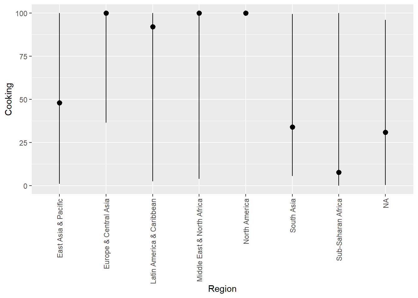
Method 2
ggplot(data = worldbankdata) +
  geom_pointrange(
    mapping = aes(x = Region, y = Cooking),
    stat = "summary",
    fun.min = min,
    fun.max = max,
    fun = median
  ) +
  theme(axis.text.x = element_text(angle = 90, vjust = 0.5, hjust=1))
Warning: Removed 6047 rows containing non-finite outside the scale range
(`stat_summary()`).
geom_polygon
Package
ggplot2 (Wickham 2016)
Description
Create polygon given x and y values. This is similar to paths except that the start an end points are connected.
Understandable aesthetics
required aesthetics
x,
y
optional aesthetics
alpha, colour, fill, group, linetype, linewidth, subgroup
See also
geom_path
Example
a1 <- worldbankdata |>
  filter(Country == "Bangladesh") |>
  filter(Year >= 2013 & Year <= 2021) |>
  ggplot(aes(x=Year, y=Electricity)) +
  geom_polygon() +
  theme(axis.text.x = element_text(angle = 90, vjust = 0.5, hjust=1)) +
  scale_x_continuous(breaks = 2013:2021)  +
  ggtitle("a1: X-time dependent variable")
a2 <- worldbankdata |>
  ggplot(aes(x=Electricity, y=Cooking)) +
  geom_polygon() + ggtitle("a2: X-time independent variable")
a1|a2
geom_polygon_pattern
Package
ggpattern (FC, Davis, and ggplot2 authors 2023)
Description
Fill polygons with pattern
Understandable aesthetics
required aesthetics
x or y,
optional aesthetics
alpha, colour, fill, group, linetype, linewidth, subgroup, pattern_fill, pattern_fill_colour, pattern
See also
geom_polygon
Example
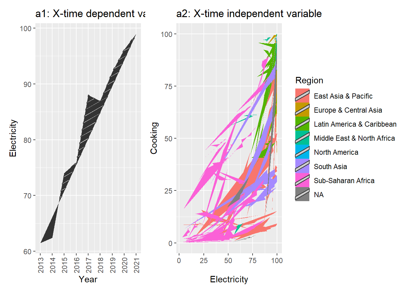
a1 <- worldbankdata |>
  filter(Country == "Bangladesh") |>
  filter(Year >= 2013 & Year <= 2021) |>
  ggplot(aes(x=Year, y=Electricity)) +
  geom_polygon_pattern() +
  theme(axis.text.x = element_text(angle = 90, vjust = 0.5, hjust=1)) +
  scale_x_continuous(breaks = 2013:2021)  +
  ggtitle("a1: X-time dependent variable")
a2 <- worldbankdata |>
  ggplot(aes(x=Electricity, y=Cooking)) +
  geom_polygon_pattern(aes(fill=Region)) +
  ggtitle("a2: X-time independent variable")
a1|a2
FC, Mike, Trevor L Davis, and ggplot2 authors. 2023. Ggpattern: ’Ggplot2’ Pattern Geoms.
Wickham, Hadley. 2016.
Ggplot2: Elegant Graphics for Data Analysis. Springer-Verlag New York.
https://ggplot2.tidyverse.org.