geom_vline
Package
ggplot2 (Wickham 2016 )
Description
Draw a verticle line at the specified intercept.
Understandable aesthetics
required aesthetics
xintercept
optional aesthetics
alpha, colour, group, linetype, linewidth
See also
geom_abline , geom_hline
Example
<- ggplot (worldbankdata, aes (y = Cooking, x = Electricity)) + geom_vline (xintercept = 50 ) + labs (title = "a1: geom_vline only" ) + theme (aspect.ratio = 1 )<- ggplot (worldbankdata, aes (y = Cooking, x = Electricity)) + geom_vline (xintercept = 50 ) + geom_point () + labs (title = "a2: geom_vline \n and geom_point" ) + theme (aspect.ratio = 1 )| a2
geom_vridgeline
Package
ggridges (Wilke 2023 )
Description
Plots the sum of the x and width aesthetics versus y, filling the area between x and x + width with a color.
Understandable aesthetics
required aesthetics
x
y
optional aesthetics
width, group, scale, min_width, color, fill, alpha, linetype, linewidth
See also
geom_boxplot , geom_ribbon
Example
library (ggridges)|> filter (Income %in% c ("L" , "UM" , "H" )) |> ggplot (aes (x = Income, y = Cooking, width = after_stat (density), fill = Income)) + geom_vridgeline (stat = "ydensity" , trim = FALSE , alpha = 0.85 , scale = 2 ) + labs (title = "Ridgeline of Cooking Fuel by Income Group" )
geom_voronoi
Package
ggvoronoi (Garrett, Nar, and Fisher 2024 )
Description
A Voronoi diagram is a way to divide space based on proximity to a set of points. Think of it as creating territories around each point, where every location in a territory is closer to that point than any other.
Understandable aesthetics
required aesthetics
x
y
optional aesthetics
width, group, scale, min_width, color, fill, alpha, linetype, linewidth
See also
geom_point , geom_ribbon
Example
#remotes::install_github("garretrc/ggvoronoi", dependencies = TRUE, build_opts = c("--no-resave-data")) library (ggplot2)library (ggvoronoi)# 1. Create a data frame with province names and centroid coordinates <- data.frame (Province = c ("Western" , "Central" , "Southern" , "Northern" , "Eastern" , "North Western" , "North Central" , "Uva" , "Sabaragamuwa" ),lon = c (79.95 , 80.63 , 80.22 , 80.38 , 81.05 , 79.95 , 80.65 , 81.0 , 80.35 ),lat = c (6.90 , 7.30 , 6.05 , 9.65 , 7.85 , 7.75 , 8.35 , 6.85 , 6.75 )# 2. Define a bounding box outline (roughly Sri Lanka coordinates) <- data.frame (x = c (79.6 , 82.0 , 82.0 , 79.6 ),y = c (5.8 , 5.8 , 10.0 , 10.0 )# 3. Plot Voronoi diagram ggplot (province_points, aes (x = lon, y = lat)) + geom_voronoi (aes (fill = Province), outline = outline) + geom_point (color = "black" , size = 2 ) + geom_text (aes (label = Province), size = 3 , vjust = - 1 ) + coord_equal () + labs (title = "Voronoi Diagram of Sri Lanka Provinces" )
geom_violin
Package
ggplot2 (Wickham 2016 )
Description
Creates violin plot.
Understandable aesthetics
required aesthetics
x
y
optional aesthetics
alpha, colour, group, linetype, linewidth, weight
See also
geom_boxplot , geom_density
Example
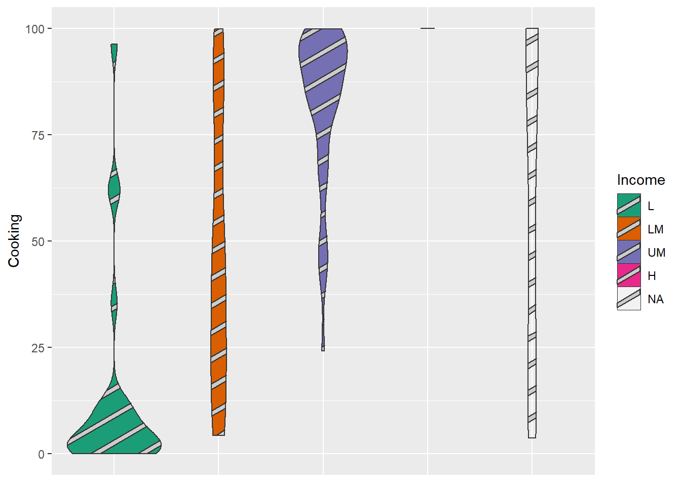
|> :: filter (Year == 2021 ) |> ggplot (aes (y = Cooking, x= Income, fill= Income)) + geom_violin () + scale_fill_brewer (palette = "Dark2" ) + theme (axis.title.x= element_blank (),axis.text.x= element_blank (),axis.ticks.x= element_blank ())
geom_violin_pattern
Package
ggforce (Pedersen 2022 )
Description
Fill violin plots with patterns.
Understandable aesthetics
required aesthetics
x
y
optional aesthetics
alpha, colour, group, linetype, linewidth, weight
geom_voronoi_tile
Package
ggforce (Pedersen 2022 )
Description
Voronoi tiles are the polygons that result from the spatial division of a plane based on the input points.
Understandable aesthetics
required aesthetics
x
y
optional aesthetics
alpha, colour, linetype, size
See also
geom_voronoi_segment , geom_delaunay_tile , geom_delaunay_segment
Example
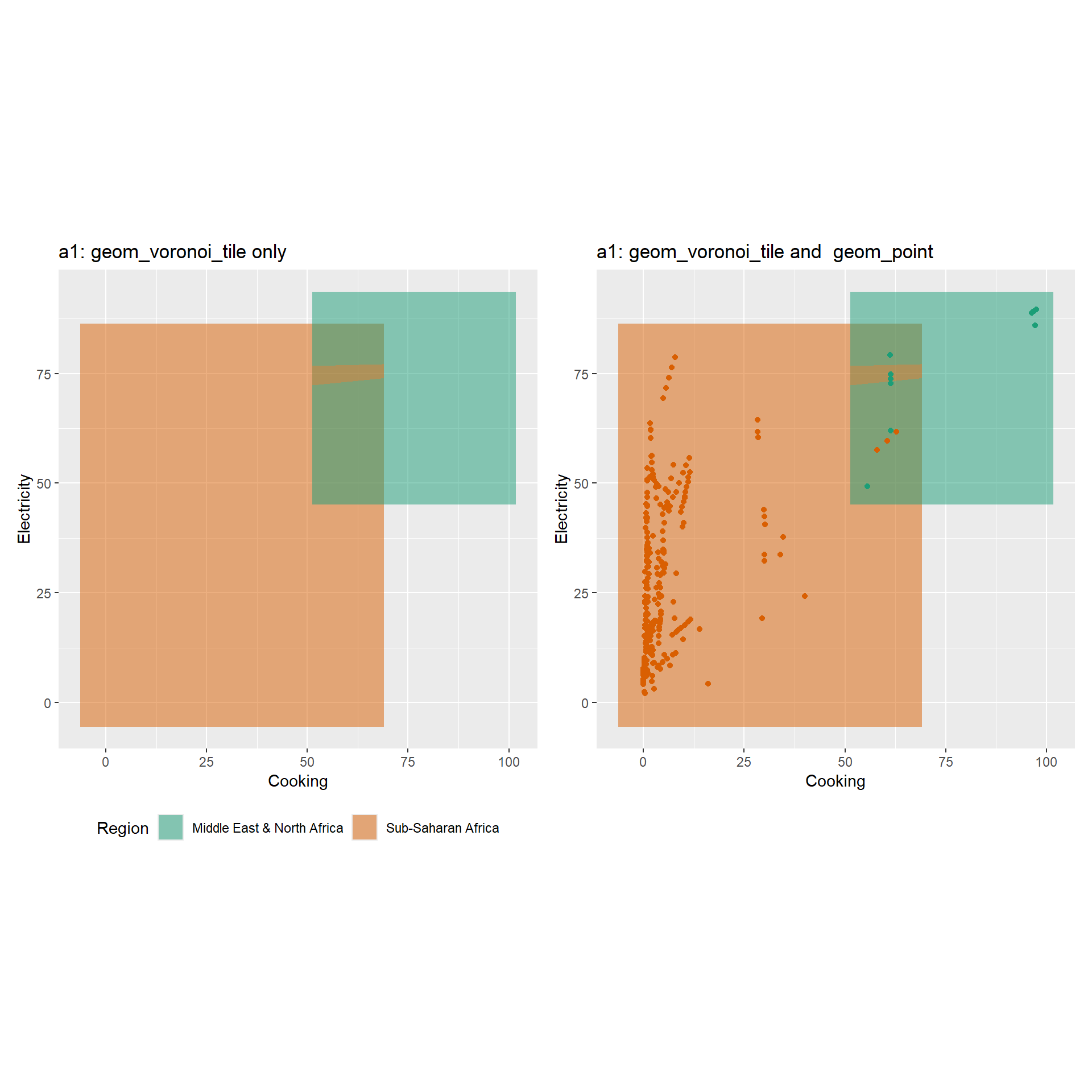
library (ggforce)<- worldbankdata |> filter (Income == "L" ) |> filter (Region == "Middle East & North Africa" | Region == "Sub-Saharan Africa" ) |> ggplot (aes (x= Cooking, y= Electricity)) + geom_voronoi_tile (alpha= 0.5 , aes (fill= Region)) + labs (title = "a1: geom_voronoi_tile only" ) + scale_fill_brewer (palette = "Dark2" ) + scale_color_brewer (palette = "Dark2" ) + theme (aspect.ratio = 1 ) + theme (legend.position= 'bottom' )<- worldbankdata |> filter (Income == "L" ) |> filter (Region == "Middle East & North Africa" | Region == "Sub-Saharan Africa" ) |> ggplot (aes (x= Cooking, y= Electricity)) + geom_voronoi_tile (alpha= 0.5 , aes (fill= Region)) + geom_point (aes (col= Region)) + labs (title = "a1: geom_voronoi_tile and geom_point" ) + scale_fill_brewer (palette = "Dark2" ) + scale_color_brewer (palette = "Dark2" ) + theme (aspect.ratio = 1 ) + theme (legend.position= 'none' )| a2
geom_voronoi_segment
Package
ggforce (Pedersen 2022 )
Description
Represents the borders between the regions assigned to different input points.
Understandable aesthetics
required aesthetics
x
y
optional aesthetics
alpha, colour, linetype, size
See also
geom_voronoi_tile , geom_delaunay_tile , geom_delaunay_segment
Example
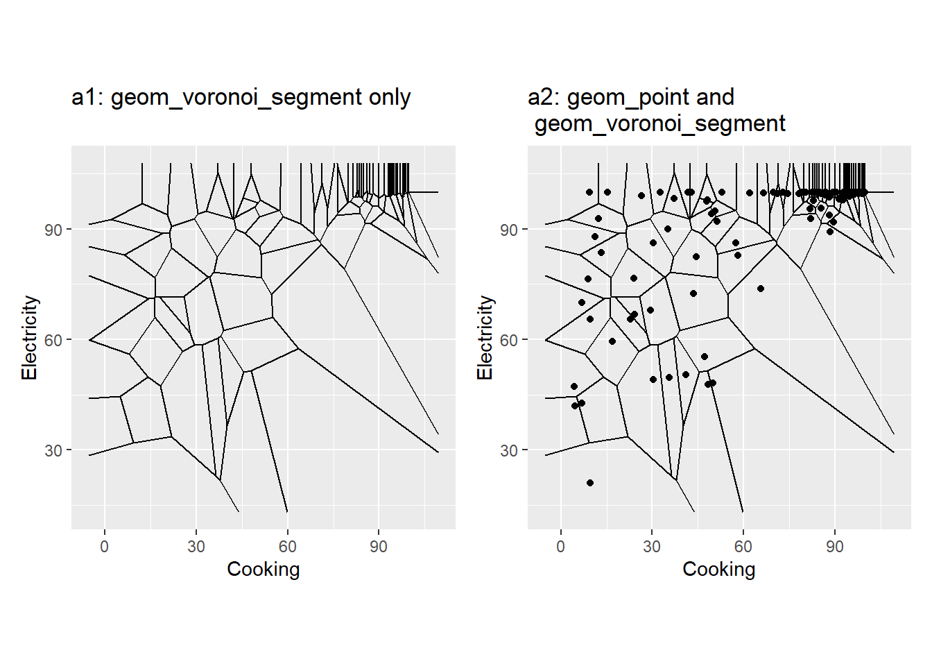
library (ggforce)library (deldir) #to calculate delaunay triangulation <- worldbankdata |> filter (Year == 2021 ) |> filter (Income == "LM" | Income == "UM" ) |> ggplot (aes (x= Cooking, y= Electricity)) + geom_voronoi_segment () + labs (title = "a1: geom_voronoi_segment only" ) + theme (aspect.ratio = 1 )<- worldbankdata |> filter (Year == 2021 ) |> filter (Income == "LM" | Income == "UM" ) |> ggplot (aes (x= Cooking, y= Electricity)) + geom_point () + geom_voronoi_segment () + labs (title = "a2: geom_point and \n geom_voronoi_segment" ) + theme (aspect.ratio = 1 )| a2
Garrett, Robert C., Austin Nar, and Thomas J. Fisher. 2024.
Ggvoronoi: Voronoi Diagrams and Heatmaps with ’Ggplot2’ .
https://github.com/garretrc/ggvoronoi .
Pedersen, Thomas Lin. 2022.
Ggforce: Accelerating ’Ggplot2’ .
https://CRAN.R-project.org/package=ggforce .
Wickham, Hadley. 2016.
Ggplot2: Elegant Graphics for Data Analysis . Springer-Verlag New York.
https://ggplot2.tidyverse.org .
Wilke, Claus O. 2023.
Ggridges: Ridgeline Plots in ’Ggplot2’ .
https://CRAN.R-project.org/package=ggridges .